Henri De Braekeleer Palette 2

Palette Analysis
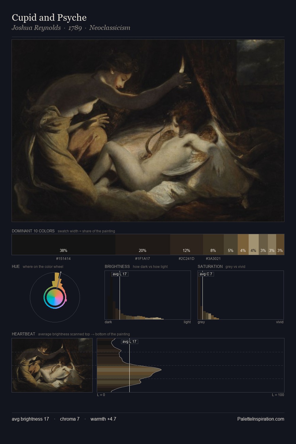
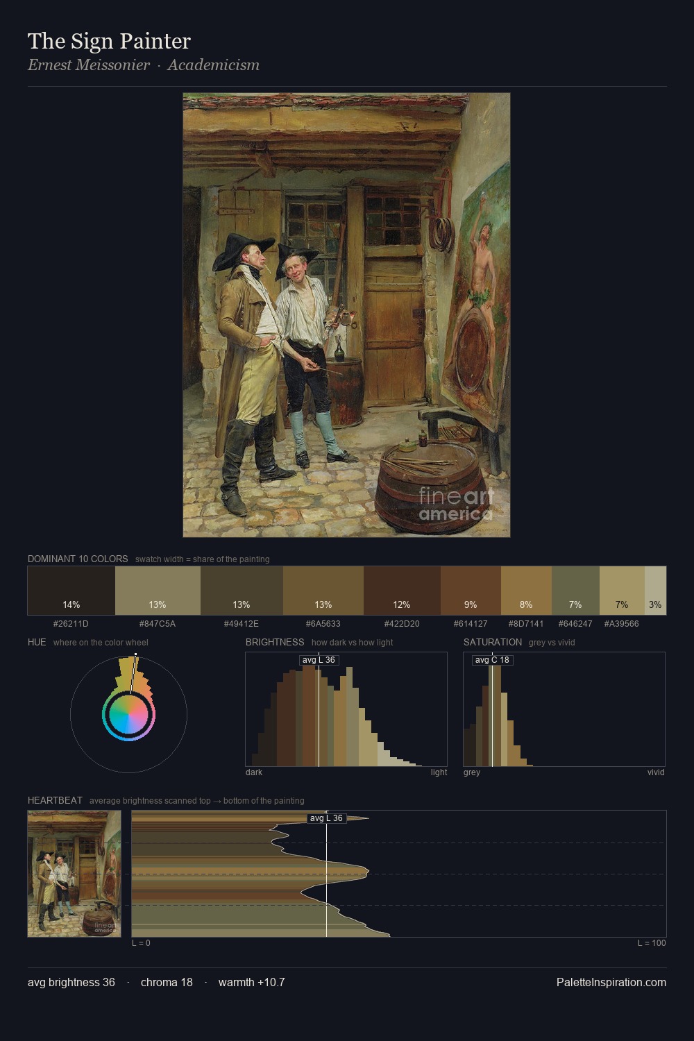
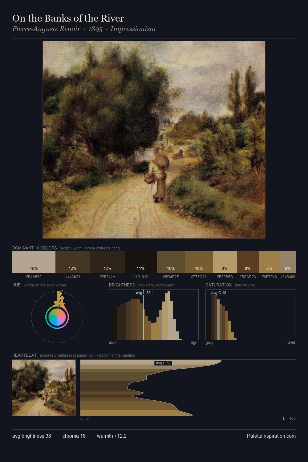
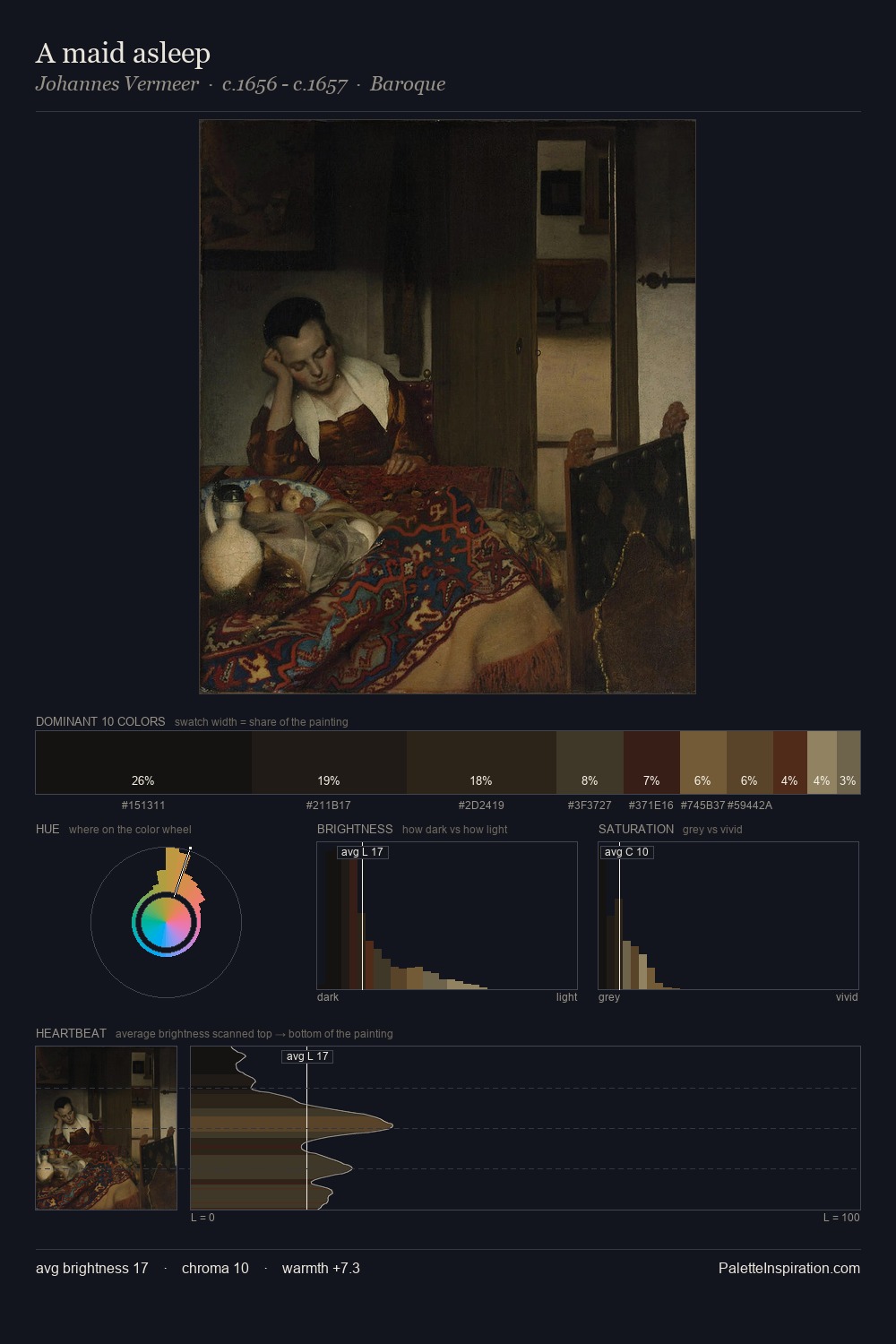
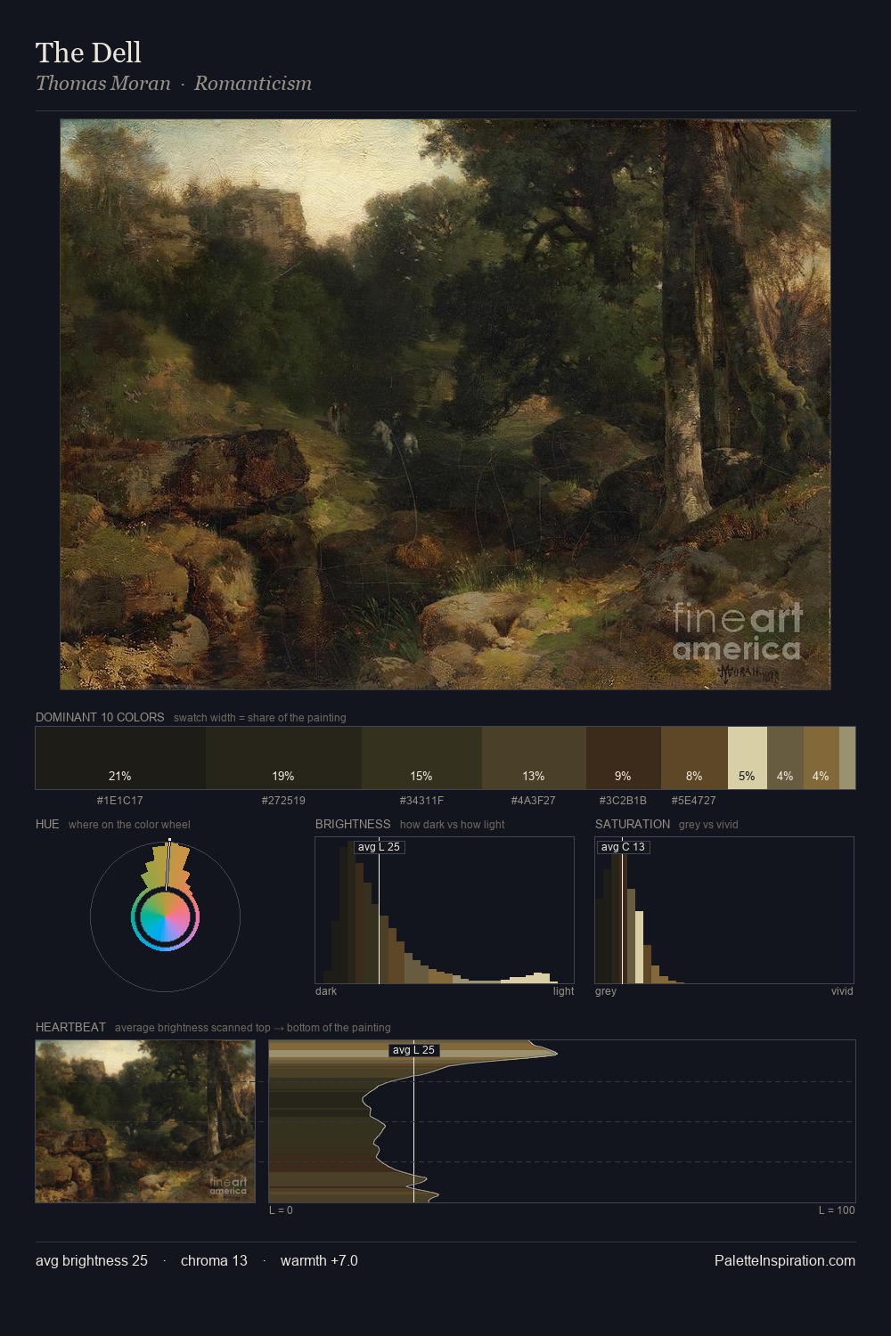
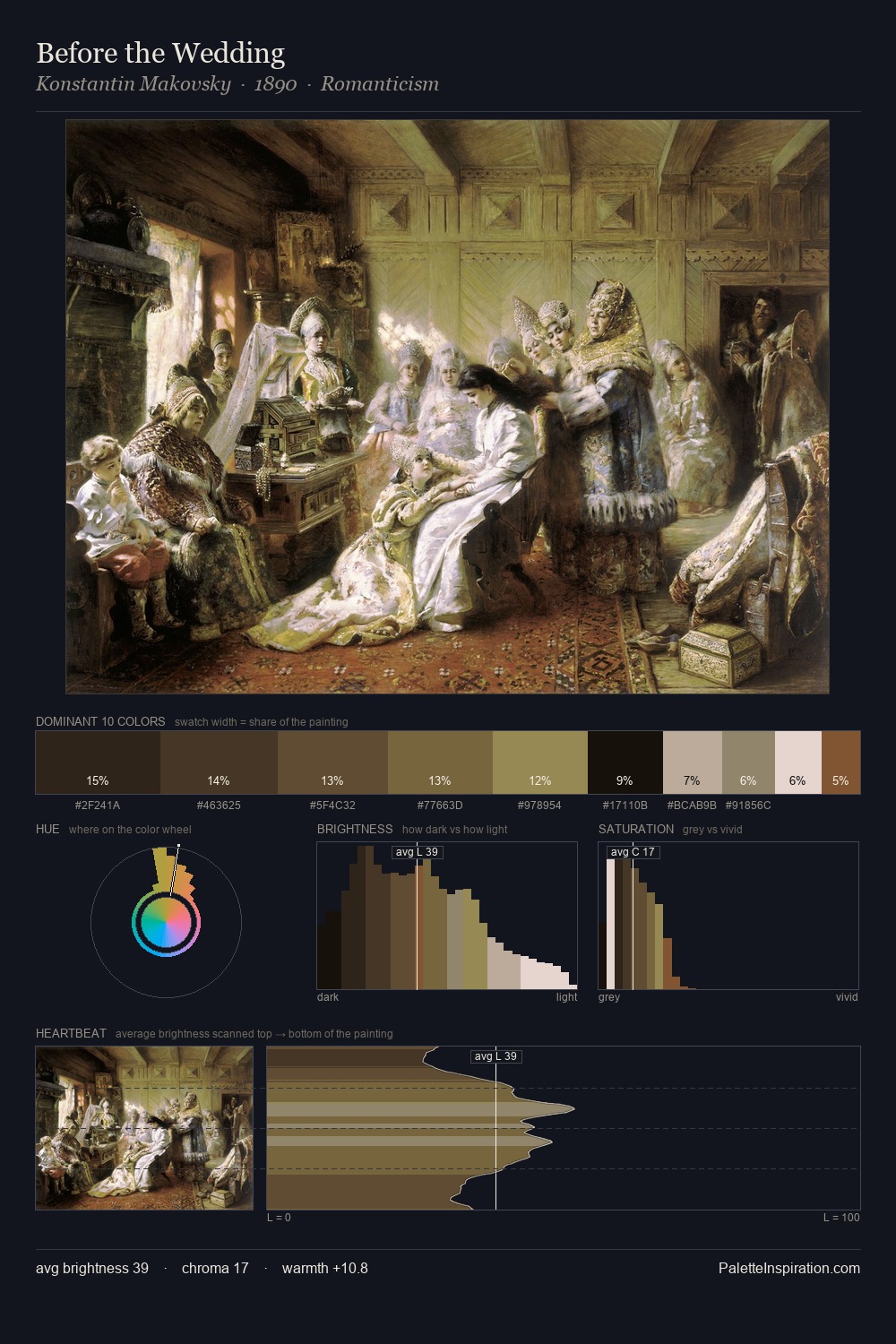
Henri De Braekeleer dwells firmly in the shadows, with no more than a whisper of light. Warm hues command this palette; Henri De Braekeleer favours the reds, oranges, and yellows of firelight and earth. All colours lean toward grey, building depth through value rather than colour punch. #4A3621 delivers the chromatic peak at only 11.1% - a small shot of colour with outsized visual impact. Value range is moderate at 42 units - enough contrast for legibility, not so much as to fragment the tonal unity. Together these qualities place Henri De Braekeleer firmly in the tonal tradition - concerned with mood and atmosphere rather than chromatic display. In the context of Henri De Braekeleer's full range of palettes, group 2 represents one movement in an ongoing chromatic dialogue.
Example use cases
- theater design
- jewelry brands
- tobacco-adjacent retail
- event branding
- film & entertainment
I Love This!
Copy, export, or download for your project