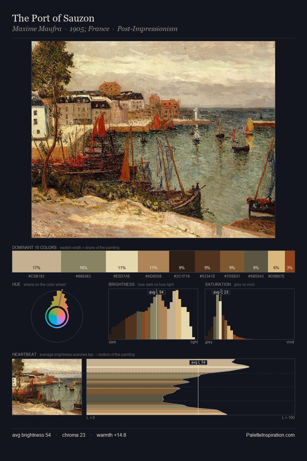
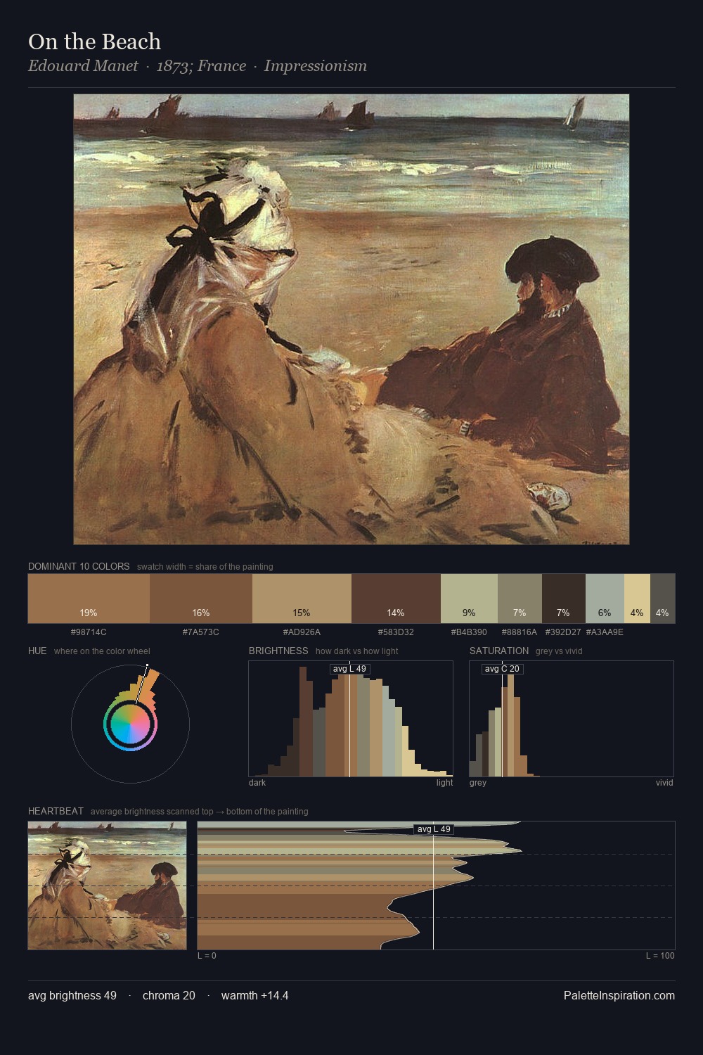
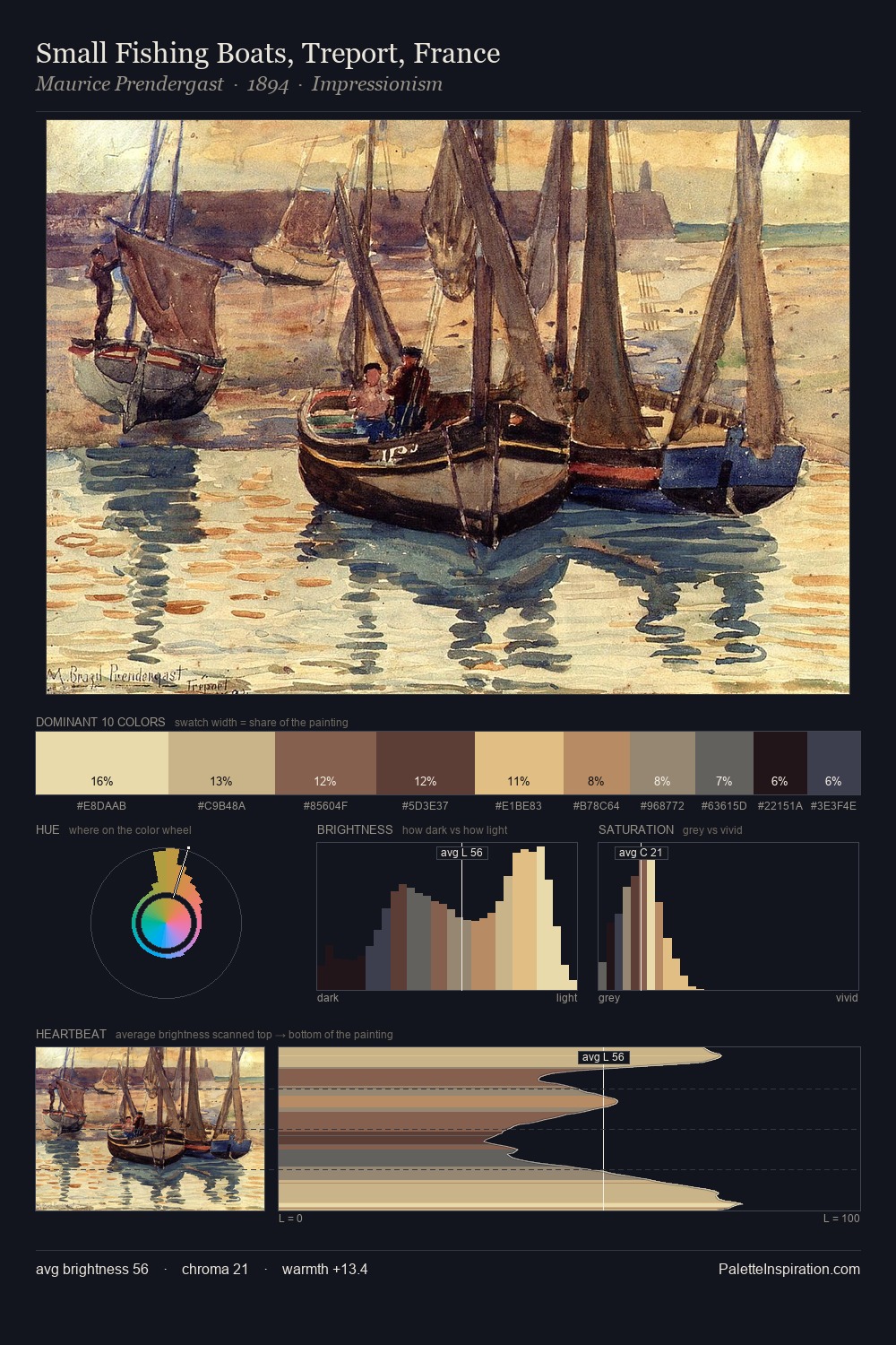
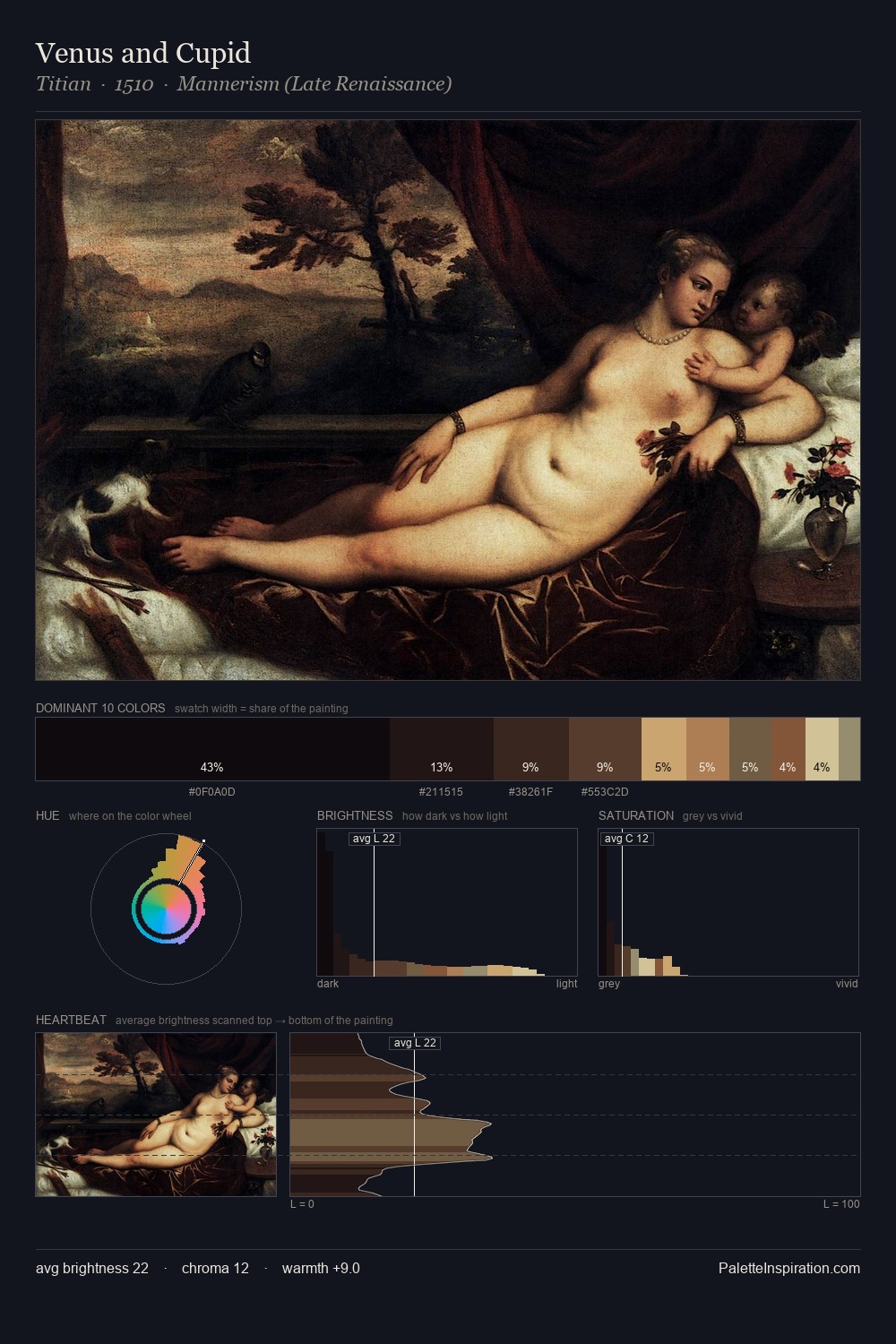
Hendrik Willem Mesdag Palette 3

Palette Analysis
Values in Hendrik Willem Mesdag tilt decisively toward white, giving the palette its luminous character. Warm and cool tones are held in careful balance - neither family dominates, creating tension and resolution simultaneously. Mid-range chroma keeps the palette grounded - colourful but not strident. At 9.1%, #865C44 carries the palette's sharpest chromatic charge: an accent that earns its place precisely because it is withheld. A value spread of 60 units gives the palette both depth and air - shadows are genuinely dark, lights genuinely light. The combination of mid-to-high key, balanced temperature, and elevated chroma is characteristic of Impressionist observation: light broken into its component hues. Palette 3 sits within the larger chromatic argument that Hendrik Willem Mesdag's complete body of work advances.
Example use cases
- ceramics & pottery
- boutique hospitality
- menswear
- heritage food brands
- craft & artisan brands
I Love This!
Copy, export, or download for your project