Hendrik Pothoven Master Palette
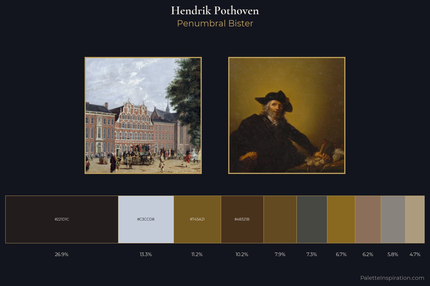
Palette Analysis
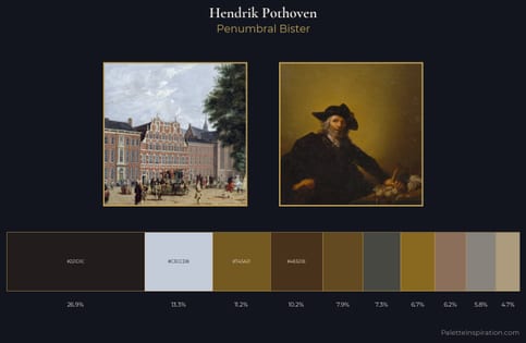
Mid-key values give Hendrik Pothoven its characteristic quietness - nothing blazes, nothing disappears. Warm and cool tones are held in careful balance - neither family dominates, creating tension and resolution simultaneously. The absence of saturated colour is itself an expressive choice: this is a palette of restraint and atmosphere. Hendrik Pothoven gives 26.9% of the composition to a single #221D1C - a decisive chromatic anchor. The saturated accent, #48321B, registers at 10.2% - sparse enough to feel like a deliberate surprise. The value range spans 60 units across the palette, providing the full gamut from deep shadow to near-white and ensuring clear tonal hierarchy. These proportions encode Hendrik Pothoven's instinctive sense of how much of each quality the eye can hold.
Example use cases
- theater design
- jewelry brands
- tobacco-adjacent retail
- event branding
- film & entertainment
I Love This!
Copy, export, or download for your project