Hendrik Heerschop Palette 5
Tenebrous Bister
Tenebrous Dark and murky - low-key values with obscured form, Baroque in temperament.
Bister Dark warm brown - a traditional ink and wash pigment made from wood soot.

Palette Analysis
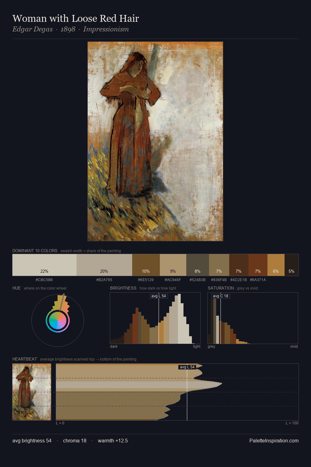
The value structure of Hendrik Heerschop is mid-key: quiet, controlled, and cohesive. Warmth dominates - the palette of Hendrik Heerschop leans heavily on the yellow-orange-red arc of the colour wheel. Saturation is deliberately withheld - the beauty here lies in the near-monochromatic gradations rather than colour difference. 25.1% of the palette belongs to #14100D, a concentration that makes it the unmistakable visual centre. The saturated accent, #3E2311, registers at 8.2% - sparse enough to feel like a deliberate surprise. 51 units of value spread create a palette that is varied but unified - contrast in the service of harmony. Palette 5 sits within the larger chromatic argument that Hendrik Heerschop's complete body of work advances.
Example use cases
- music labels
- luxury hospitality
- editorial photography
- leather goods
- premium streaming
I Love This!
Use This Palette
Copy, export, or download for your project
Copy, export, or download for your project
Copy:
Download:
Share: