Heinrich Campendonk Palette 1

Palette Analysis
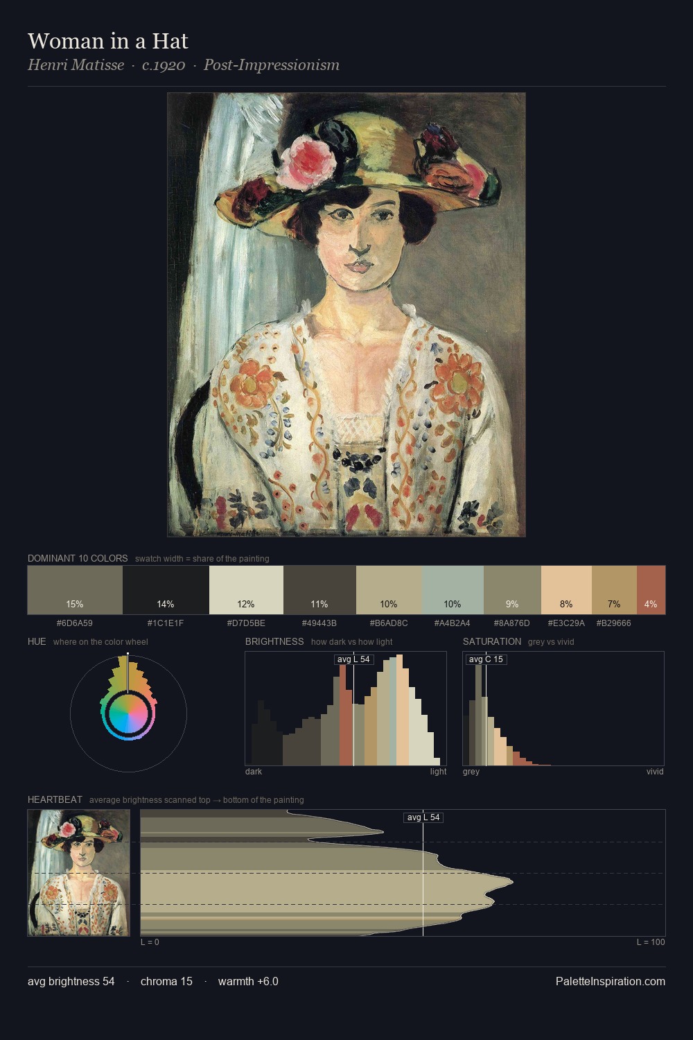
Light floods Heinrich Campendonk; the palette keeps values pale and airy across its range. Temperature is cool-dominant, with blue and green families claiming the largest areas. The absence of saturated colour is itself an expressive choice: this is a palette of restraint and atmosphere. At 31.7%, #E4DAC4 functions less as a colour accent and more as a complete atmospheric environment. #B7694C functions as the palette's exclamation mark: highest chroma, lowest percentage (2.8%). The full value range is 67 units: broad enough to build convincing three-dimensional form. High luminosity and cool temperature suggest the plein-air condition: unfiltered daylight and open sky. In the context of Heinrich Campendonk's full range of palettes, group 1 represents one movement in an ongoing chromatic dialogue.
Example use cases
- ceramics & pottery
- boutique hospitality
- menswear
- heritage food brands
- craft & artisan brands
I Love This!
Copy, export, or download for your project