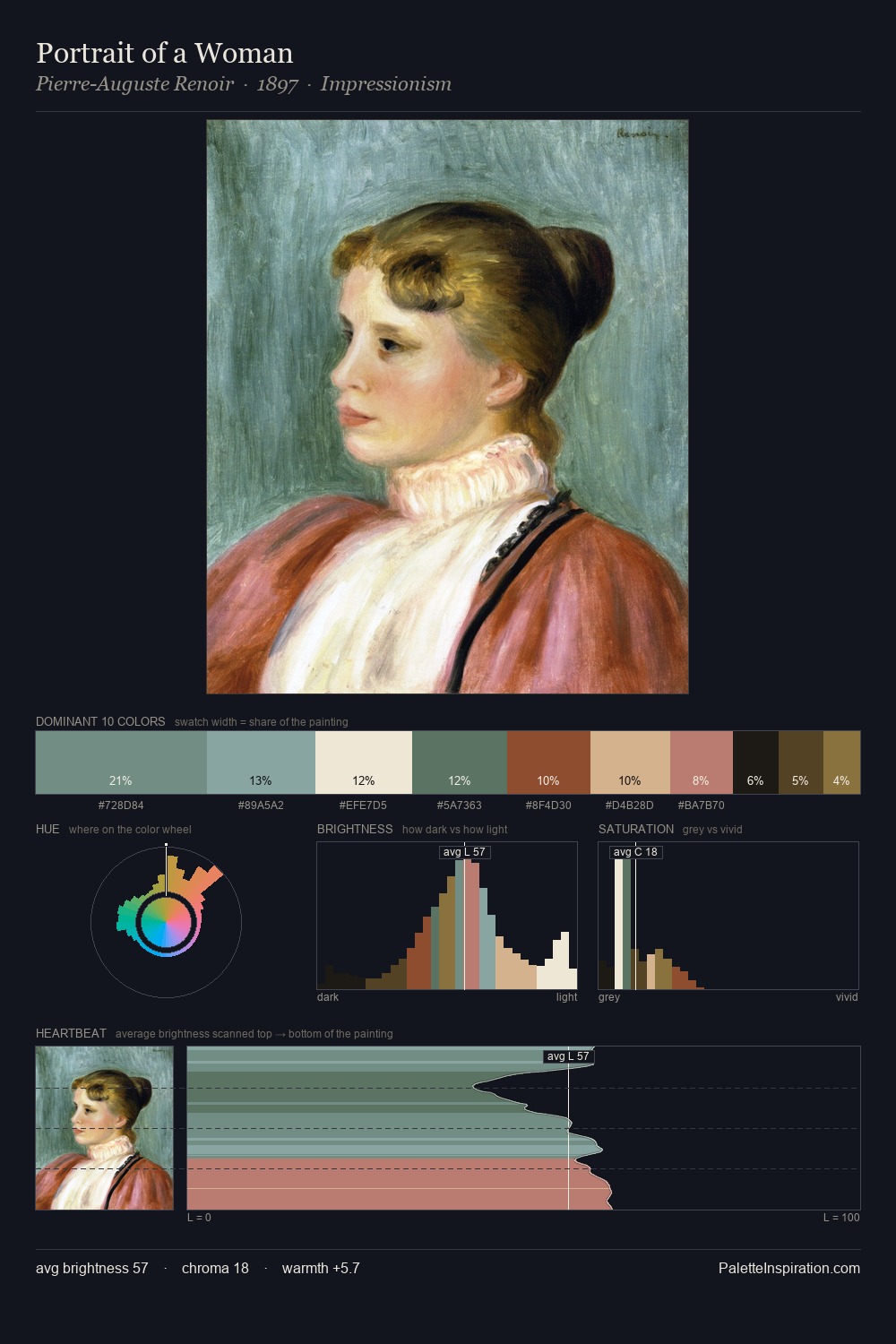
Harrison Fisher Palette 4

Palette Analysis
Harrison Fisher works in the upper reaches of the value scale, creating an atmosphere of brightness and expansiveness. Warm and cool tones are held in careful balance - neither family dominates, creating tension and resolution simultaneously. Chroma hovers near zero; colour declares itself through subtle shifts in hue rather than outright saturation. The dominant colour, #FAFBF7, takes 27.3% of the total area, establishing the overall mood before any other hue is introduced. #0E0804 functions as the palette's exclamation mark: highest chroma, lowest percentage (6.7%). 85 units of value range underpin the palette's structural clarity: the eye always knows where light falls. This is palette 4 of Harrison Fisher's sequence - a single chapter in a chromatic story told across many works.
Example use cases
- food packaging
- leather accessories
- travel & outdoor
- natural cosmetics
- interior design
I Love This!
Copy, export, or download for your project