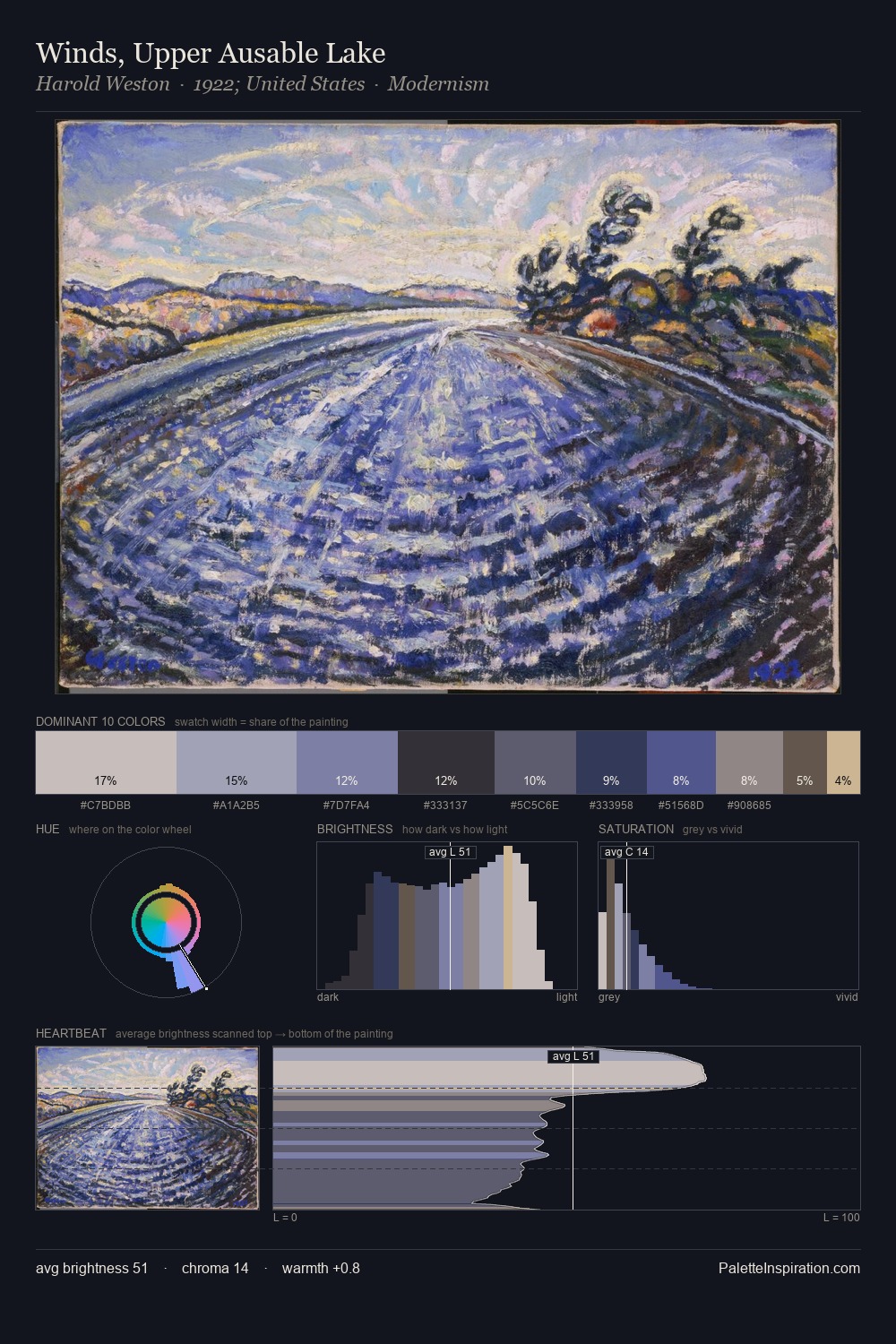
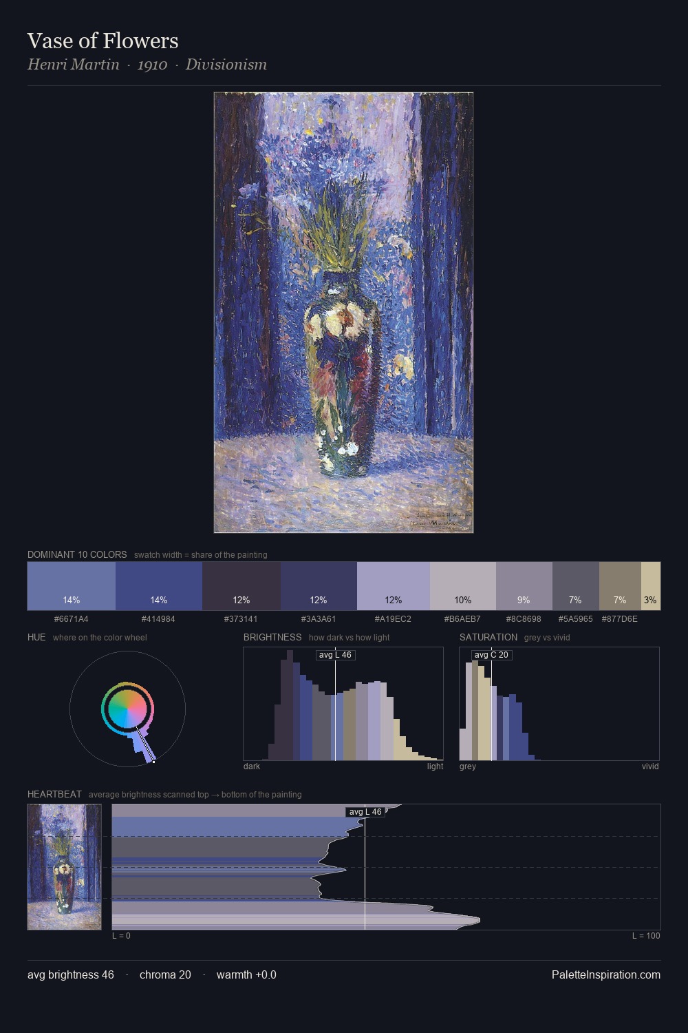
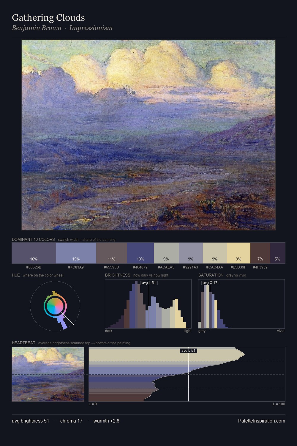
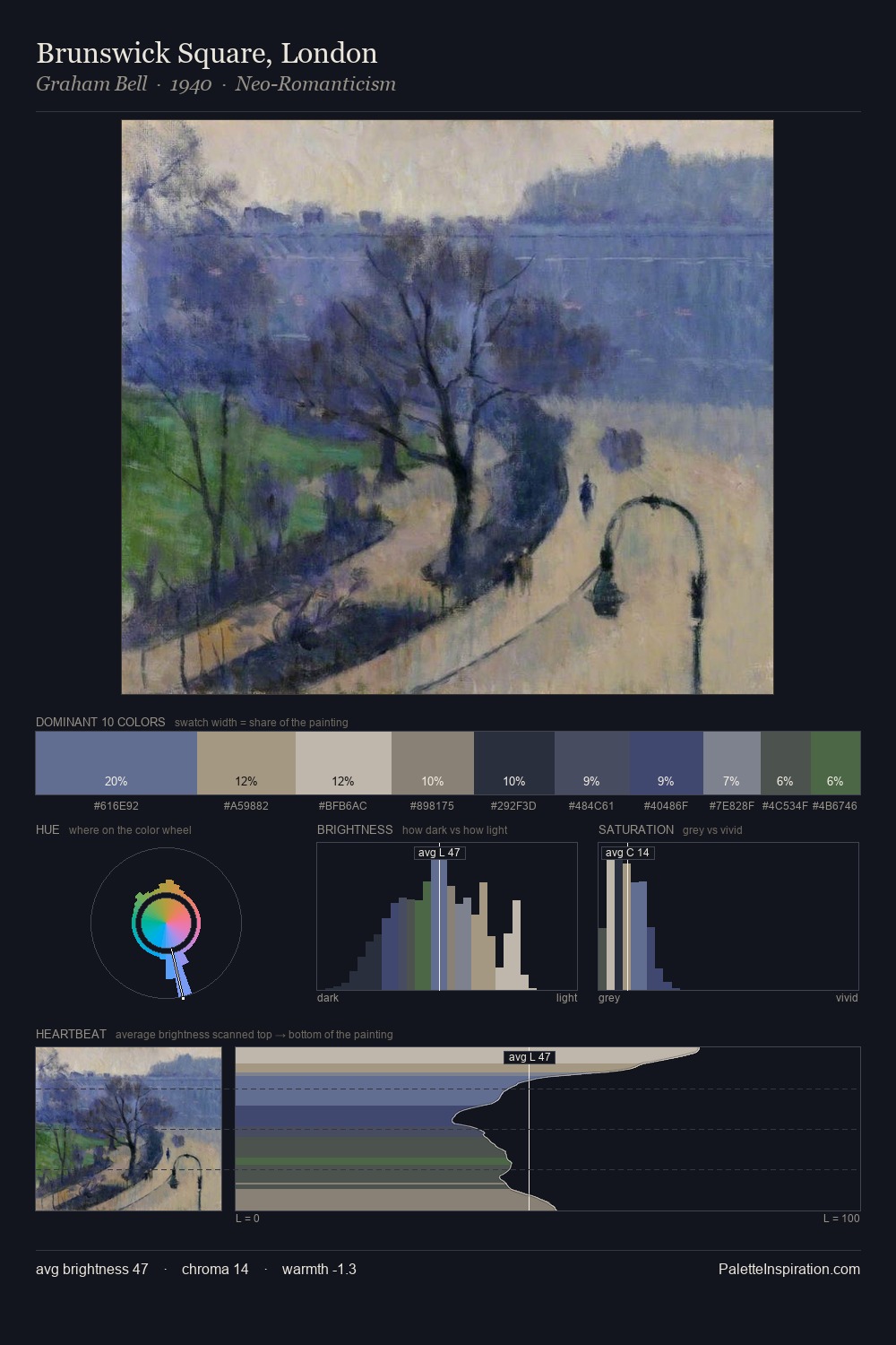
Harold Weston Master Palette
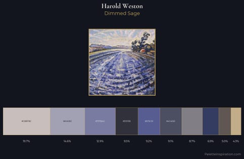
Dimmed Sage
Dimmed Moderate shadow - values pulled toward mid-dark, as if a light source has been reduced.
Sage Muted gray-green - the color of dried sage leaf, low-chroma and herbal.
Palette Analysis
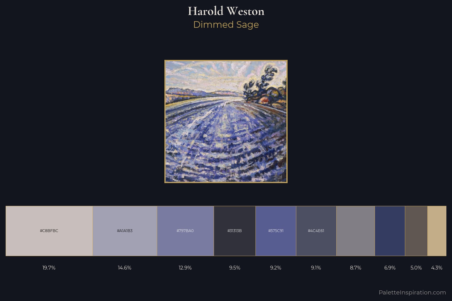
Harold Weston keeps values measured and balanced, a hallmark of tonal restraint. Cool hues prevail: blues, greens, and greys anchor the palette's emotional temperature. Chroma hovers near zero; colour declares itself through subtle shifts in hue rather than outright saturation. #C3AD89 functions as the palette's exclamation mark: highest chroma, lowest percentage (4.3%). At 49 units across the value scale, the palette keeps contrast readable without letting it dominate. The mid-to-high key, cool bias, and moderate chroma point to outdoor observation - sky and diffused daylight as the dominant light source. These proportions encode Harold Weston's instinctive sense of how much of each quality the eye can hold.
Example use cases
- museums & galleries
- academic publishing
- heritage brands
- auction houses
- exhibition design
I Love This!
Use This Palette
Copy, export, or download for your project
Copy, export, or download for your project
Copy:
Download:
Share: