Hans Thoma Palette 1
Palette Analysis
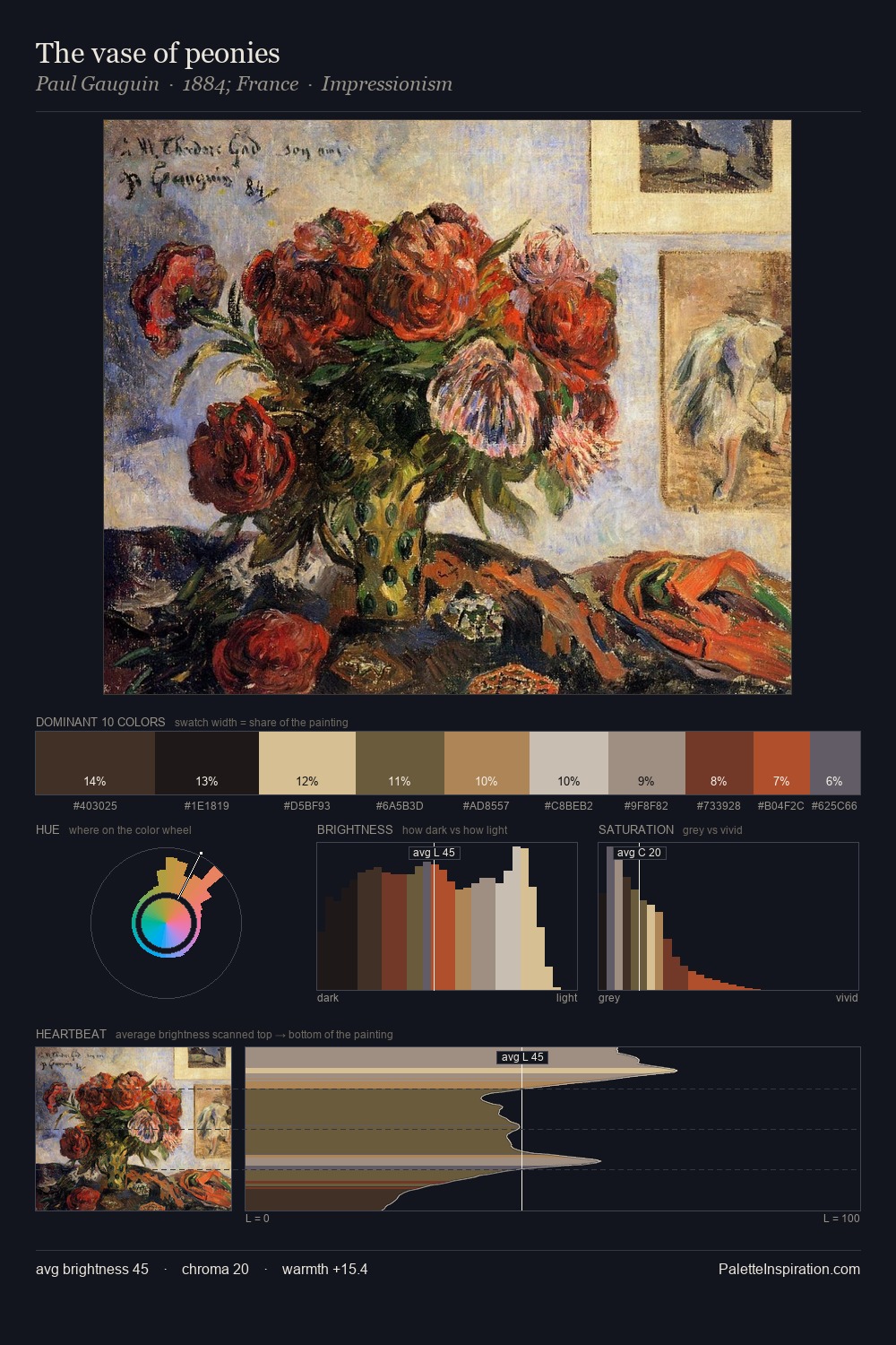
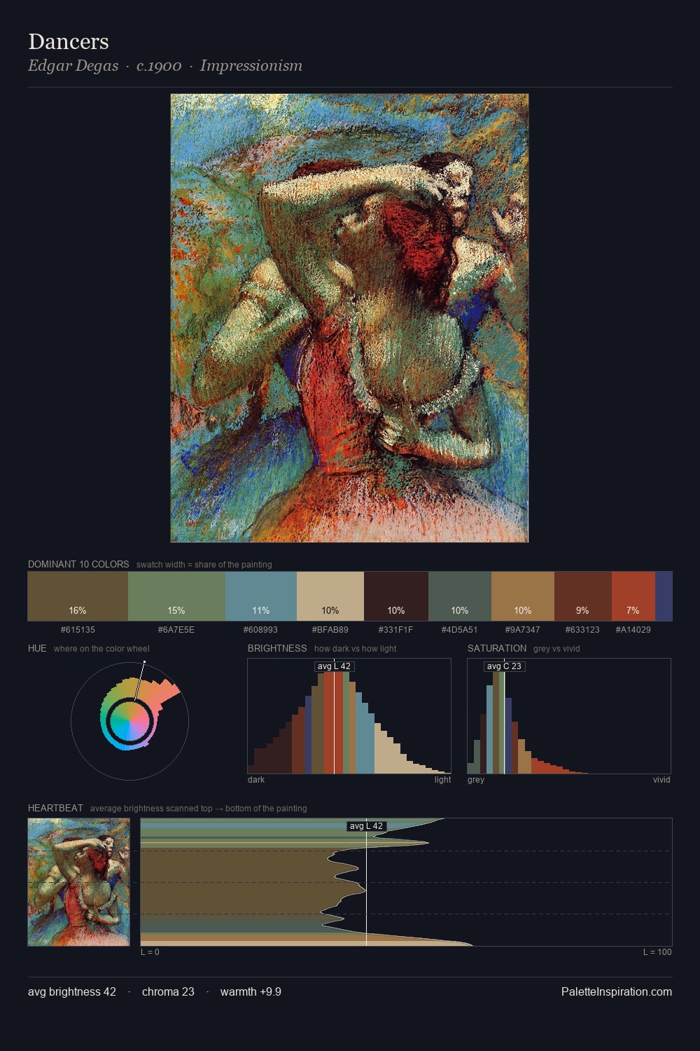
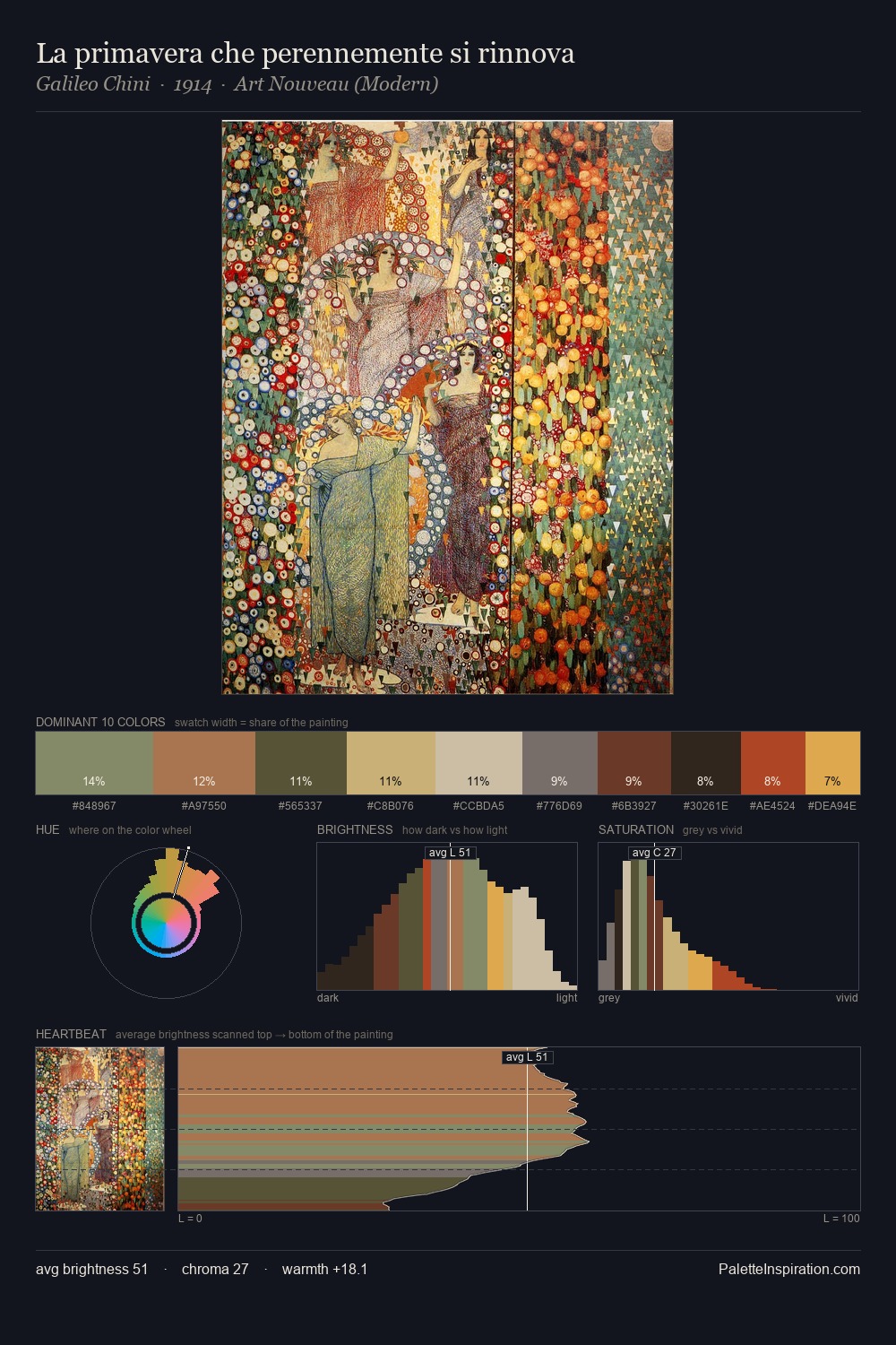
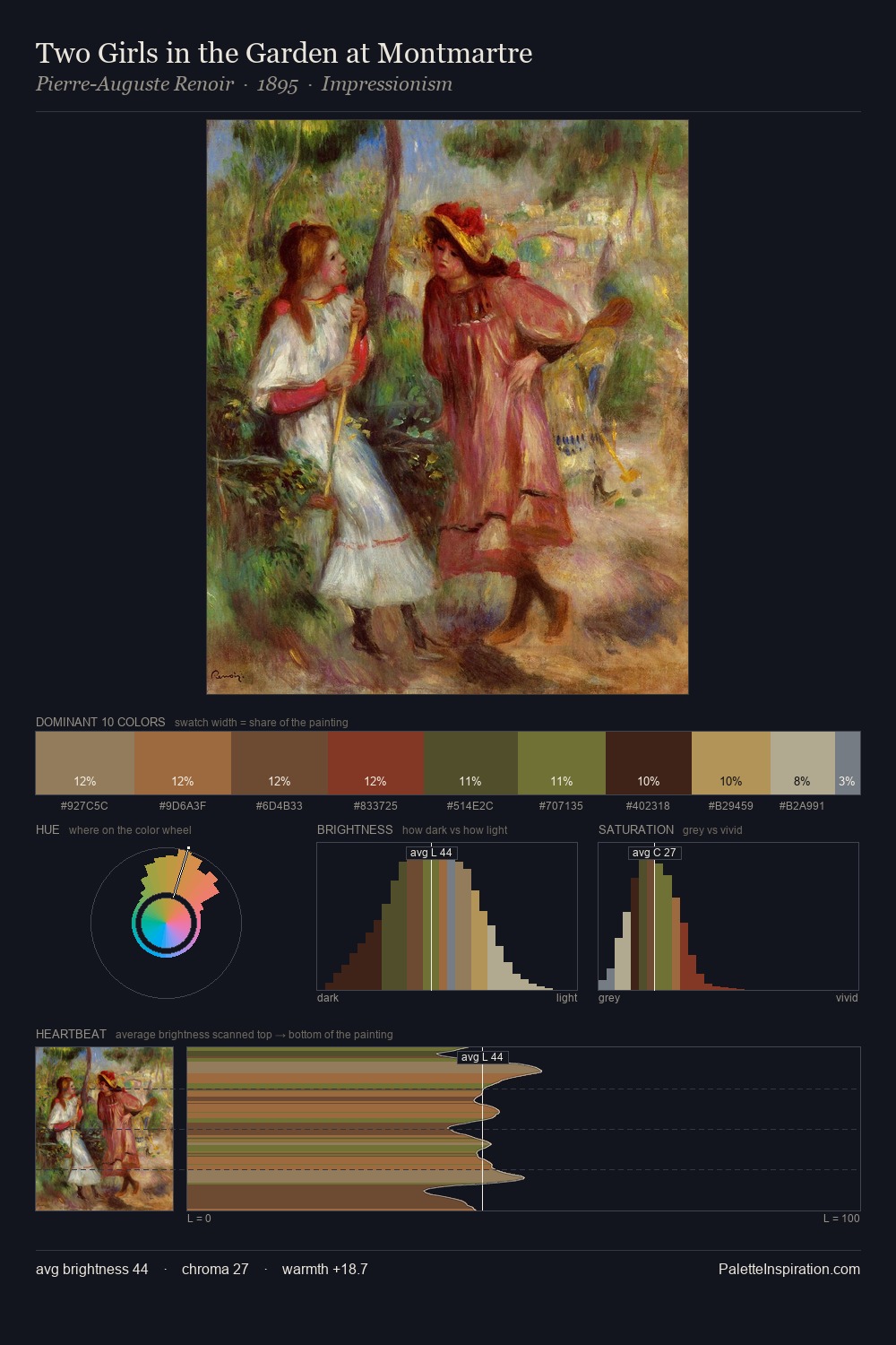
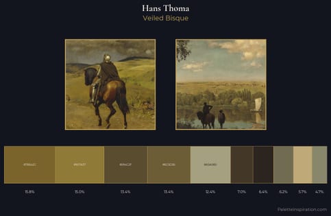
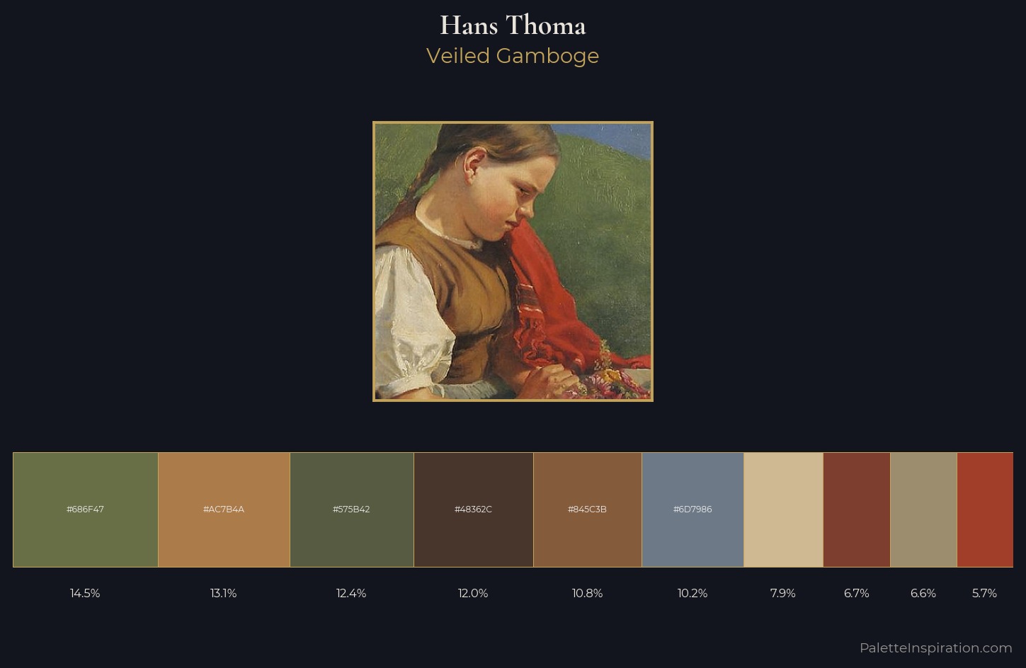
Hans Thoma occupies the comfortable middle of the value scale, avoiding both extremes to hold the eye in a sustained middle grey. The palette achieves thermal balance - reds and blues, ochres and greens, each holding the other in check. Chroma is moderate: colours carry enough saturation to be read as colour, but the palette stops well short of garish intensity. #845C3B delivers the chromatic peak at only 10.8% - a small shot of colour with outsized visual impact. Value range is moderate at 44 units - enough contrast for legibility, not so much as to fragment the tonal unity. The combination of mid-to-high key, balanced temperature, and elevated chroma is characteristic of Impressionist observation: light broken into its component hues. This is palette 1 of Hans Thoma's sequence - a single chapter in a chromatic story told across many works.
Example use cases
- ceramics & pottery
- boutique hospitality
- menswear
- heritage food brands
- craft & artisan brands
I Love This!
Copy, export, or download for your project