Hans Sterbik Palette 1
Pale Ecru
Pale High-key and low-chroma - delicate, bleached, washed with light.
Ecru Unbleached linen - warm mid-neutral, slightly grayed, raw and natural.
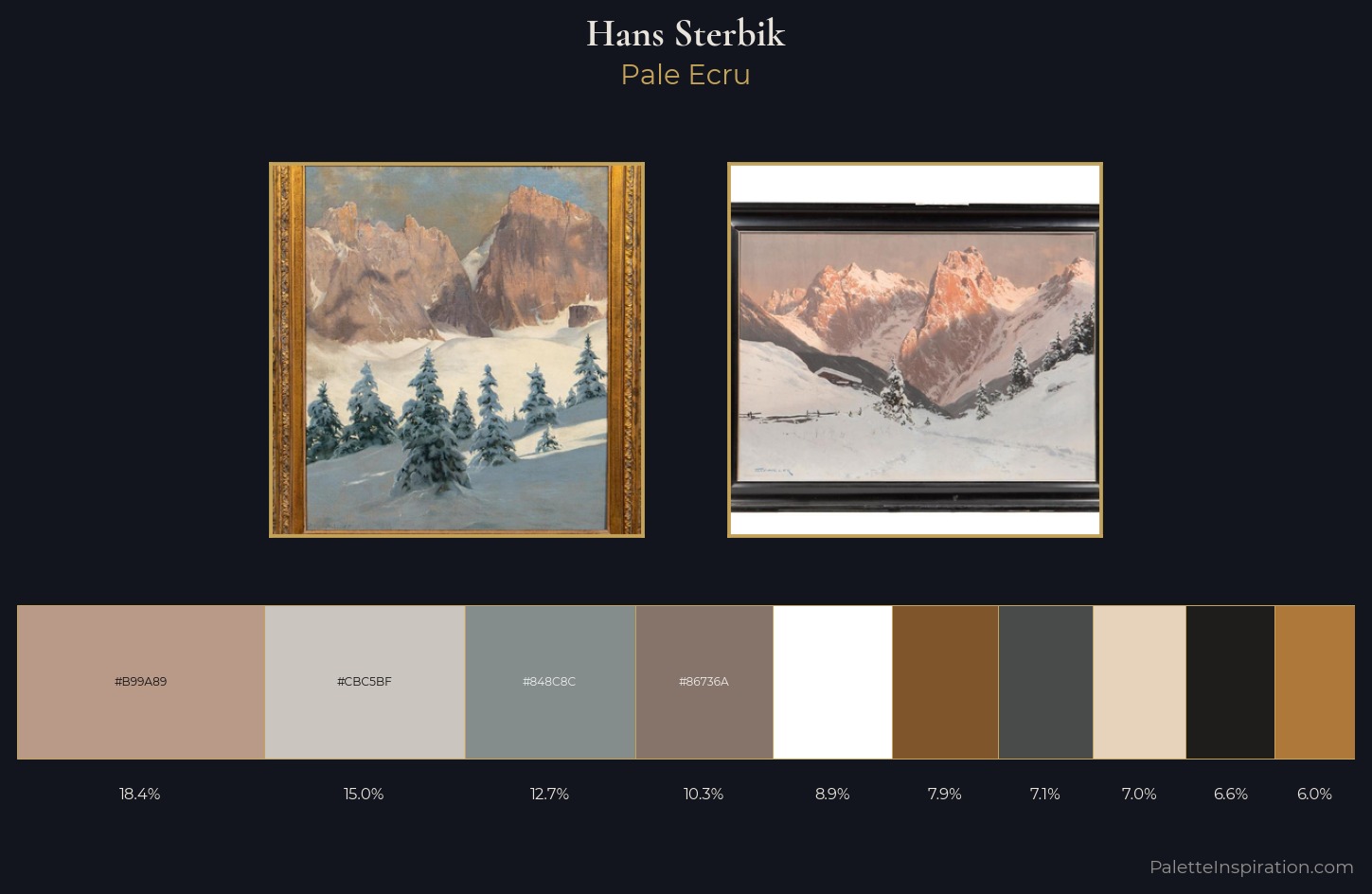
Palette Analysis
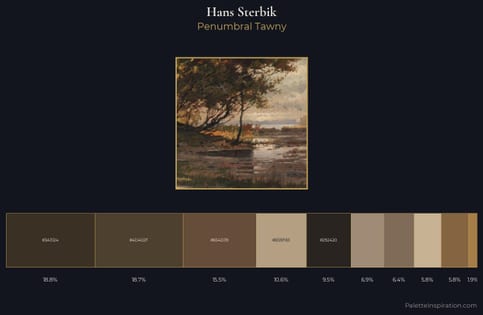
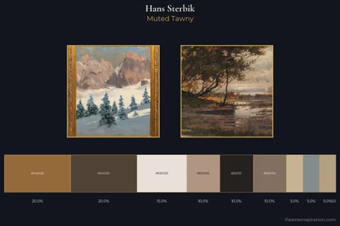
Values in Hans Sterbik tilt decisively toward white, giving the palette its luminous character. Yellow, ochre, sienna: warm hues that Hans Sterbik deploys as the palette's primary energy. All colours lean toward grey, building depth through value rather than colour punch. #E7D3BC delivers the chromatic peak at only 7.0% - a small shot of colour with outsized visual impact. The value range spans 77 units across the palette, providing the full gamut from deep shadow to near-white and ensuring clear tonal hierarchy. Palette 1 sits within the larger chromatic argument that Hans Sterbik's complete body of work advances.
Example use cases
- exhibition design
- foundation branding
- estate management
- art education
- museums & galleries
I Love This!
Use This Palette
Copy, export, or download for your project
Copy, export, or download for your project
Copy:
Download:
Share: