Hans Holbein the Elder Palette 1
Soft Ecru
Soft Low-contrast, gentle chroma - mid-key values and low saturation, approachable and calm.
Ecru Unbleached linen - warm mid-neutral, slightly grayed, raw and natural.

Palette Analysis
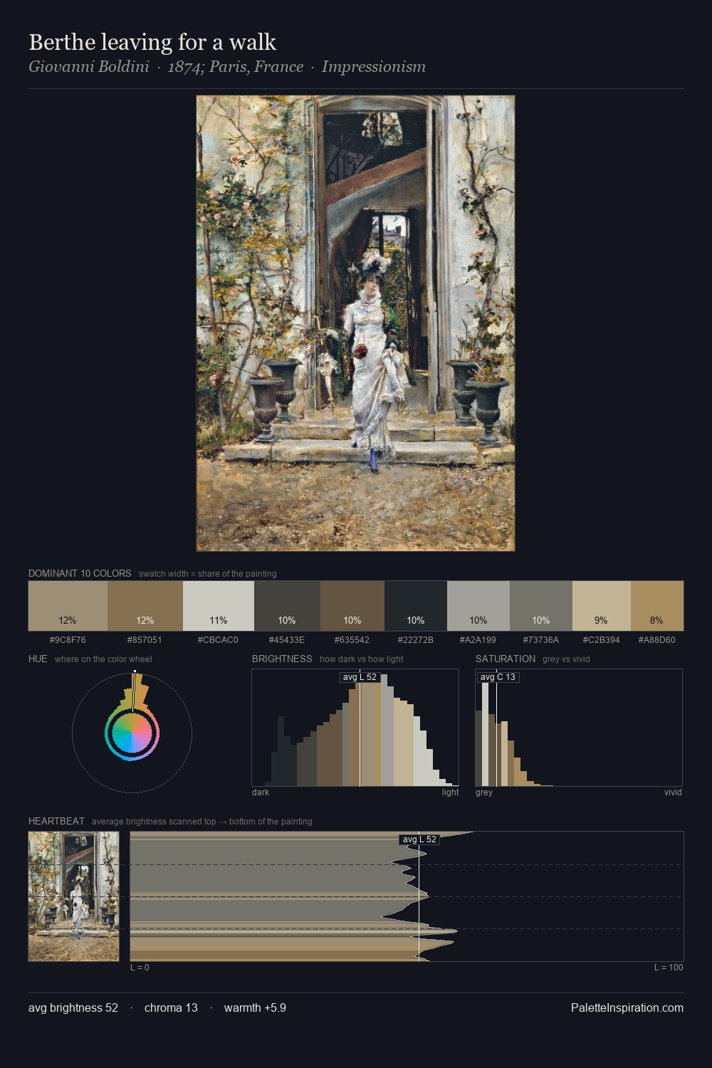
The high-key values of Hans Holbein the Elder give it an effulgent, almost bleached quality. Yellow, ochre, sienna: warm hues that Hans Holbein the Elder deploys as the palette's primary energy. Saturation is deliberately withheld - the beauty here lies in the near-monochromatic gradations rather than colour difference. The most saturated colour, #9C7E51, is reserved to 9.0% of the surface, where it acts as a focal punctuation. The palette spans 49 value units: a measured range that delivers coherence over drama. This is palette 1 of Hans Holbein the Elder's sequence - a single chapter in a chromatic story told across many works.
Example use cases
- exhibition design
- foundation branding
- estate management
- art education
- museums & galleries
I Love This!
Use This Palette
Copy, export, or download for your project
Copy, export, or download for your project
Copy:
Download:
Share: