Hans Hoffmann Palette 2

Palette Analysis
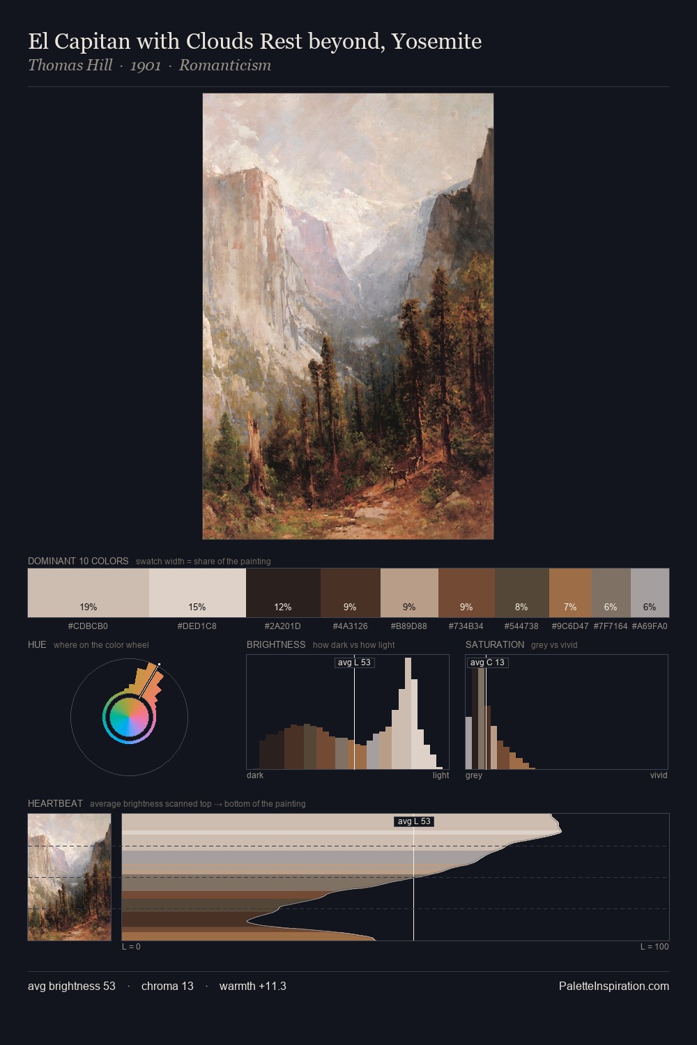
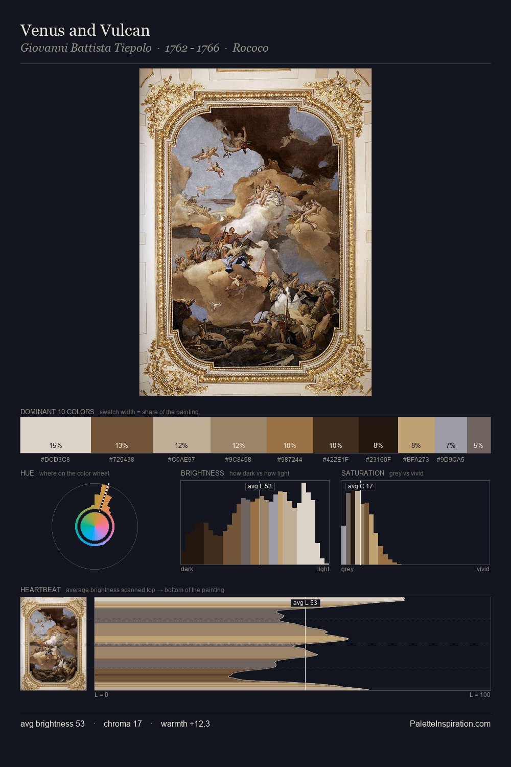
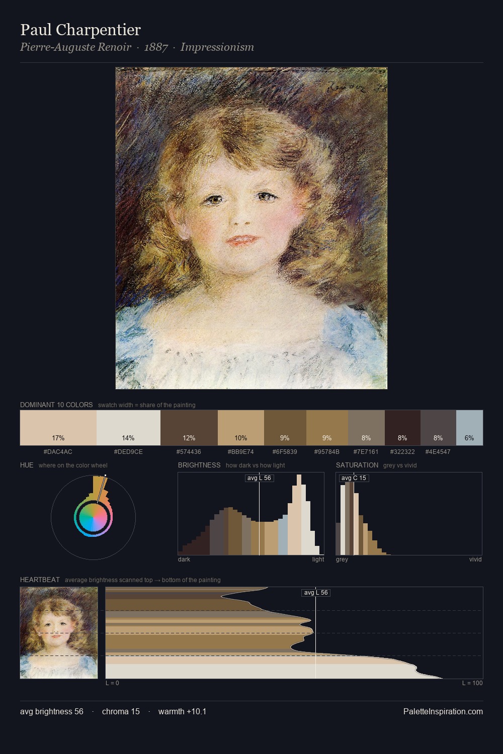
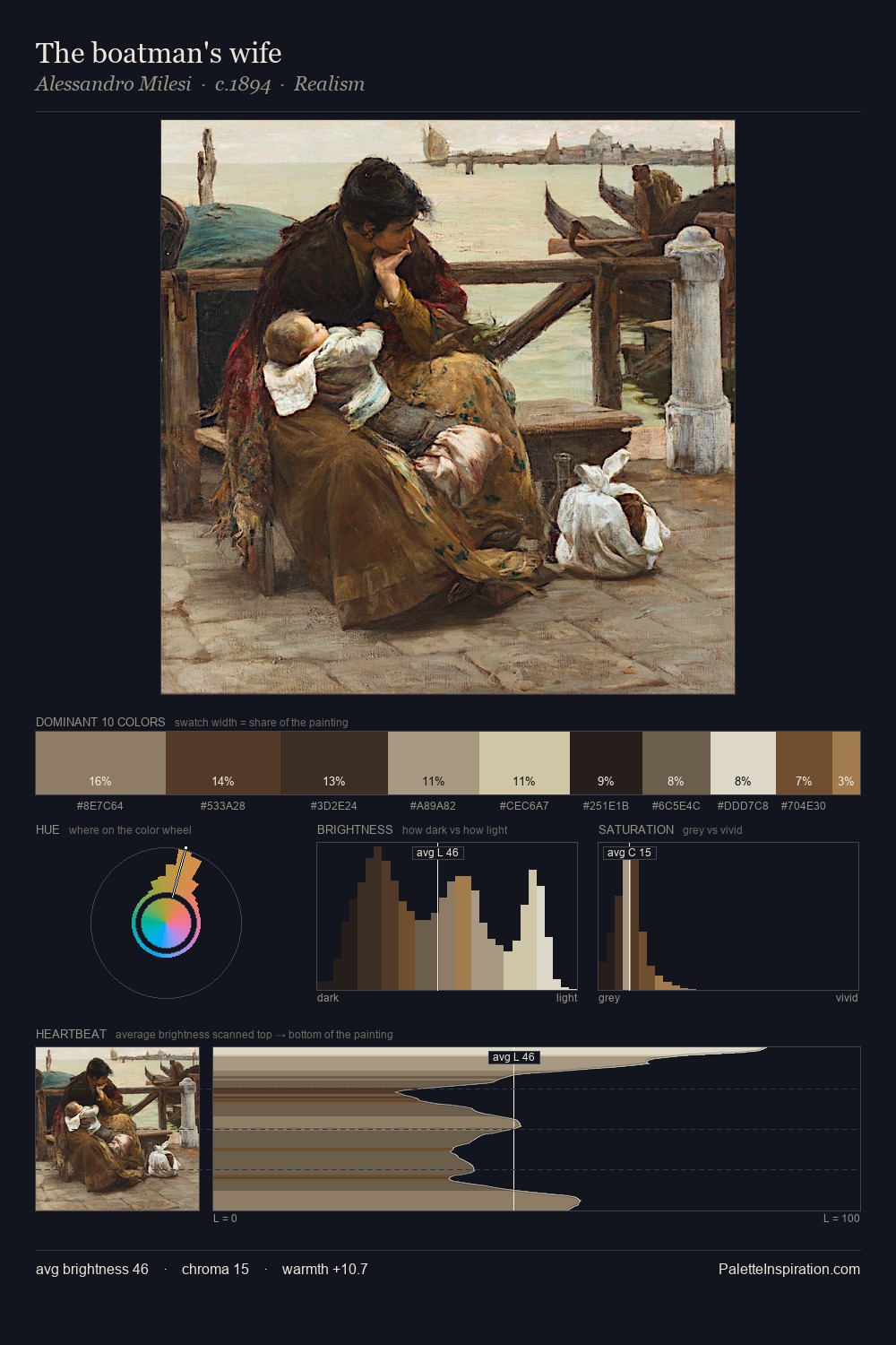
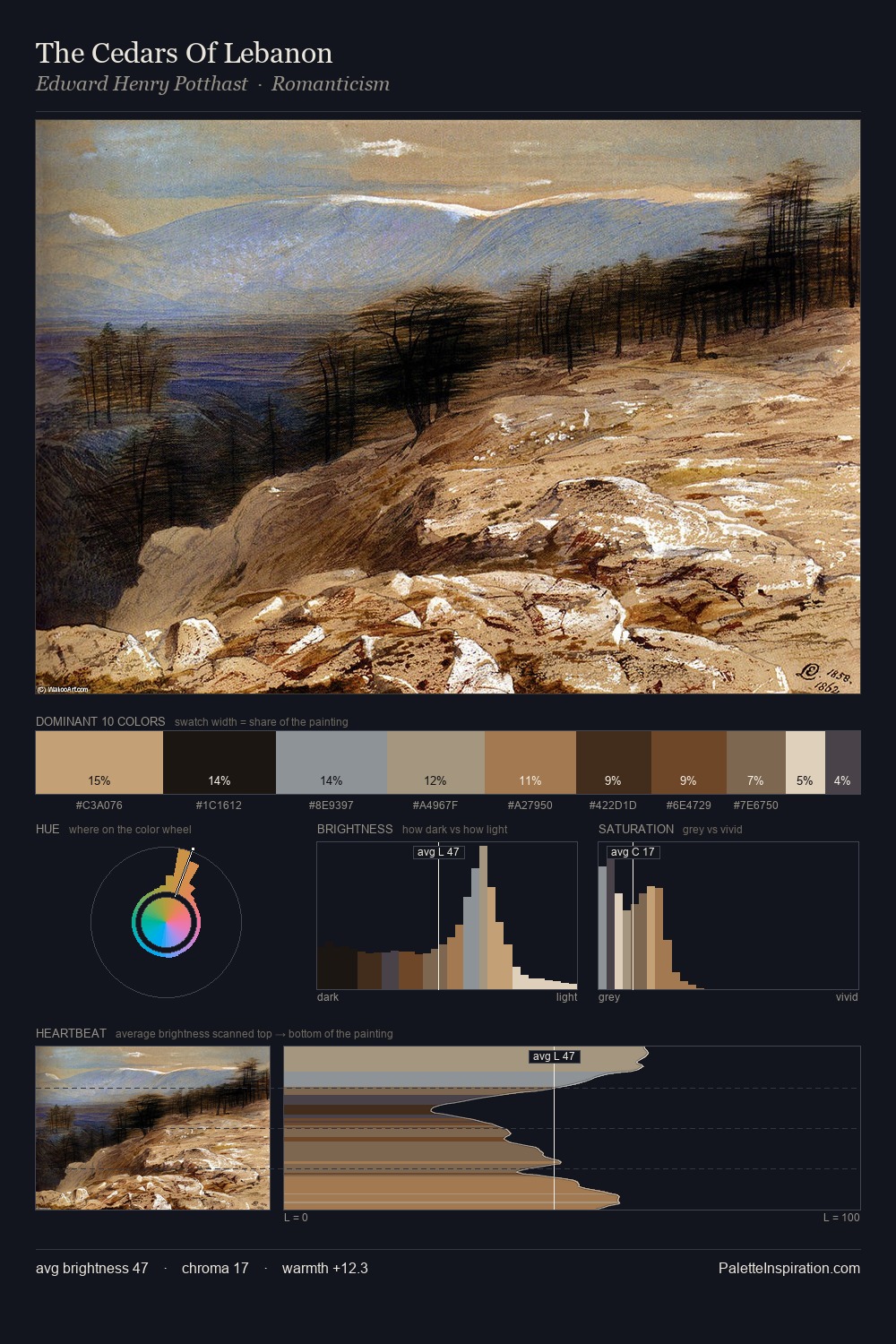
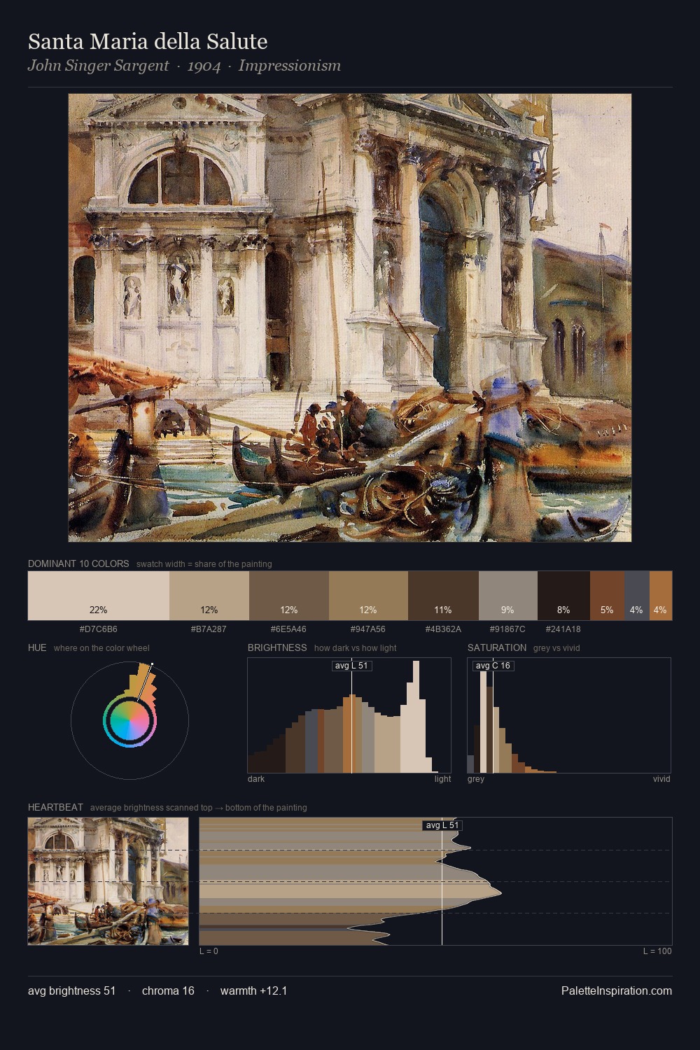
Values in Hans Hoffmann tilt decisively toward white, giving the palette its luminous character. Temperature is cool-dominant, with blue and green families claiming the largest areas. The absence of saturated colour is itself an expressive choice: this is a palette of restraint and atmosphere. A single dominant - #DAD2BF at 35.8% - sets the character of the whole composition. At 3.9%, #9F764C carries the palette's sharpest chromatic charge: an accent that earns its place precisely because it is withheld. From deepest dark to palest light, the palette traverses 67 units of the value scale - a span that creates natural depth. The palette has the character of outdoor light: cool, mid-bright, with colour rendered faithfully rather than expressively. Hans Hoffmann's palette 2 carries its own internal logic while remaining in conversation with the artist's broader colour intelligence.
Example use cases
- ceramics & pottery
- boutique hospitality
- menswear
- heritage food brands
- craft & artisan brands
I Love This!
Copy, export, or download for your project