Hans Hartung Master Palette

Palette Analysis
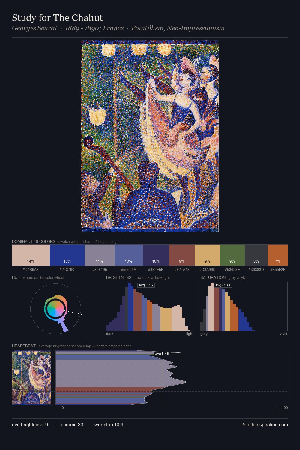
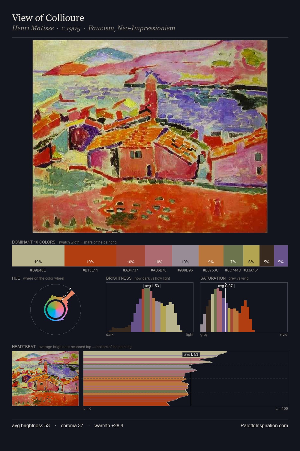
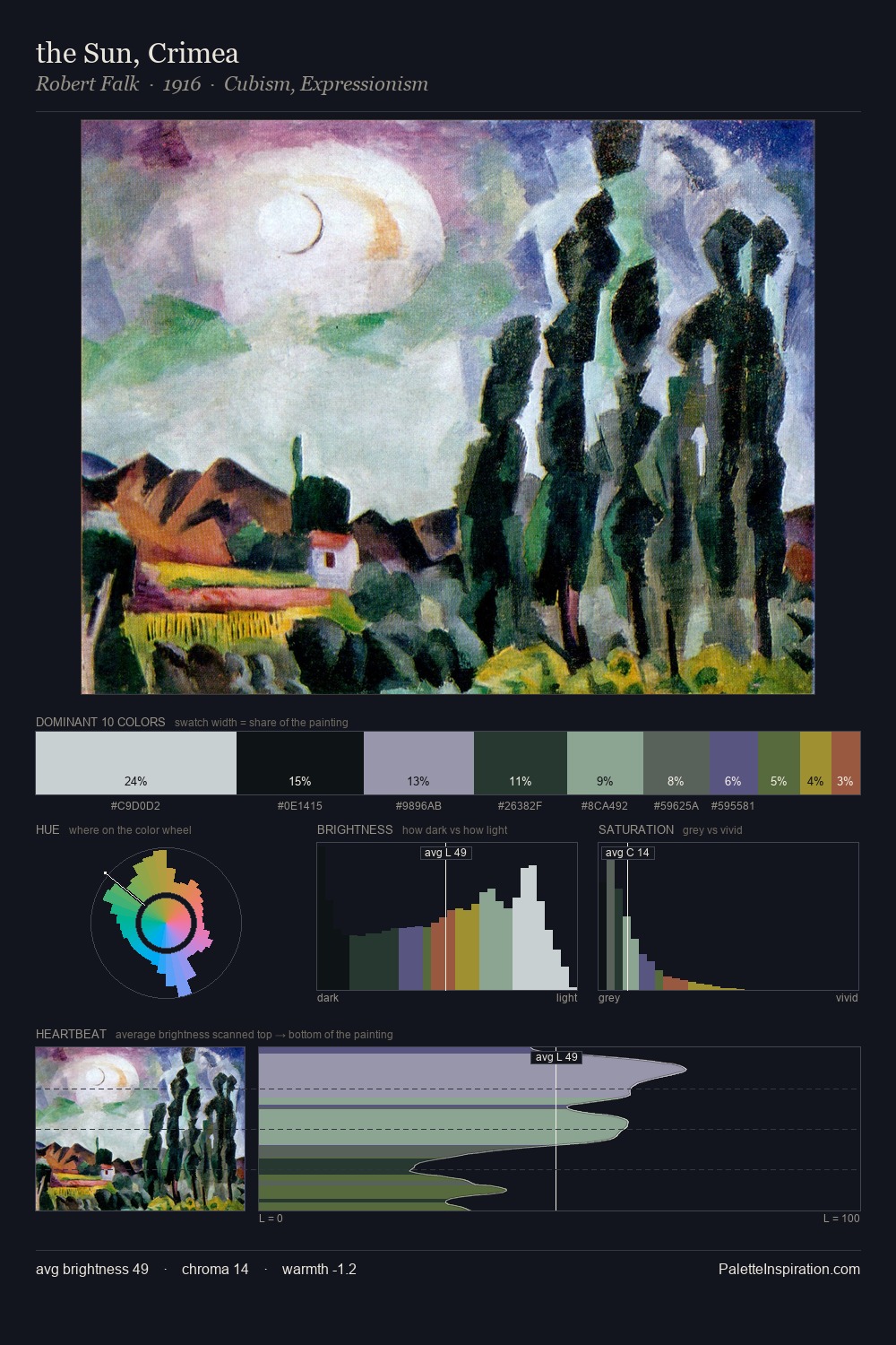
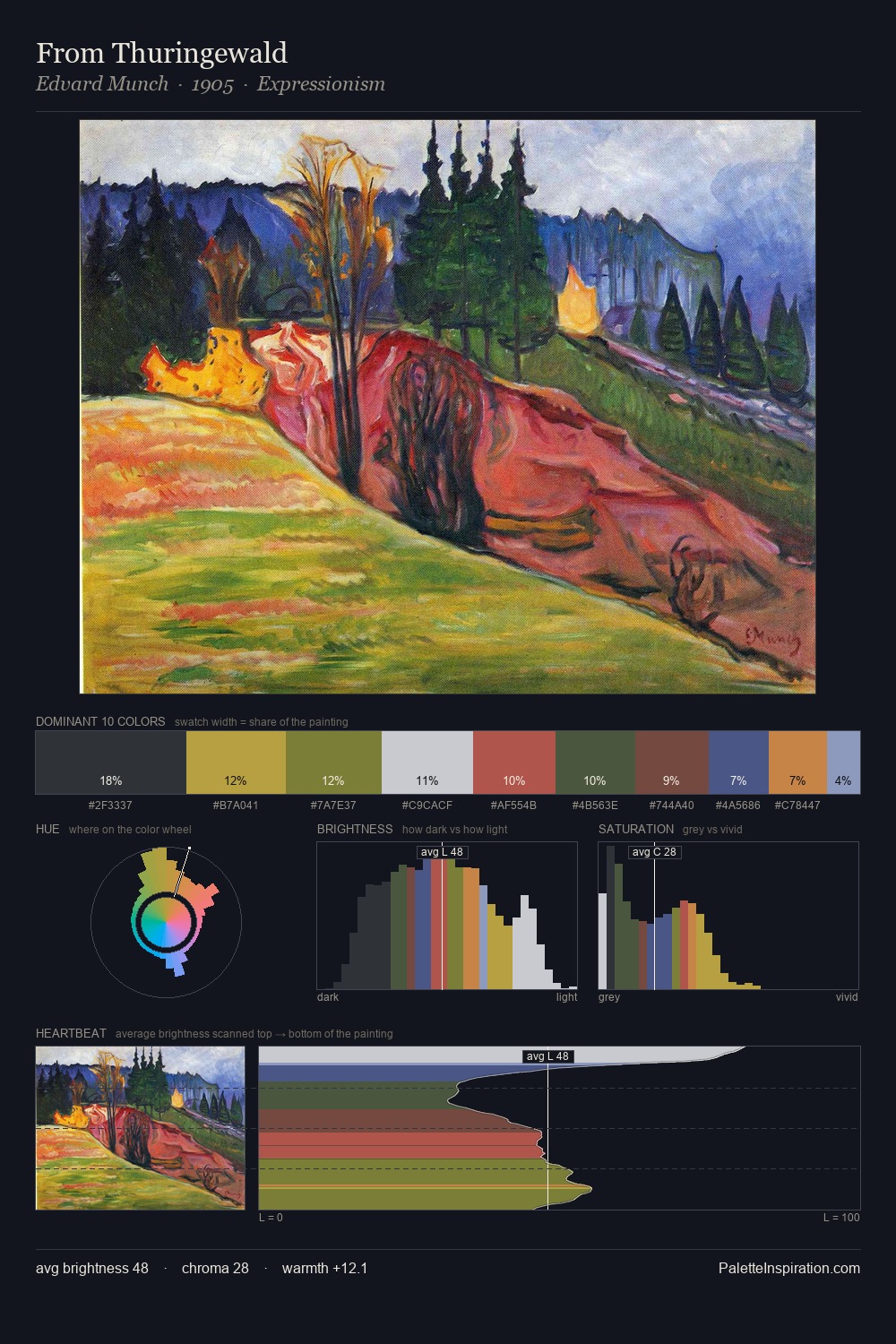
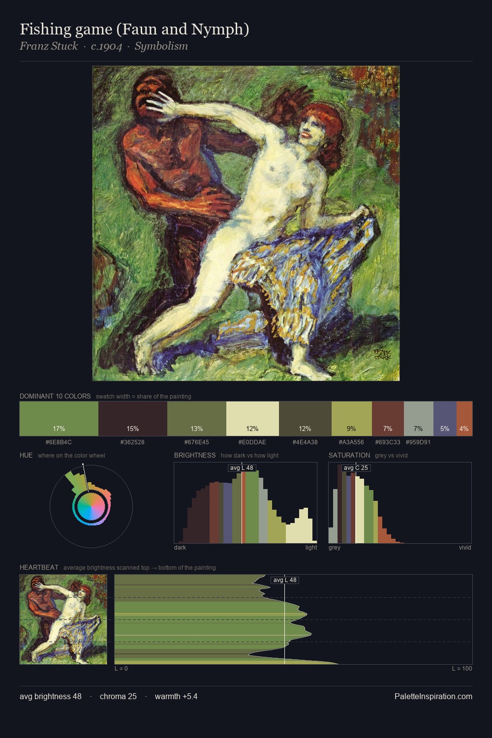
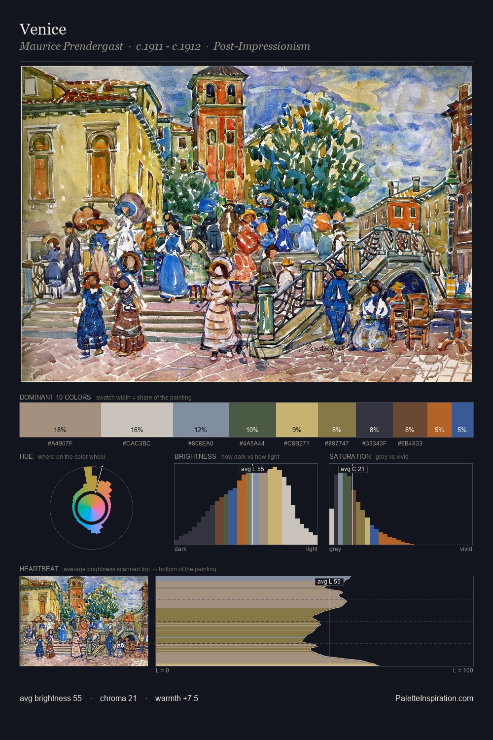
The value structure of Hans Hartung is mid-key: quiet, controlled, and cohesive. A distinctly cool atmosphere runs through this palette: sky, water, and mist given colour form. Muted throughout, the palette achieves its effects through value and temperature rather than chromatic force. At 10.0%, #3E3F78 carries the palette's sharpest chromatic charge: an accent that earns its place precisely because it is withheld. Value range is moderate at 47 units - enough contrast for legibility, not so much as to fragment the tonal unity. The mid-to-high key, cool bias, and moderate chroma point to outdoor observation - sky and diffused daylight as the dominant light source. The palette is a signature: Hans Hartung's particular sense of value, warmth, and colour weight made legible.
Example use cases
- boutique hospitality
- film production
- menswear
- art prints & posters
- heritage brands
I Love This!
Copy, export, or download for your project