Hans Hartung Palette 1

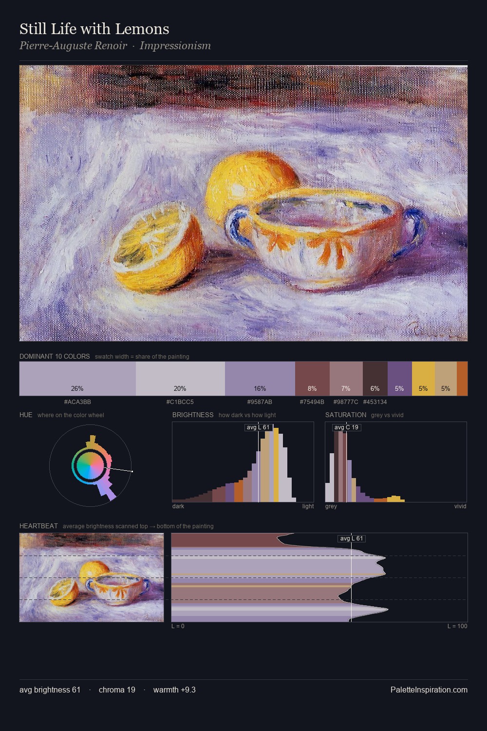
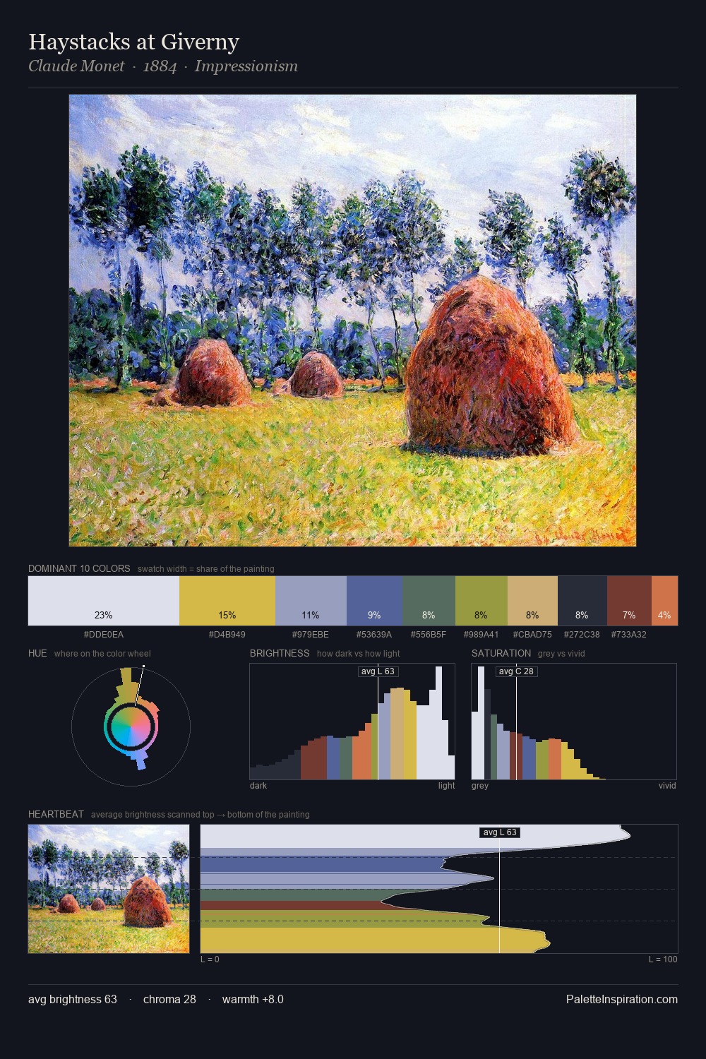
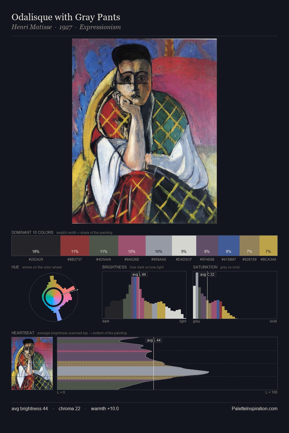
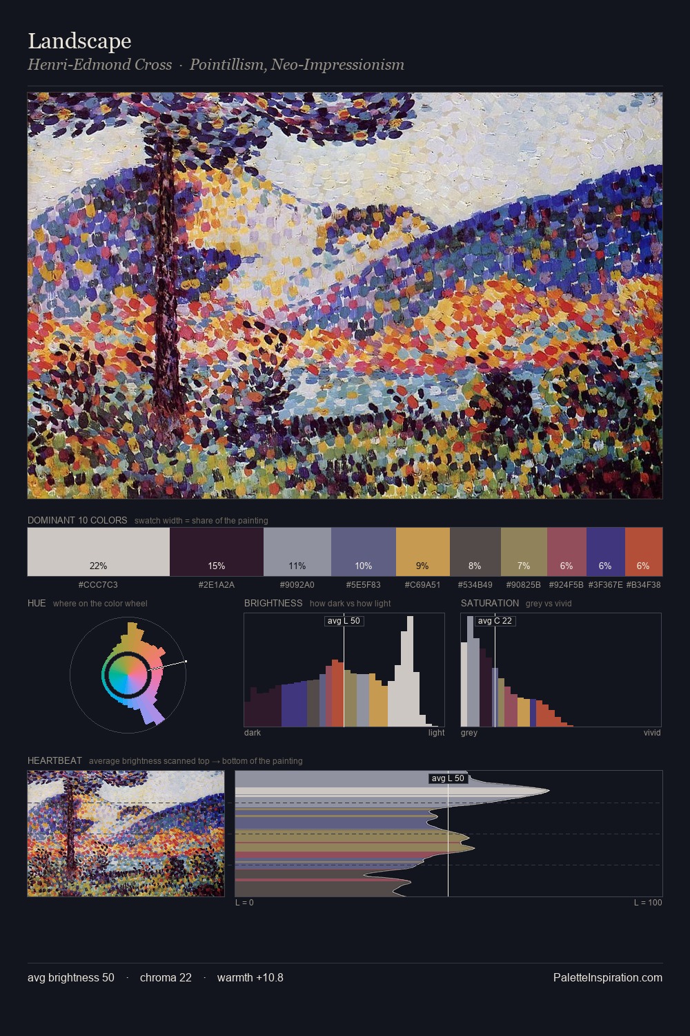
Palette Analysis
Hans Hartung occupies the comfortable middle of the value scale, avoiding both extremes to hold the eye in a sustained middle grey. The dominant temperature is warm, with earth tones and fire-hues setting the emotional key. Chroma is kept low across all colours, producing the soft, enveloping quality that characterises tonal painting. At 28.1%, #D7CFD5 functions less as a colour accent and more as a complete atmospheric environment. The highest-chroma note - #D8AE3F - appears at just 3.5%, deployed as a precision accent against the quieter ground. A value spread of 58 units gives the palette both depth and air - shadows are genuinely dark, lights genuinely light. Palette 1 sits within the larger chromatic argument that Hans Hartung's complete body of work advances.
Example use cases
- archival print
- university identity
- rare books
- cultural institutions
- nonprofit identity
I Love This!
Copy, export, or download for your project