Hans Andersen Brendekilde Palette 2

Palette Analysis
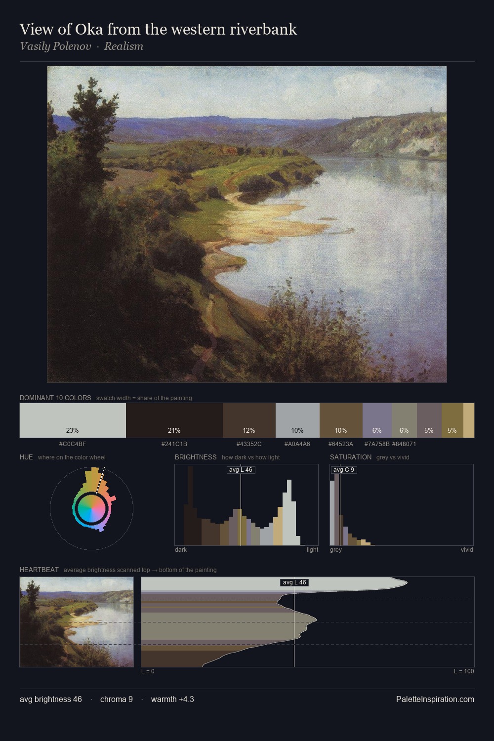
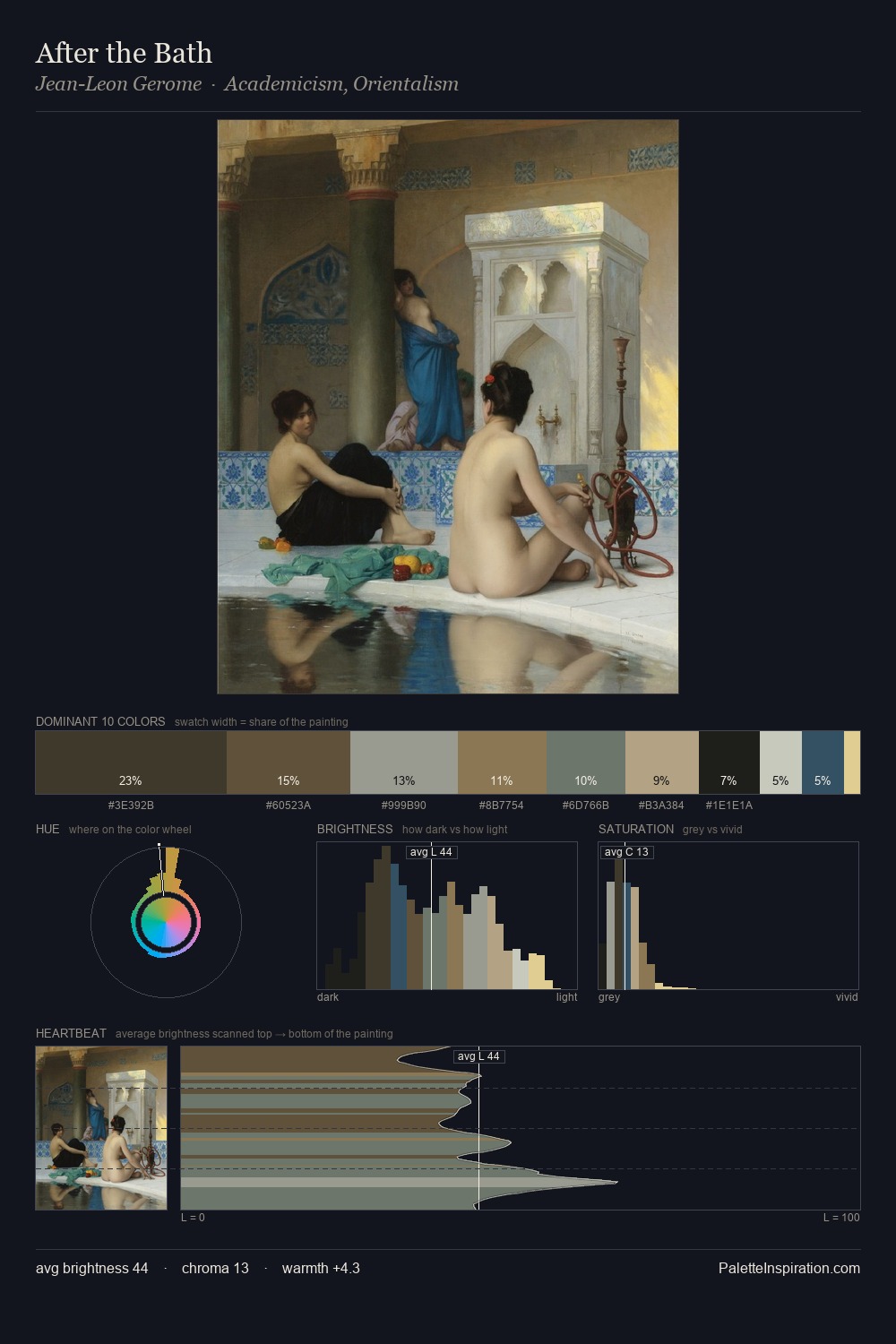
The high-key values of Hans Andersen Brendekilde give it an effulgent, almost bleached quality. Hans Andersen Brendekilde builds on cool foundations: the palette favours the blue-cyan-green arc. Every colour is desaturated; the palette proceeds through near-neutrals and gently-coloured greys. At 29.9%, #D8DCD7 functions less as a colour accent and more as a complete atmospheric environment. The highest-chroma note - #7F794E - appears at just 8.0%, deployed as a precision accent against the quieter ground. From deepest dark to palest light, the palette traverses 66 units of the value scale - a span that creates natural depth. The mid-to-high key, cool bias, and moderate chroma point to outdoor observation - sky and diffused daylight as the dominant light source. Hans Andersen Brendekilde's palette 2 carries its own internal logic while remaining in conversation with the artist's broader colour intelligence.
Example use cases
- exhibition design
- foundation branding
- estate management
- art education
- museums & galleries
I Love This!
Copy, export, or download for your project
Related Palettes

Hans Andersen Brendekilde Palette 1
Soft Sage

Hans Andersen Brendekilde Palette 3
Muted Parchment

Hans Andersen Brendekilde Palette 4
Veiled Caramel

Hans Andersen Brendekilde Palette 5
Veiled Parchment

Hans Andersen Brendekilde Palette 6
Penumbral Tawny

Hans Andersen Brendekilde Palette 7
Veiled Tawny