Hannah Hoch Master Palette

Palette Analysis
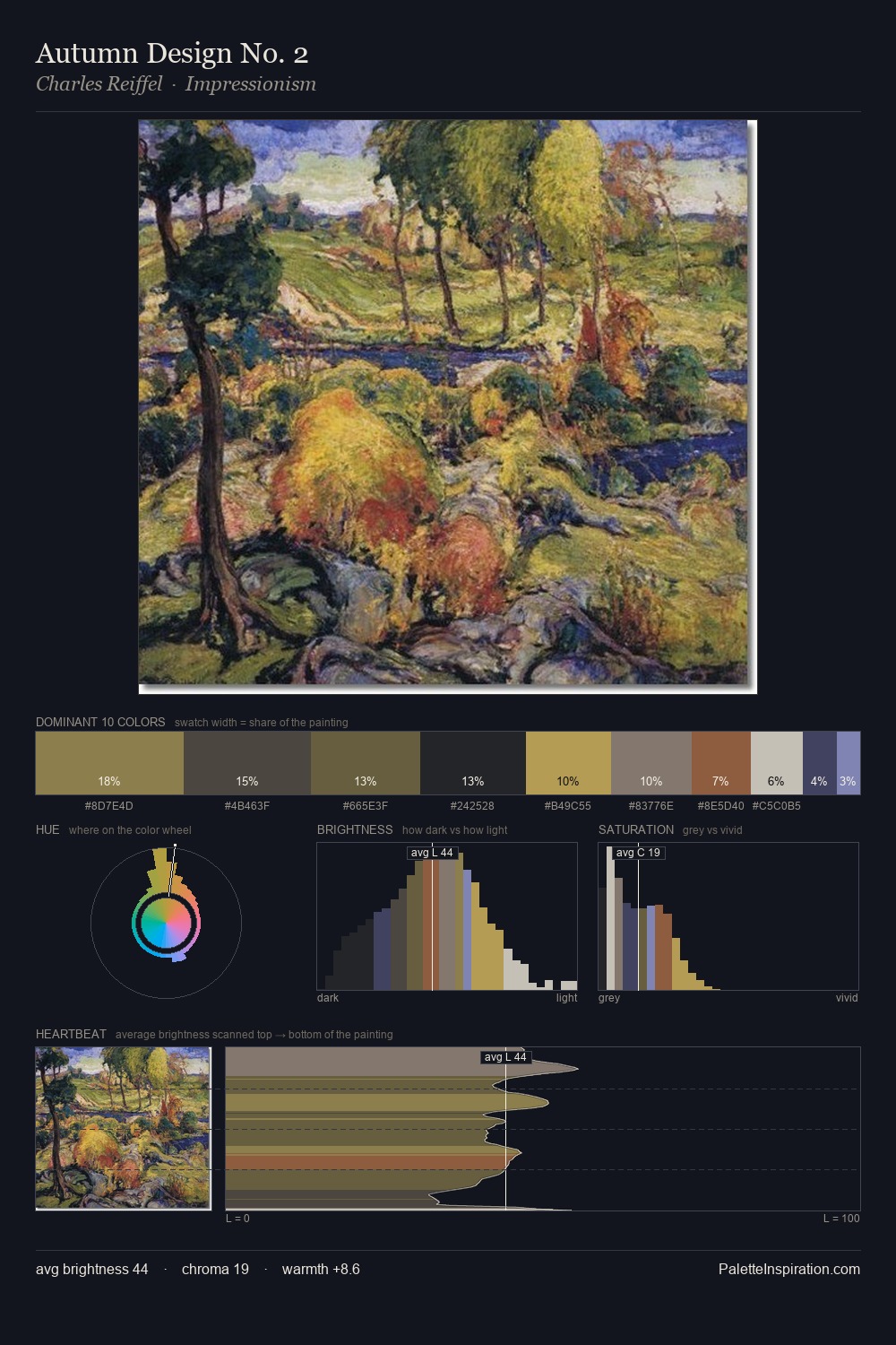
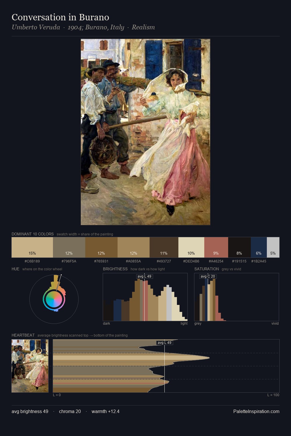
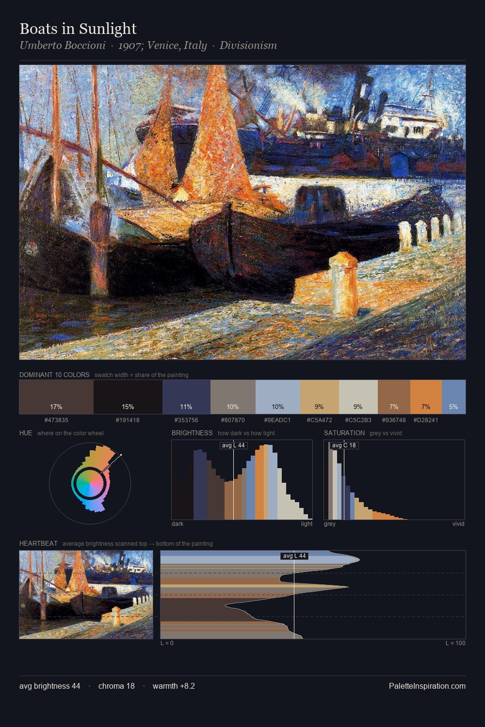
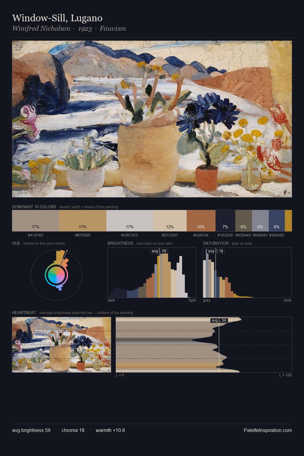
Hannah Hoch occupies the comfortable middle of the value scale, avoiding both extremes to hold the eye in a sustained middle grey. Temperature reads distinctly warm: the reds and earth tones from Hannah Hoch carry the compositional weight. Chroma is kept low across all colours, producing the soft, enveloping quality that characterises tonal painting. Hannah Hoch gives 25.0% of the composition to a single #605C5B - a decisive chromatic anchor. The highest-chroma note - #CDB372 - appears at just 5.0%, deployed as a precision accent against the quieter ground. The value range spans 71 units across the palette, providing the full gamut from deep shadow to near-white and ensuring clear tonal hierarchy. The palette is recognisably Hannah Hoch's own: particular in its temperature, chroma, and the economy of its brightest note.
Example use cases
- exhibition design
- foundation branding
- estate management
- art education
- museums & galleries
I Love This!
Copy, export, or download for your project