Hanna Hirsch-Pauli Palette 1

Palette Analysis
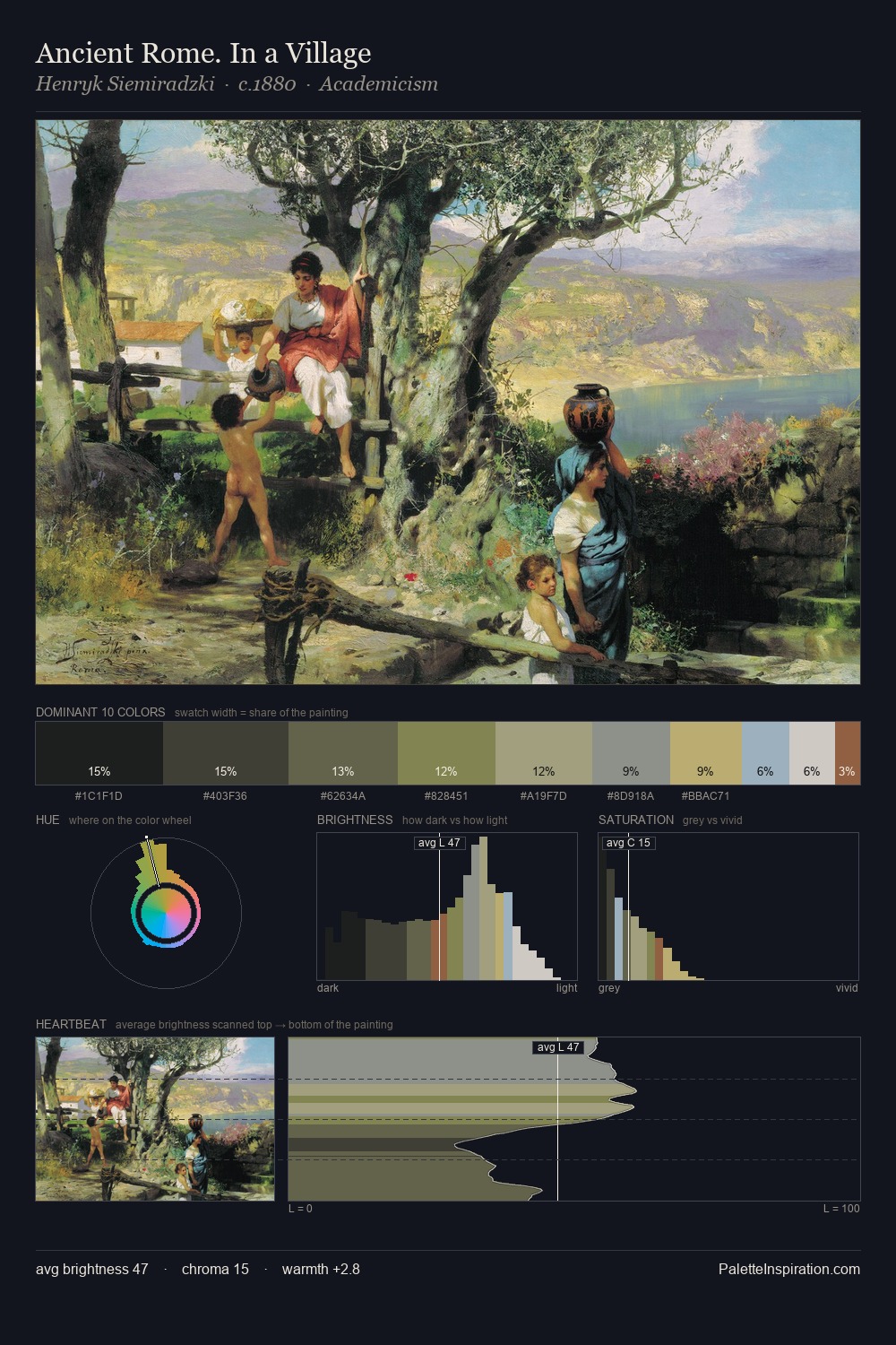
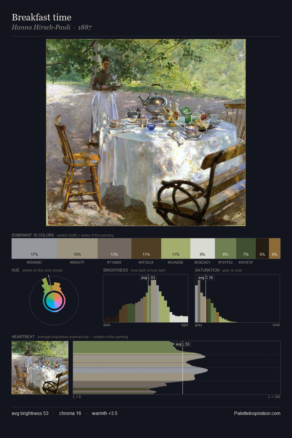
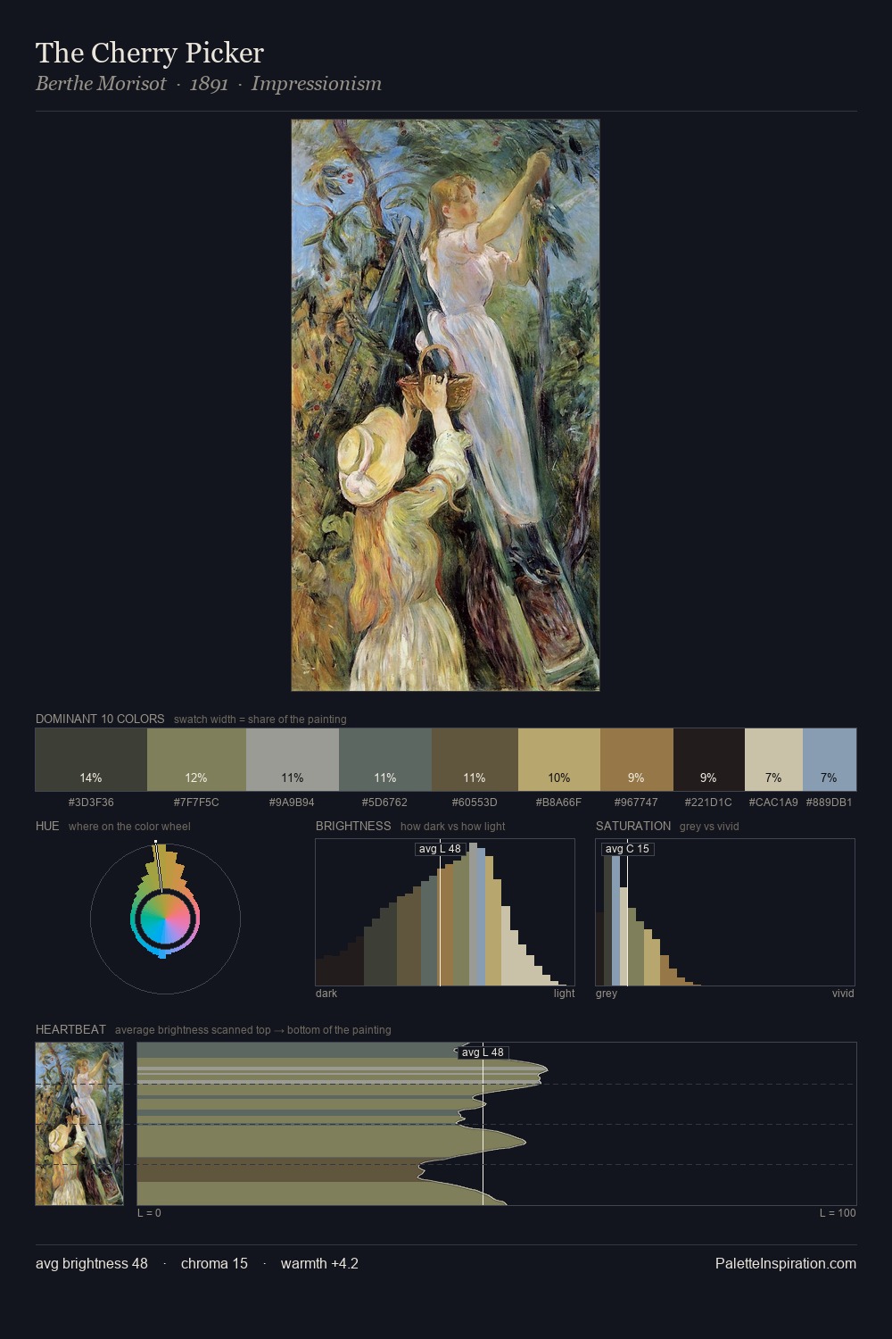
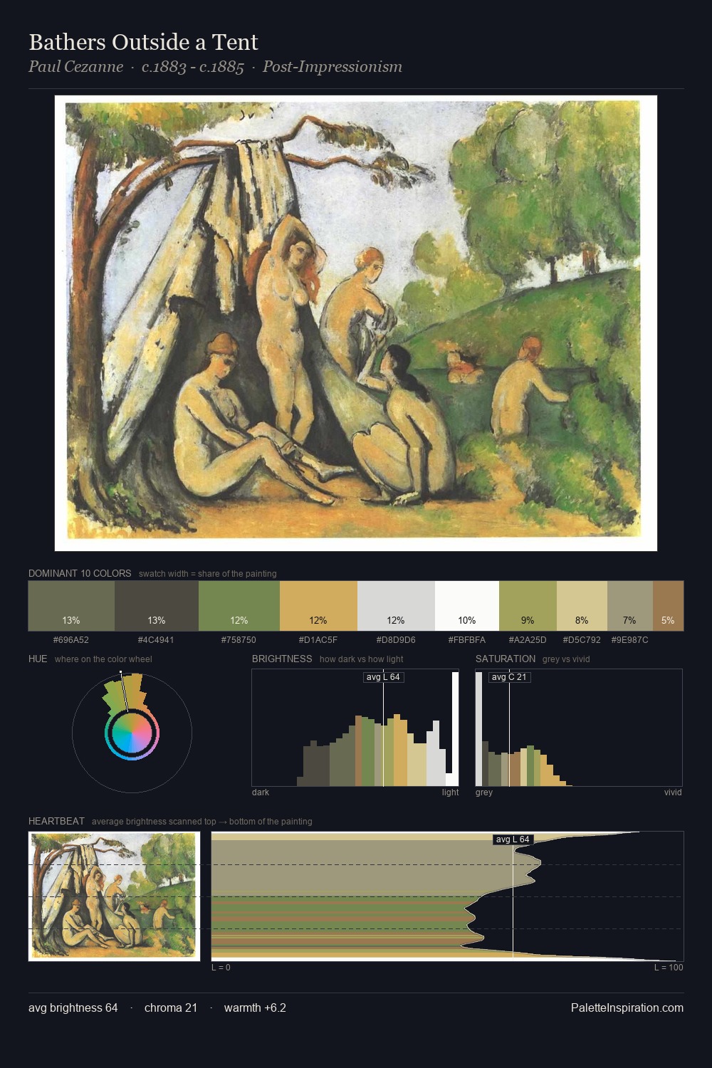
Mid-key values give Hanna Hirsch-Pauli its characteristic quietness - nothing blazes, nothing disappears. Cool tones set the register here - the blues and greens easily outweigh any warm accents. The absence of saturated colour is itself an expressive choice: this is a palette of restraint and atmosphere. The highest-chroma note - #9A713C - appears at just 4.4%, deployed as a precision accent against the quieter ground. 52 units of value spread create a palette that is varied but unified - contrast in the service of harmony. The mid-to-high key, cool bias, and moderate chroma point to outdoor observation - sky and diffused daylight as the dominant light source. In the context of Hanna Hirsch-Pauli's full range of palettes, group 1 represents one movement in an ongoing chromatic dialogue.
Example use cases
- exhibition design
- foundation branding
- estate management
- art education
- museums & galleries
I Love This!
Copy, export, or download for your project