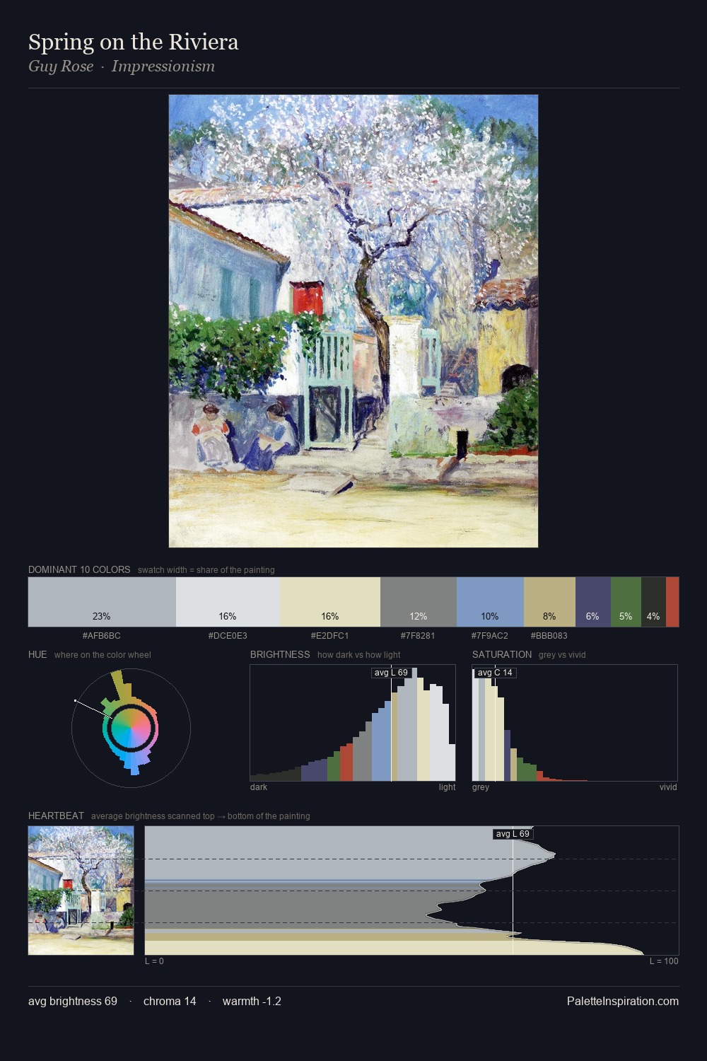
Guy Rose Palette 2
Pearlescent Alabaster
Pearlescent Iridescent light quality - high-key with subtle hue variation, like mother-of-pearl.
Alabaster Warm off-white - creamy stone white, luminous and slightly translucent.

Palette Analysis
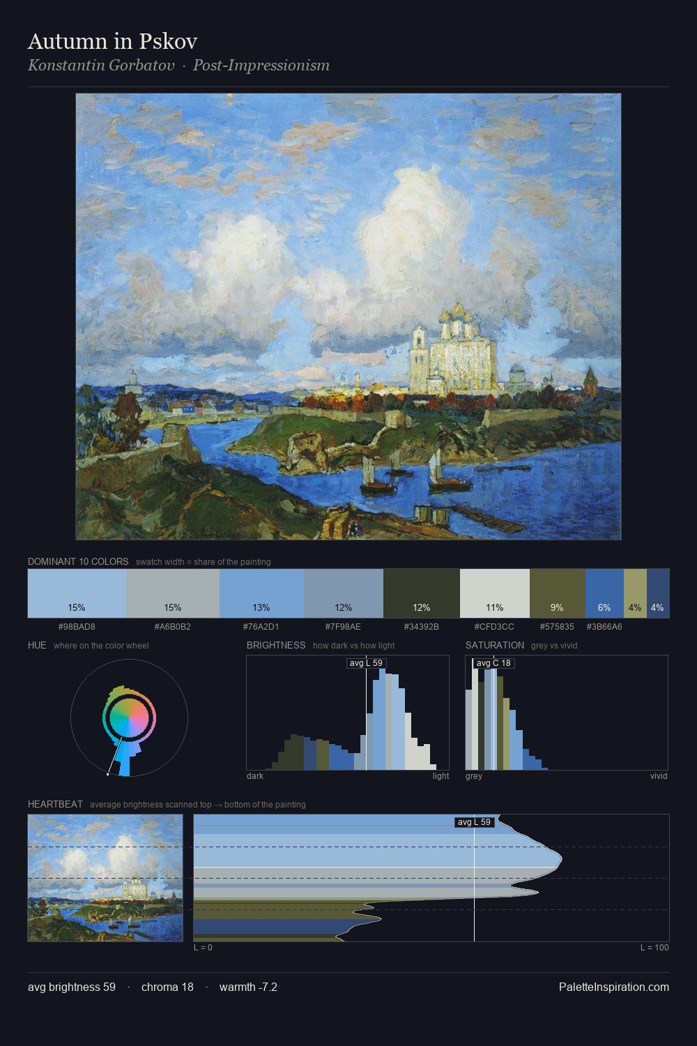
Guy Rose is high-key - luminous, open, and weighted toward light. Temperature is cool-dominant, with blue and green families claiming the largest areas. Saturation is deliberately withheld - the beauty here lies in the near-monochromatic gradations rather than colour difference. The saturated accent, #B9AD78, registers at 7.2% - sparse enough to feel like a deliberate surprise. At 60 units of value range, the palette has the tonal breadth to sustain complex spatial readings. The palette has the character of outdoor light: cool, mid-bright, with colour rendered faithfully rather than expressively. This is palette 2 of Guy Rose's sequence - a single chapter in a chromatic story told across many works.
Example use cases
- design agencies
- product brands
- e-commerce
- editorial sites
- publishing
I Love This!
Use This Palette
Copy, export, or download for your project
Copy, export, or download for your project
Copy:
Download:
Share: