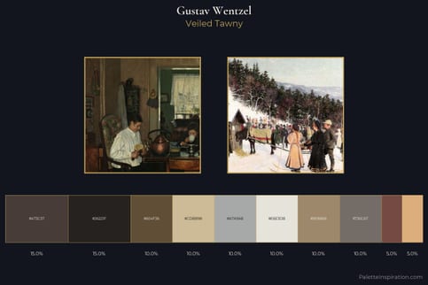
Gustav Wentzel Palette 1
Palette Analysis
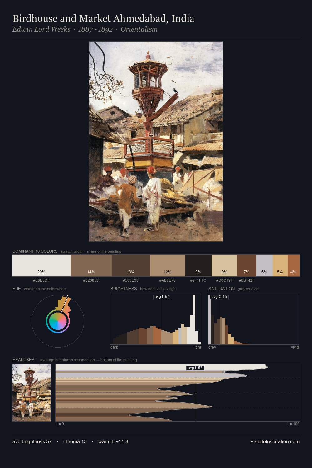
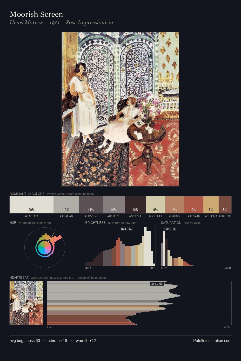
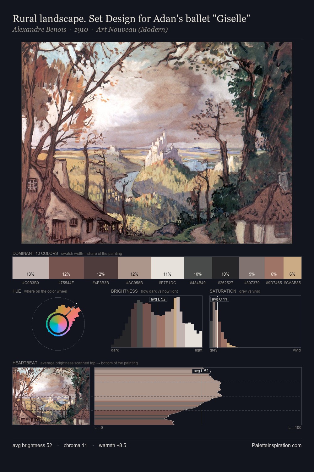
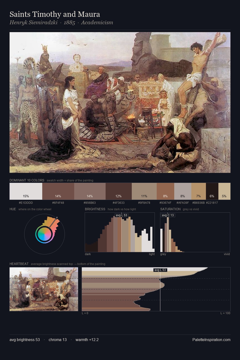
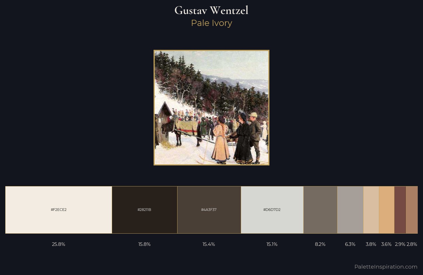
Gustav Wentzel is high in key: pale, luminous, and filled with optical air. Warmth dominates - the palette of Gustav Wentzel leans heavily on the yellow-orange-red arc of the colour wheel. Chroma hovers near zero; colour declares itself through subtle shifts in hue rather than outright saturation. Gustav Wentzel gives 25.9% of the composition to a single #F2ECE2 - a decisive chromatic anchor. The saturated accent, #A97E63, registers at 2.8% - sparse enough to feel like a deliberate surprise. The value range spans 70 units across the palette, providing the full gamut from deep shadow to near-white and ensuring clear tonal hierarchy. Gustav Wentzel's palette 1 carries its own internal logic while remaining in conversation with the artist's broader colour intelligence.
Example use cases
- ceramics & pottery
- boutique hospitality
- menswear
- heritage food brands
- craft & artisan brands
I Love This!
Copy, export, or download for your project