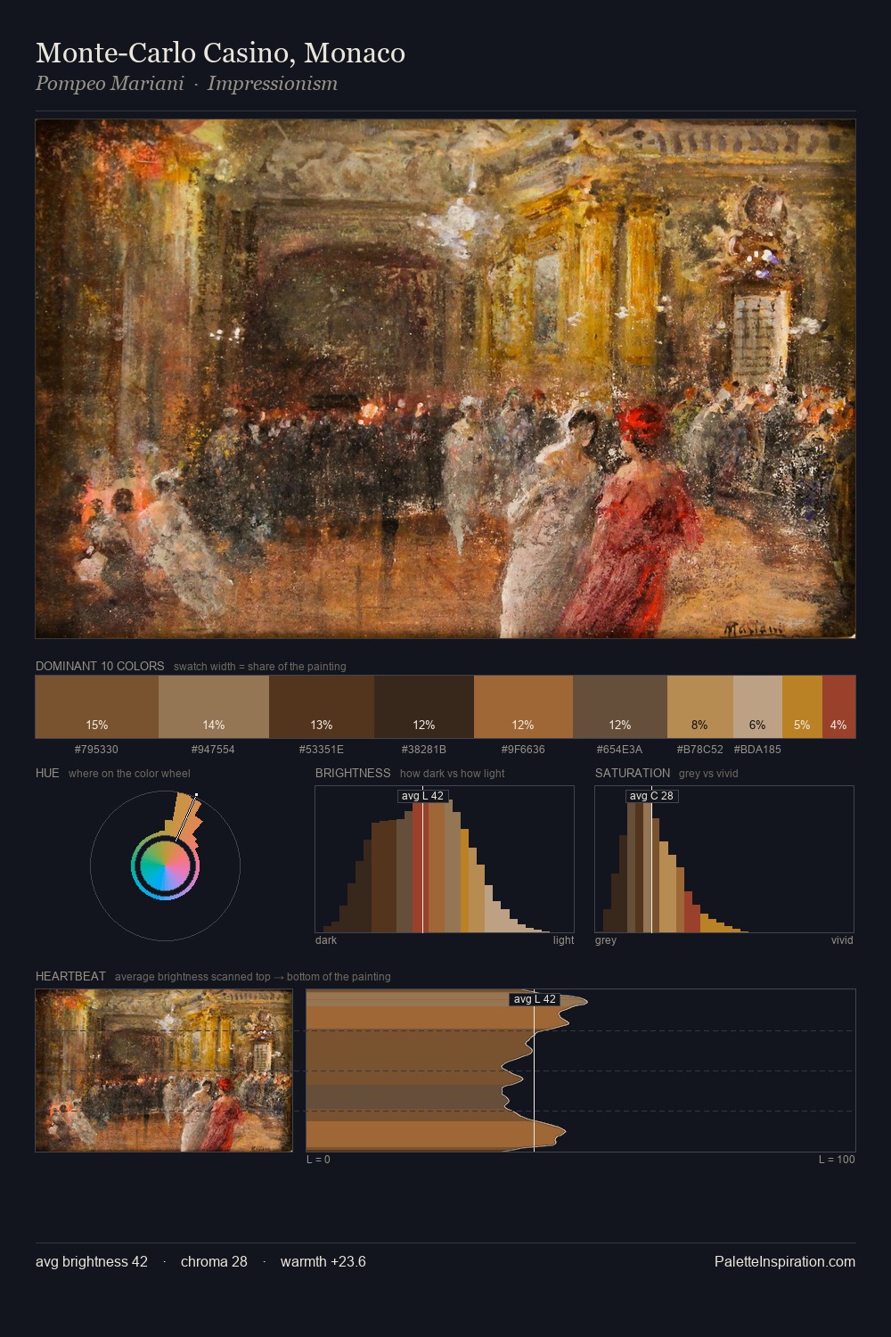
Gustav Pope Palette 5
Muted Caramel
Muted Deliberately desaturated - chroma pulled toward gray, the restraint of tonal painting.
Caramel Warm mid-brown - the color of cooked sugar, smooth and amber-toned.

Palette Analysis
The value structure of Gustav Pope is mid-key: quiet, controlled, and cohesive. Temperature reads distinctly warm: the reds and earth tones from Gustav Pope carry the compositional weight. Chroma is held at a comfortable level - distinct colours, but no single hue is allowed to overwhelm. The saturated accent, #5A2D19, registers at 7.1% - sparse enough to feel like a deliberate surprise. The value range of 47 units sits in the comfortable middle: enough depth, enough light, neither extreme. This is palette 5 of Gustav Pope's sequence - a single chapter in a chromatic story told across many works.
Example use cases
- theater design
- jewelry brands
- tobacco-adjacent retail
- event branding
- film & entertainment
I Love This!
Use This Palette
Copy, export, or download for your project
Copy, export, or download for your project
Copy:
Download:
Share: