Gustav Klimt Palette 1

Palette Analysis
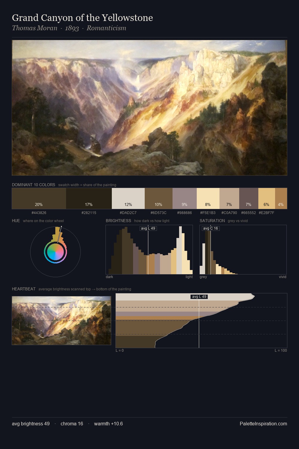
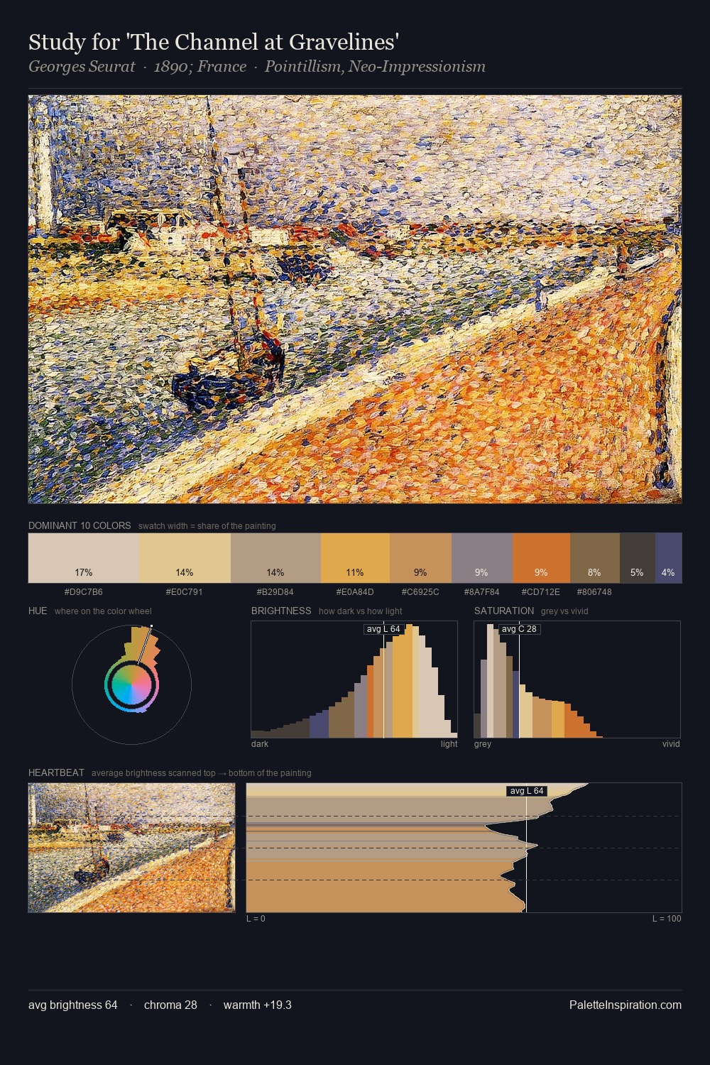
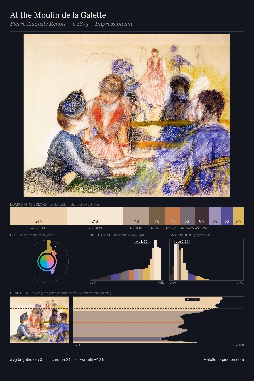
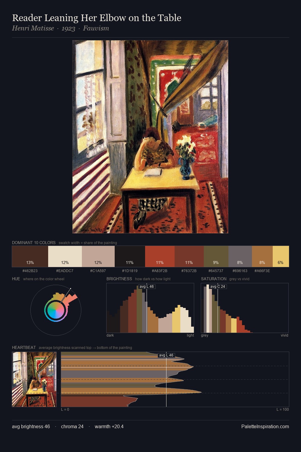
Light floods Gustav Klimt; the palette keeps values pale and airy across its range. Gustav Klimt tilts toward cool - blues and silver-greys carry the structural weight. The absence of saturated colour is itself an expressive choice: this is a palette of restraint and atmosphere. Only 4.7% is devoted to #C17B4C, yet that small allocation delivers the palette's entire chromatic tension. The value range spans 59 units across the palette, providing the full gamut from deep shadow to near-white and ensuring clear tonal hierarchy. The mid-to-high key, cool bias, and moderate chroma point to outdoor observation - sky and diffused daylight as the dominant light source. This is palette 1 of Gustav Klimt's sequence - a single chapter in a chromatic story told across many works.
Example use cases
- ceramics & pottery
- boutique hospitality
- menswear
- heritage food brands
- craft & artisan brands
I Love This!
Copy, export, or download for your project