Gustav Bauernfeind Palette 1

Palette Analysis
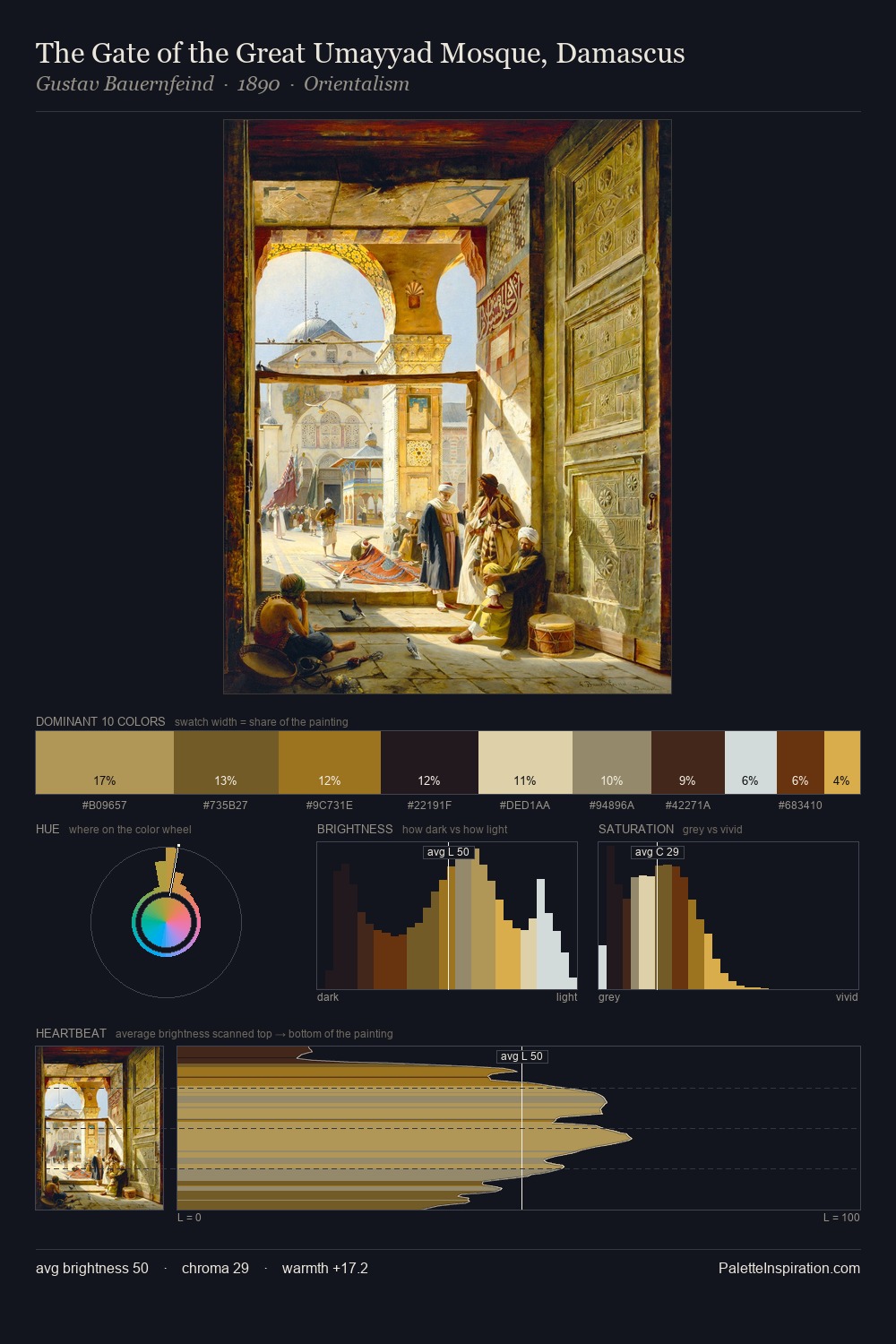
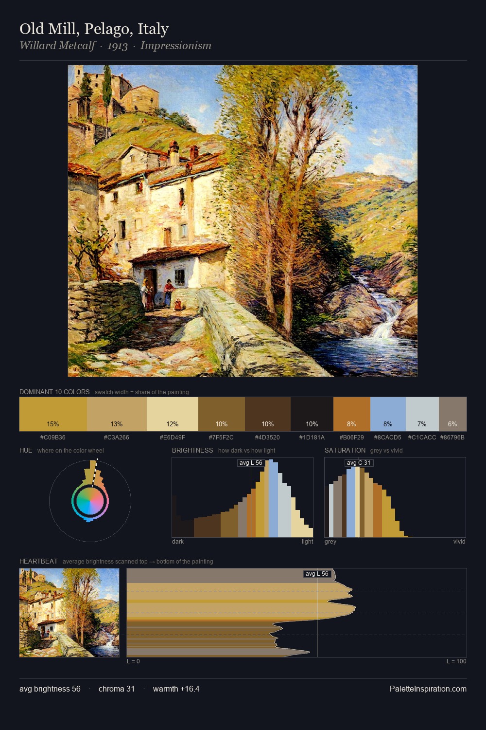
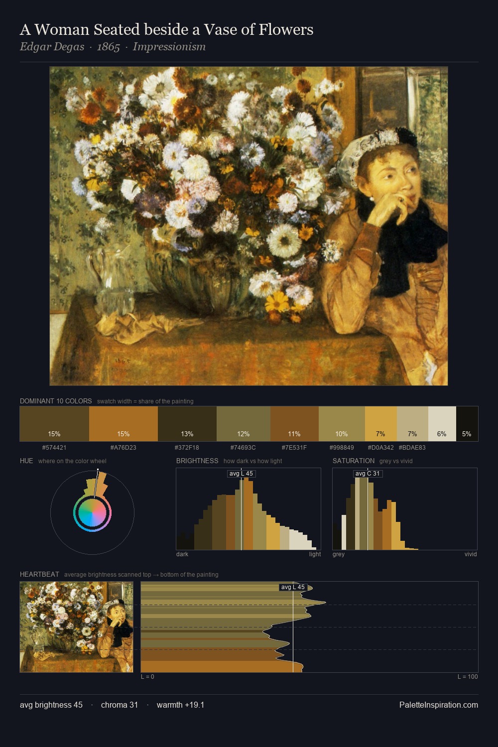
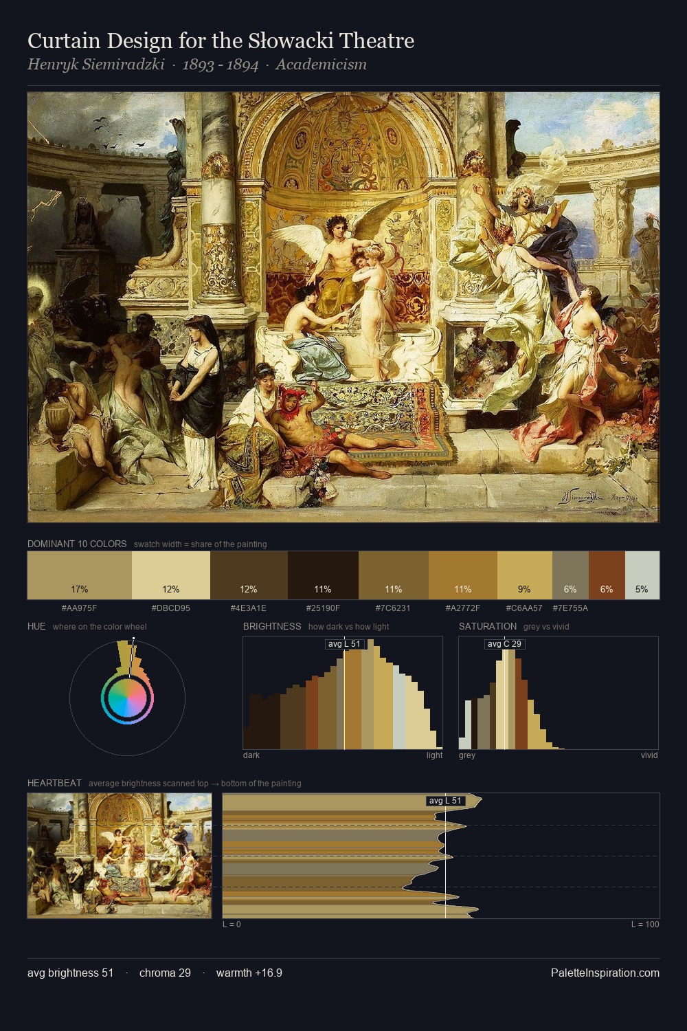
The value structure of Gustav Bauernfeind is mid-key: quiet, controlled, and cohesive. Cool tones set the register here - the blues and greens easily outweigh any warm accents. Chroma is moderate: colours carry enough saturation to be read as colour, but the palette stops well short of garish intensity. The highest-chroma note - #E0B655 - appears at just 5.1%, deployed as a precision accent against the quieter ground. At 65 units of value range, the palette has the tonal breadth to sustain complex spatial readings. High luminosity and cool temperature suggest the plein-air condition: unfiltered daylight and open sky. Gustav Bauernfeind's palette 1 carries its own internal logic while remaining in conversation with the artist's broader colour intelligence.
Example use cases
- ceramics & pottery
- boutique hospitality
- menswear
- heritage food brands
- craft & artisan brands
I Love This!
Copy, export, or download for your project