Gustaf Wilhelm Palm Palette 1
Veiled Tawny
Veiled Partially obscured light - mid-dark with a hazy, scrim-filtered quality.
Tawny Warm orange-brown - a traditional term for the color of tanned leather or lion fur.

Palette Analysis
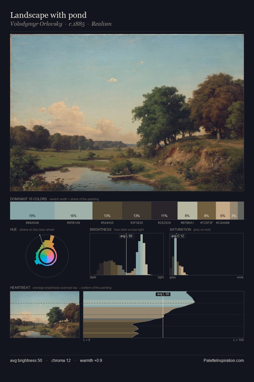
The value structure of Gustaf Wilhelm Palm is mid-key: quiet, controlled, and cohesive. Warm and cool are kept in productive tension, creating the kind of chromatic harmony that sustains the eye. Saturation is deliberately withheld - the beauty here lies in the near-monochromatic gradations rather than colour difference. Only 10.5% is devoted to #5D482F, yet that small allocation delivers the palette's entire chromatic tension. The value range of 44 units sits in the comfortable middle: enough depth, enough light, neither extreme. Palette 1 sits within the larger chromatic argument that Gustaf Wilhelm Palm's complete body of work advances.
Example use cases
- archival print
- university identity
- rare books
- cultural institutions
- nonprofit identity
I Love This!
Use This Palette
Copy, export, or download for your project
Copy, export, or download for your project
Copy:
Download:
Share: