Gunnar Berndtson Master Palette

Palette Analysis
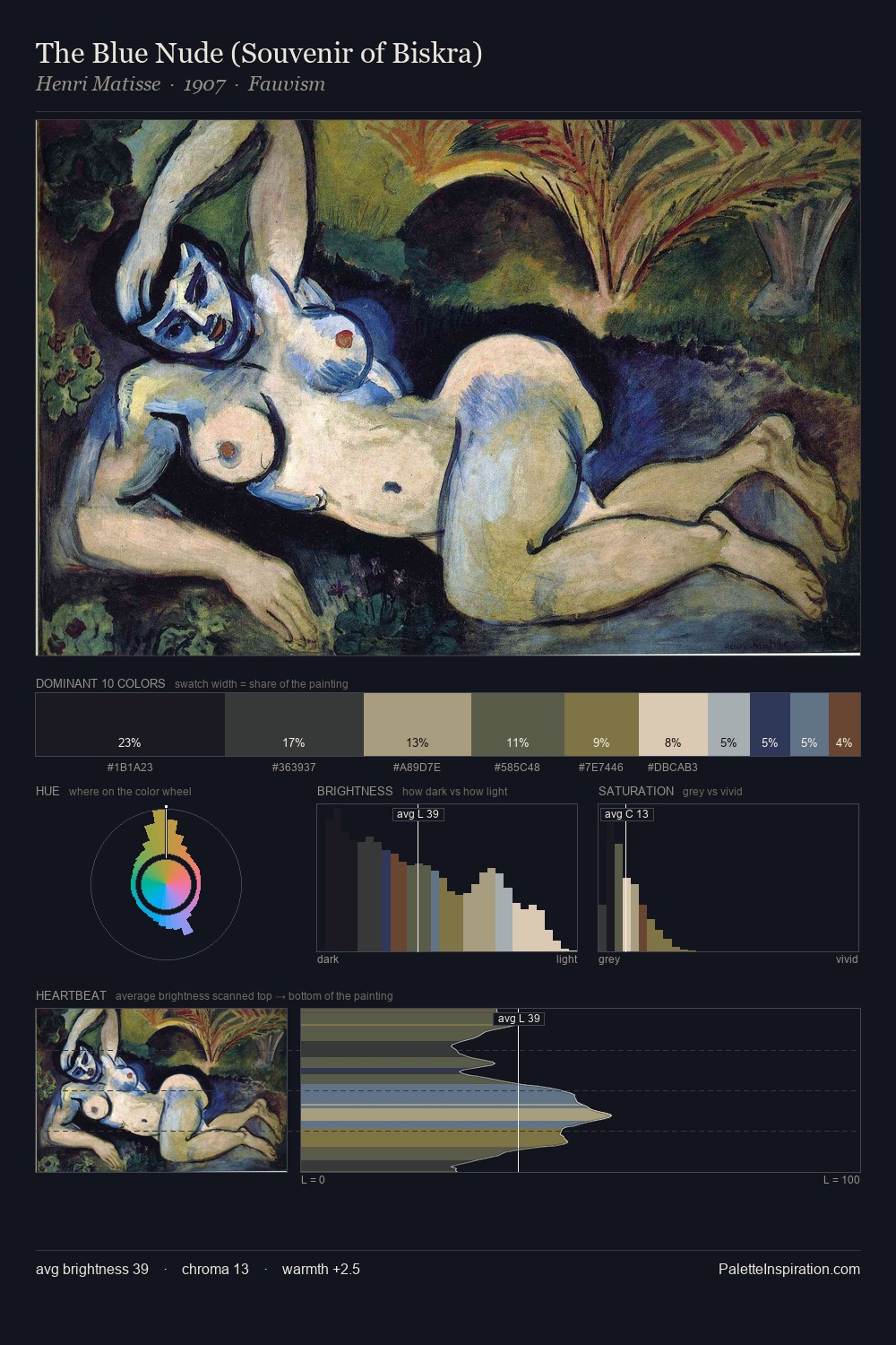
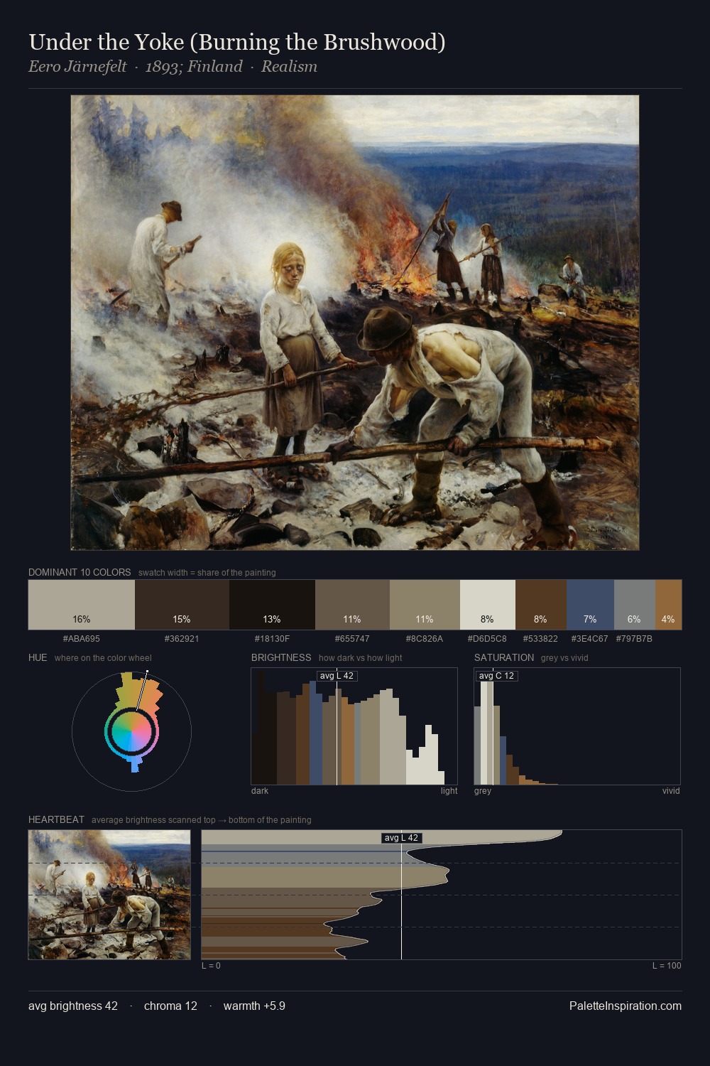
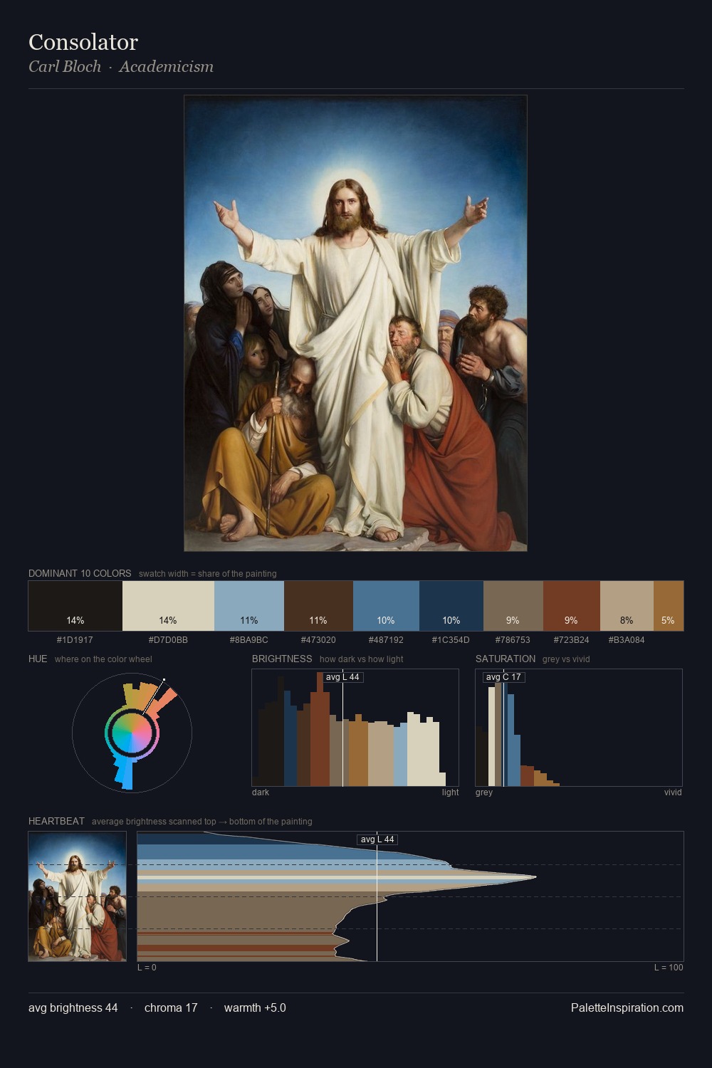
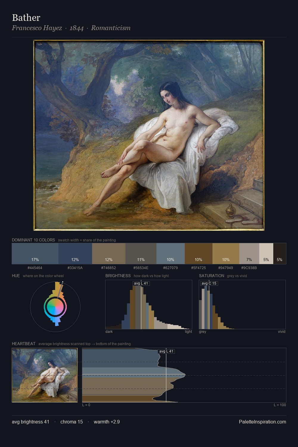
Gunnar Berndtson sits in the centre of the value range, lending the palette a sense of even, sustained light. Cool tones set the register here - the blues and greens easily outweigh any warm accents. Saturation is deliberately withheld - the beauty here lies in the near-monochromatic gradations rather than colour difference. #91723A delivers the chromatic peak at only 5.0% - a small shot of colour with outsized visual impact. At 60 units of value range, the palette has the tonal breadth to sustain complex spatial readings. The palette has the character of outdoor light: cool, mid-bright, with colour rendered faithfully rather than expressively. Gunnar Berndtson arrived at this balance through long practice; the palette carries the weight of that experience.
Example use cases
- theater design
- jewelry brands
- tobacco-adjacent retail
- event branding
- film & entertainment
I Love This!
Copy, export, or download for your project