Guido Reni Palette 4
Muted Parchment
Muted Deliberately desaturated - chroma pulled toward gray, the restraint of tonal painting.
Parchment Aged warm neutral - the color of old manuscript parchment, tan and slightly yellowed.

Palette Analysis
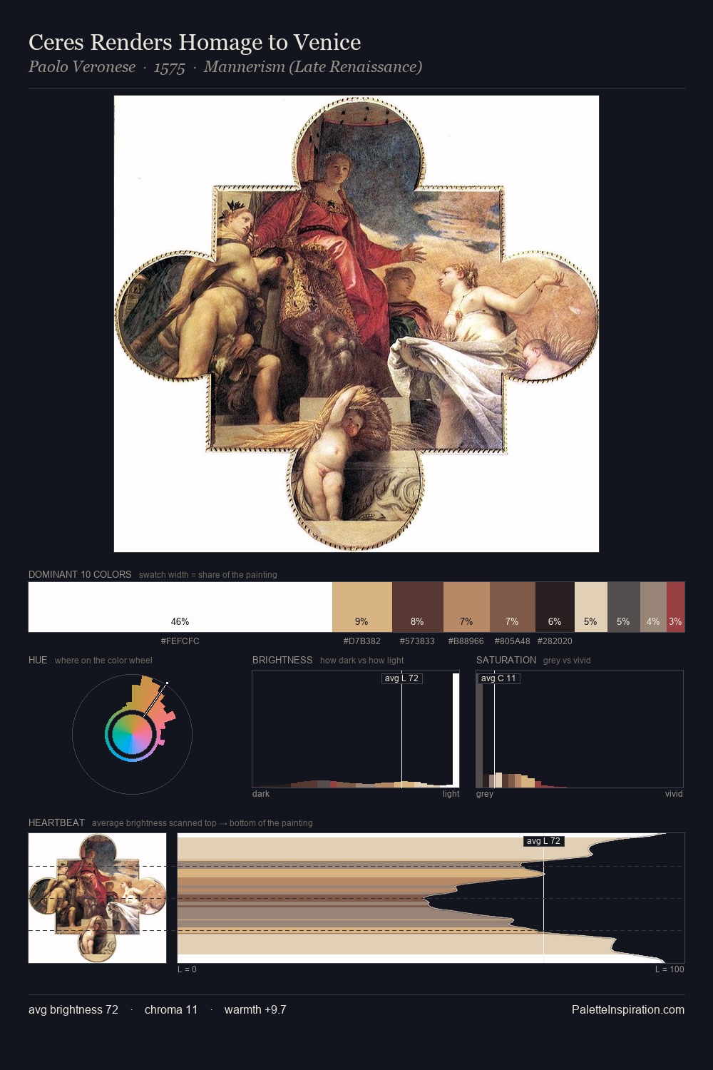
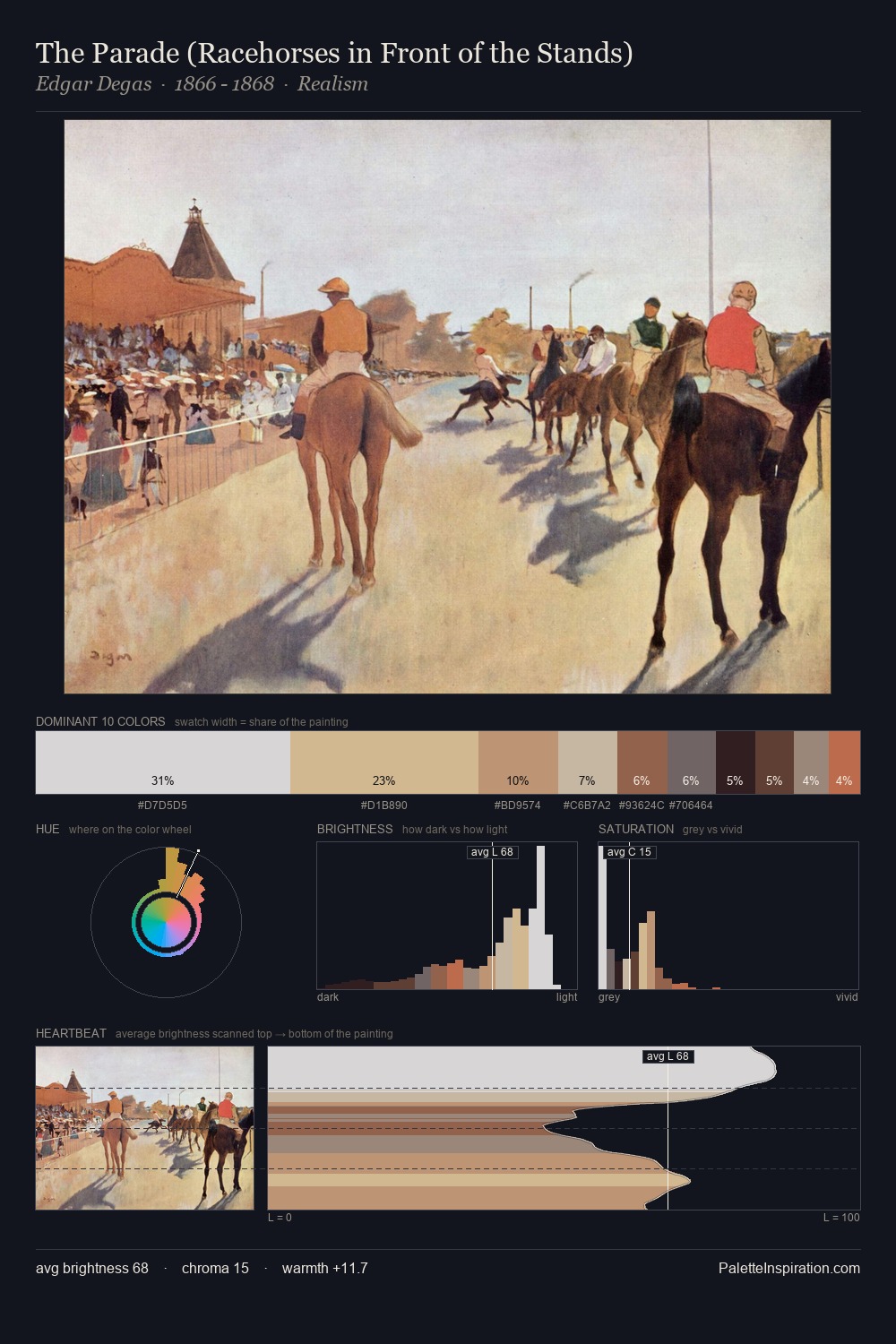
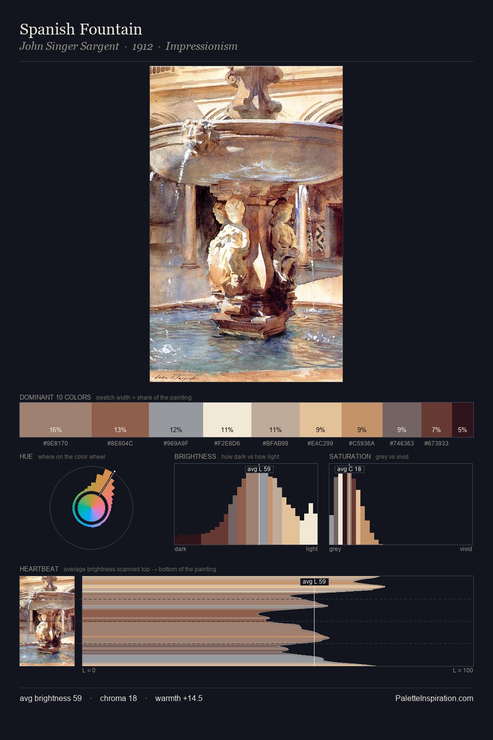
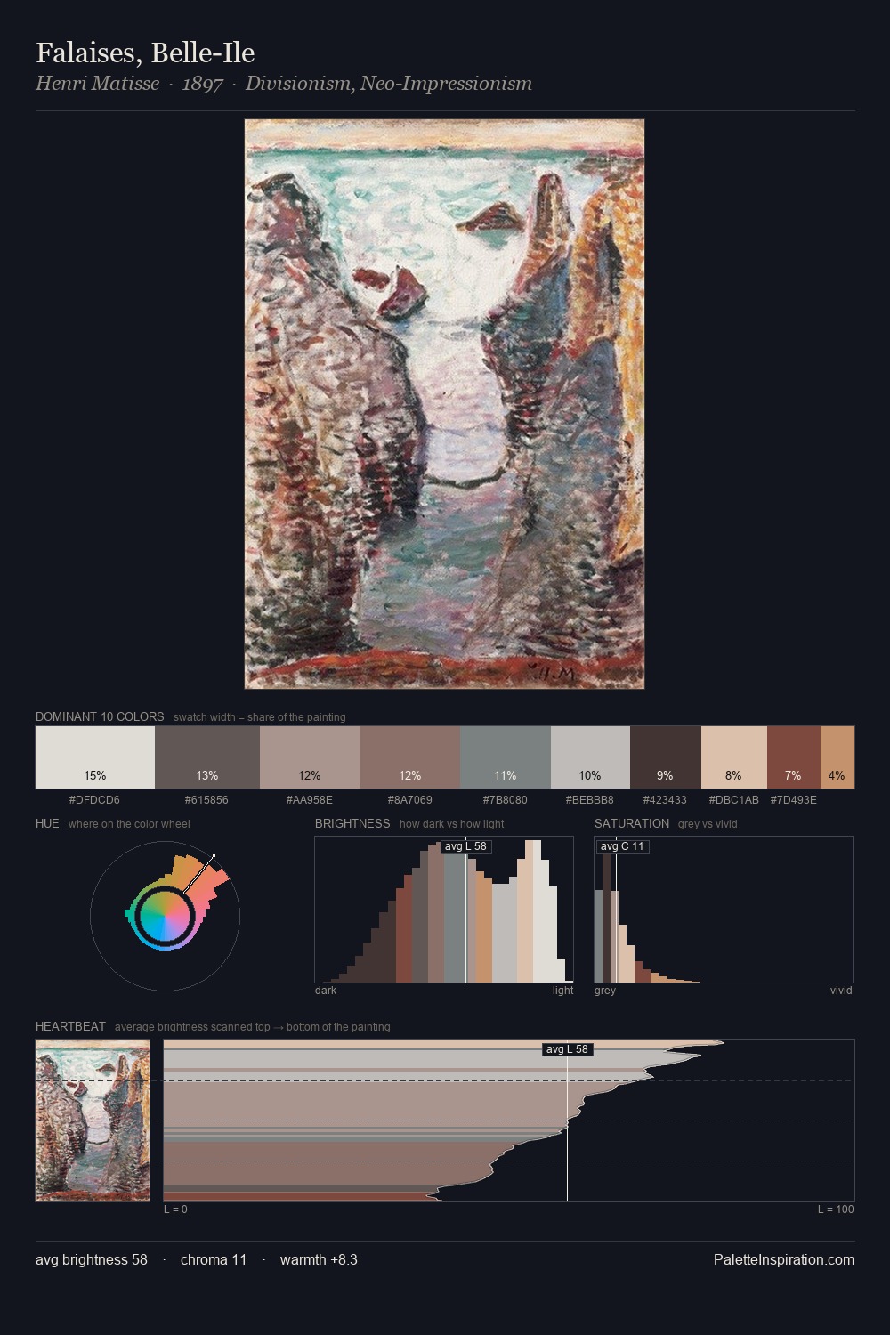
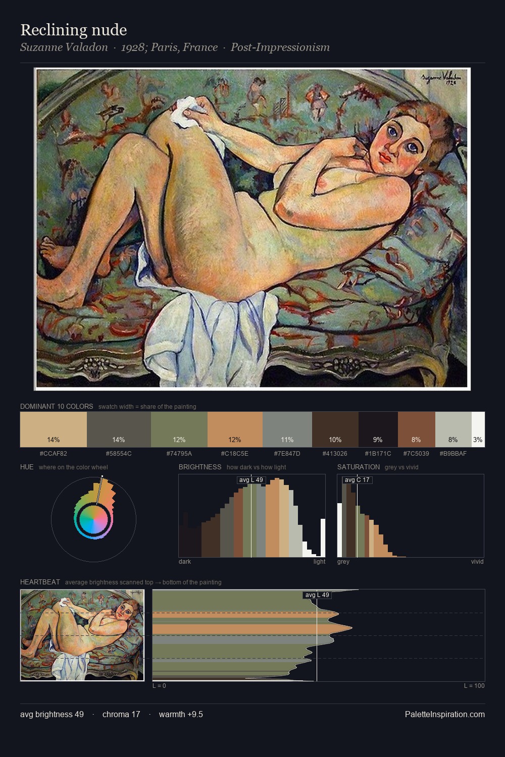
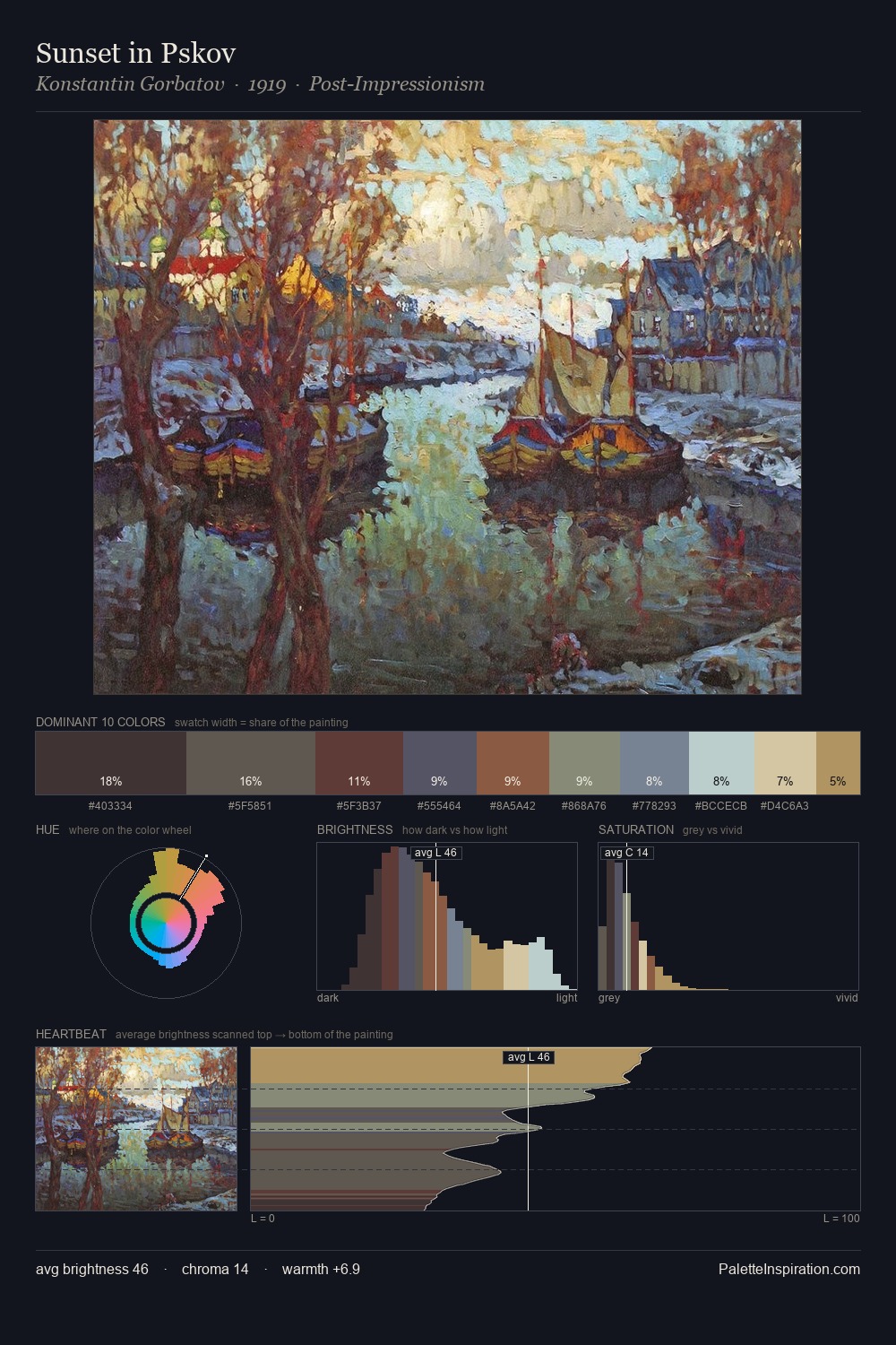
Mid-key values give Guido Reni its characteristic quietness - nothing blazes, nothing disappears. Warm hues command this palette; Guido Reni favours the reds, oranges, and yellows of firelight and earth. Every colour is desaturated; the palette proceeds through near-neutrals and gently-coloured greys. #E3C69B functions as the palette's exclamation mark: highest chroma, lowest percentage (5.8%). 69 units of value range underpin the palette's structural clarity: the eye always knows where light falls. This is palette 4 of Guido Reni's sequence - a single chapter in a chromatic story told across many works.
Example use cases
- exhibition design
- foundation branding
- estate management
- art education
- museums & galleries
I Love This!
Use This Palette
Copy, export, or download for your project
Copy, export, or download for your project
Copy:
Download:
Share: