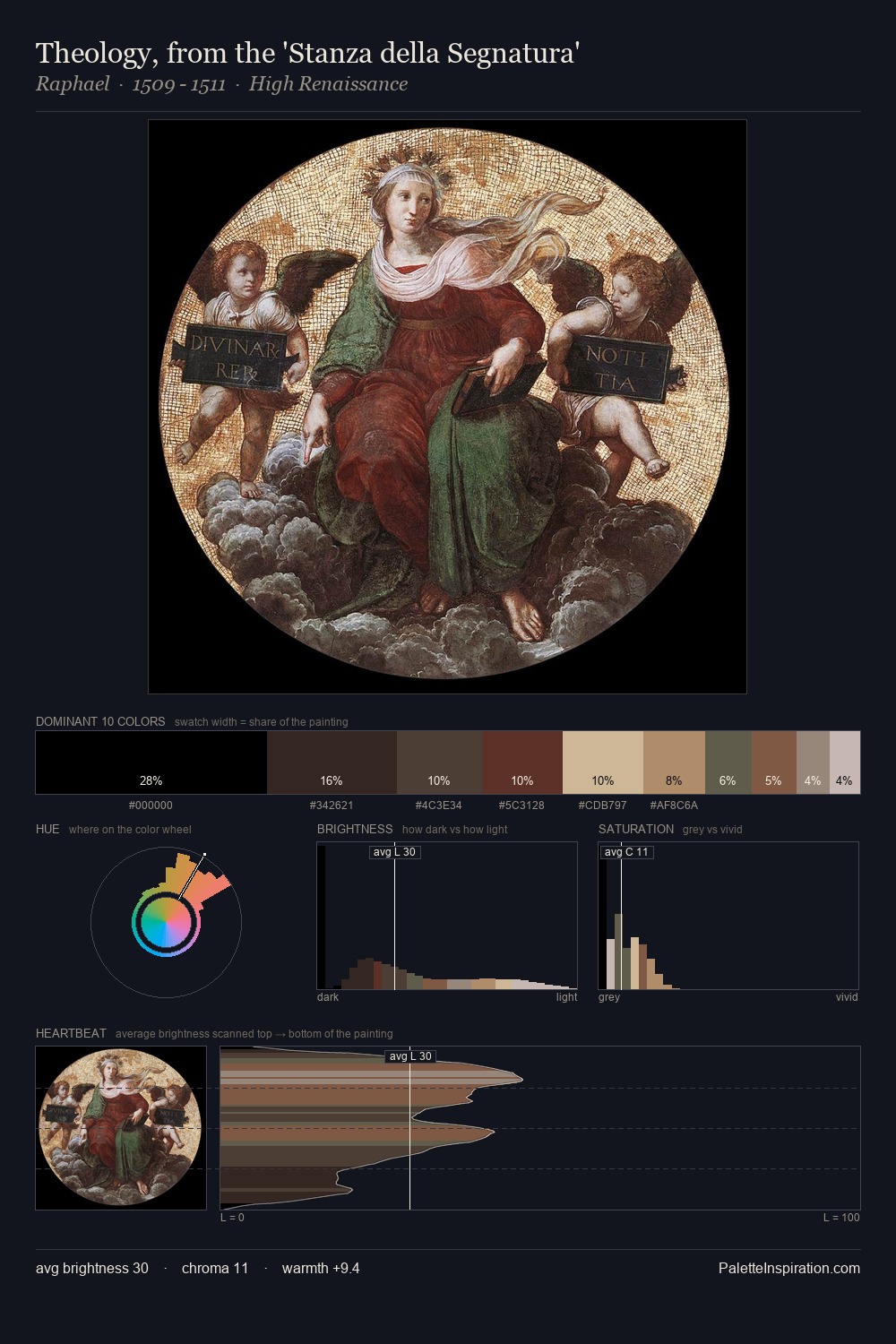
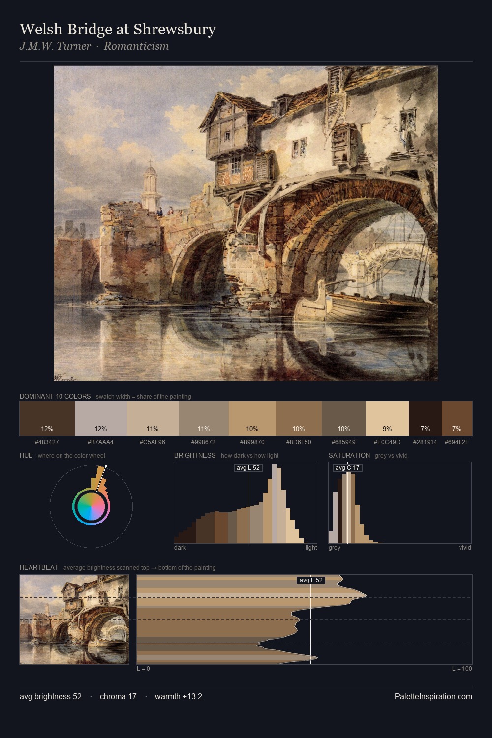
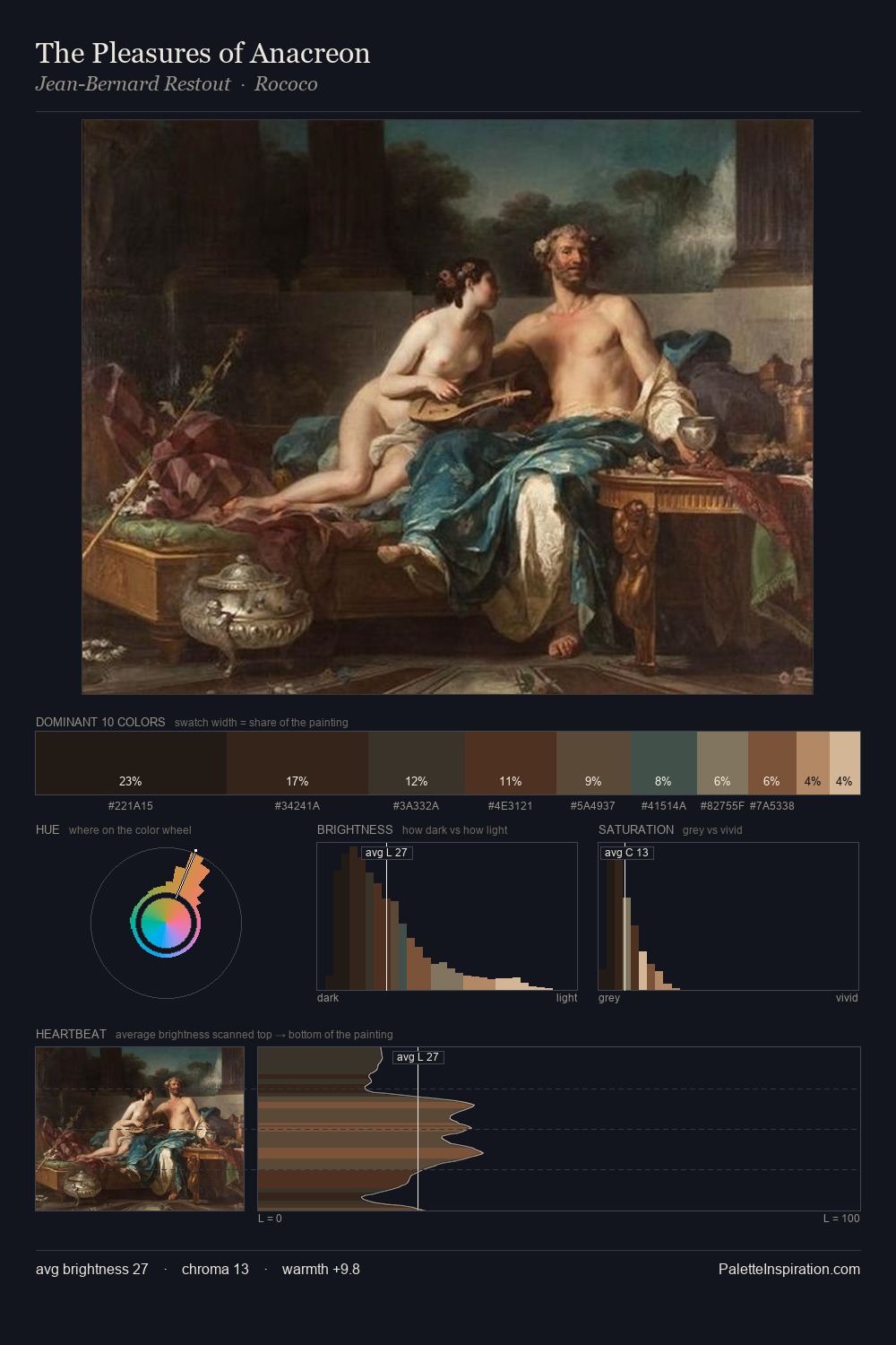
Guido Reni Palette 10
Shadowed Tawny
Shadowed Low-key - values weighted toward shadow, the palette of dim interiors and overcast skies.
Tawny Warm orange-brown - a traditional term for the color of tanned leather or lion fur.

Palette Analysis
The value structure of Guido Reni is mid-key: quiet, controlled, and cohesive. The dominant temperature is warm, with earth tones and fire-hues setting the emotional key. The absence of saturated colour is itself an expressive choice: this is a palette of restraint and atmosphere. The most saturated colour, #5A3428, is reserved to 7.3% of the surface, where it acts as a focal punctuation. The value range spans 65 units across the palette, providing the full gamut from deep shadow to near-white and ensuring clear tonal hierarchy. Palette 10 sits within the larger chromatic argument that Guido Reni's complete body of work advances.
Example use cases
- theater design
- jewelry brands
- tobacco-adjacent retail
- event branding
- film & entertainment
I Love This!
Use This Palette
Copy, export, or download for your project
Copy, export, or download for your project
Copy:
Download:
Share: