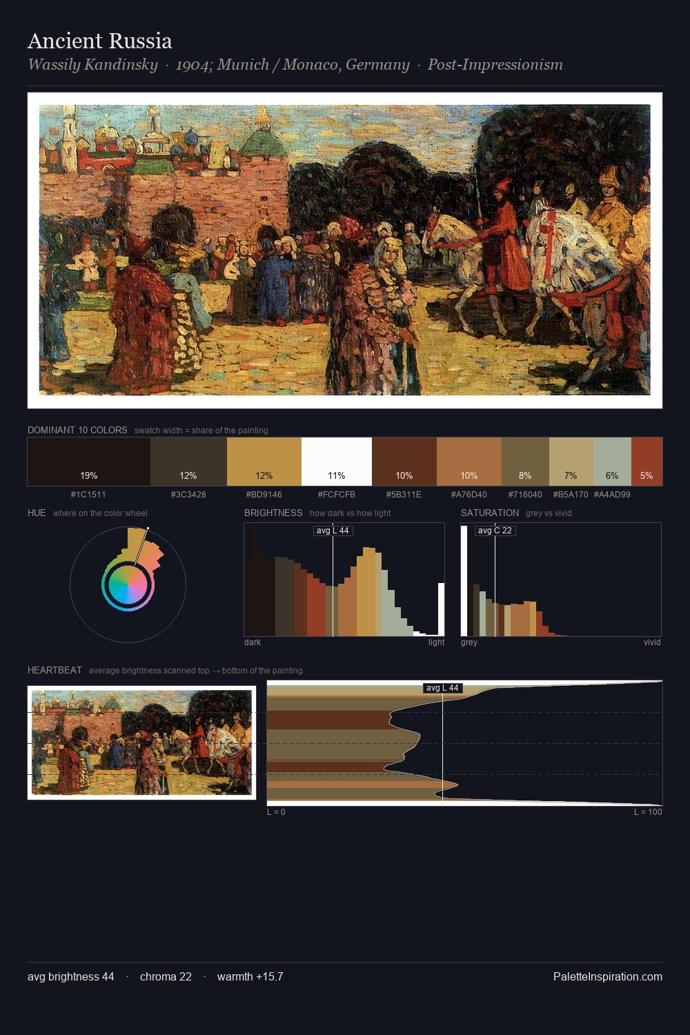
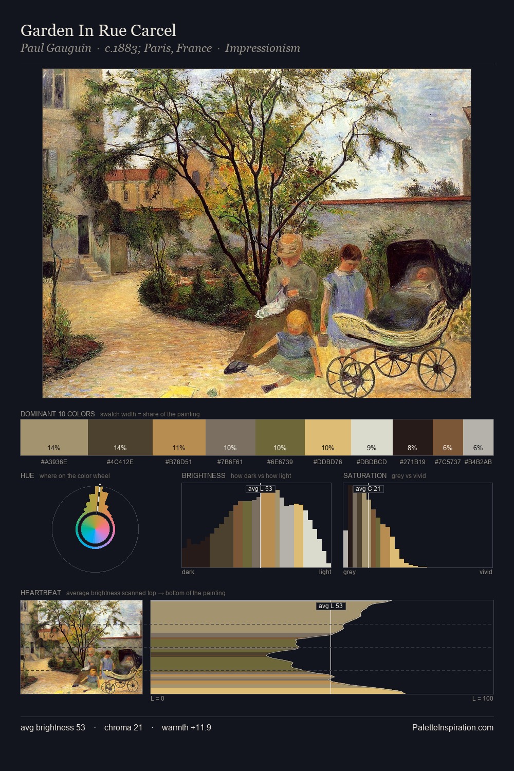
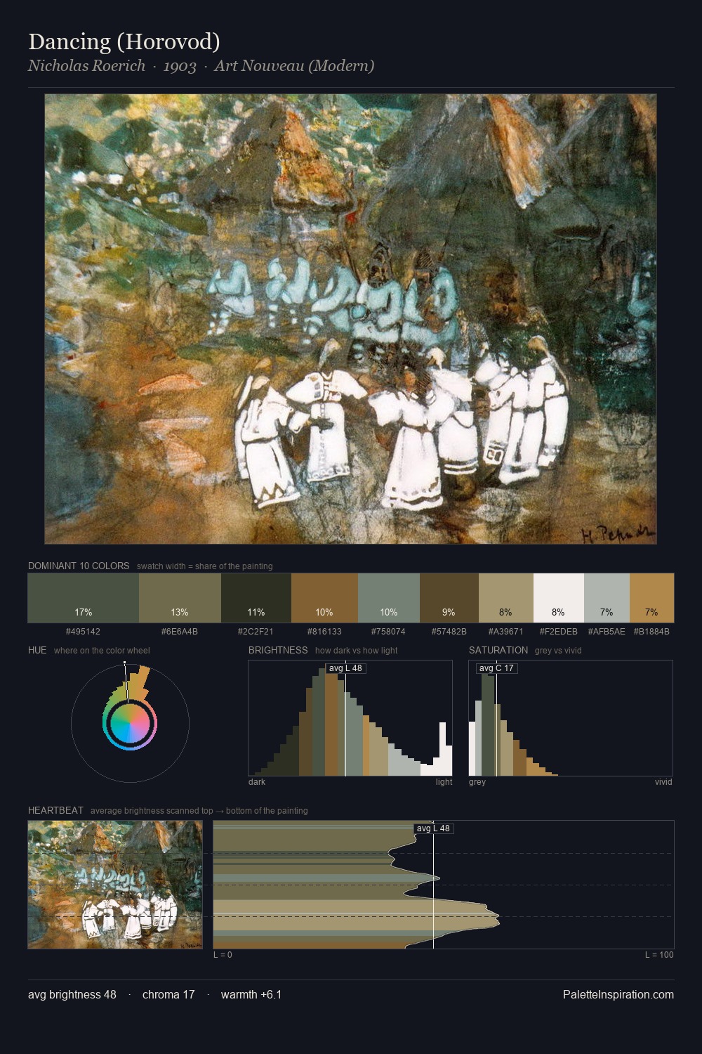
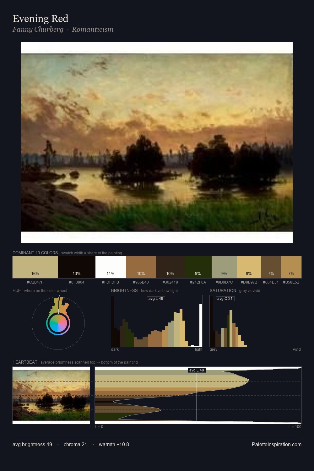
Guido Agostini Palette 3

Palette Analysis
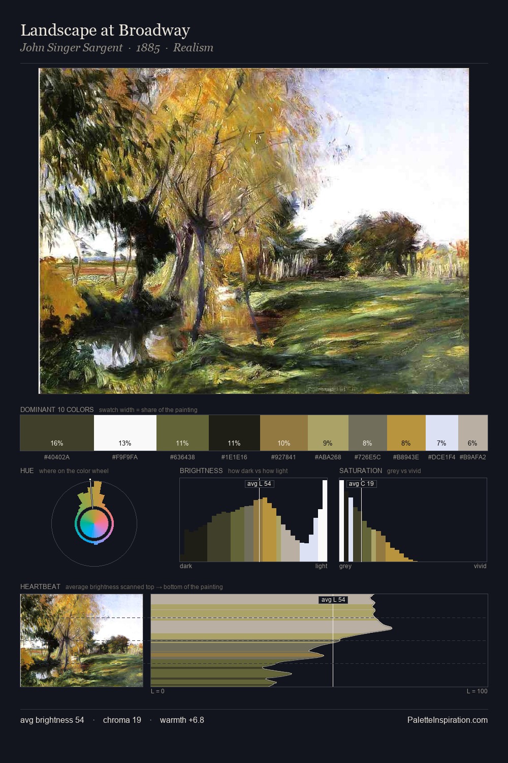
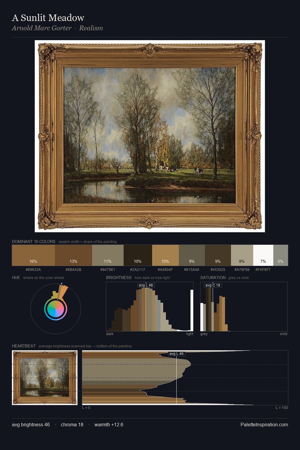
The high-key values of Guido Agostini give it an effulgent, almost bleached quality. Cool hues prevail: blues, greens, and greys anchor the palette's emotional temperature. Muted throughout, the palette achieves its effects through value and temperature rather than chromatic force. A single dominant - #FFFFFE at 45.8% - sets the character of the whole composition. Only 4.1% is devoted to #A6794A, yet that small allocation delivers the palette's entire chromatic tension. The full value range is 75 units: broad enough to build convincing three-dimensional form. The mid-to-high key, cool bias, and moderate chroma point to outdoor observation - sky and diffused daylight as the dominant light source. Guido Agostini's palette 3 carries its own internal logic while remaining in conversation with the artist's broader colour intelligence.
Example use cases
- publishing
- corporate identity
- consumer apps
- hospitality
- design agencies
I Love This!
Copy, export, or download for your project