Grigory Chernetsov Master Palette

Palette Analysis
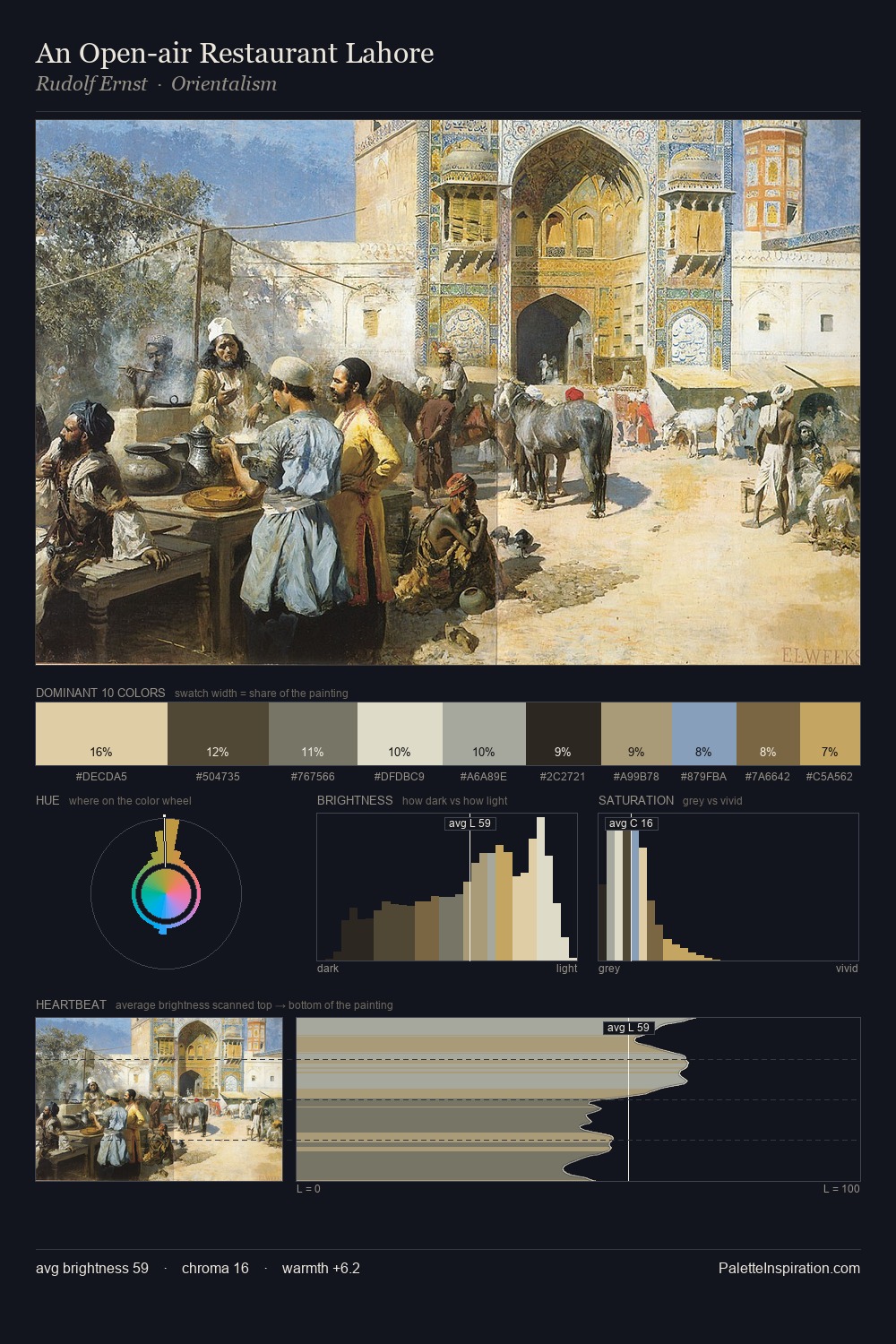
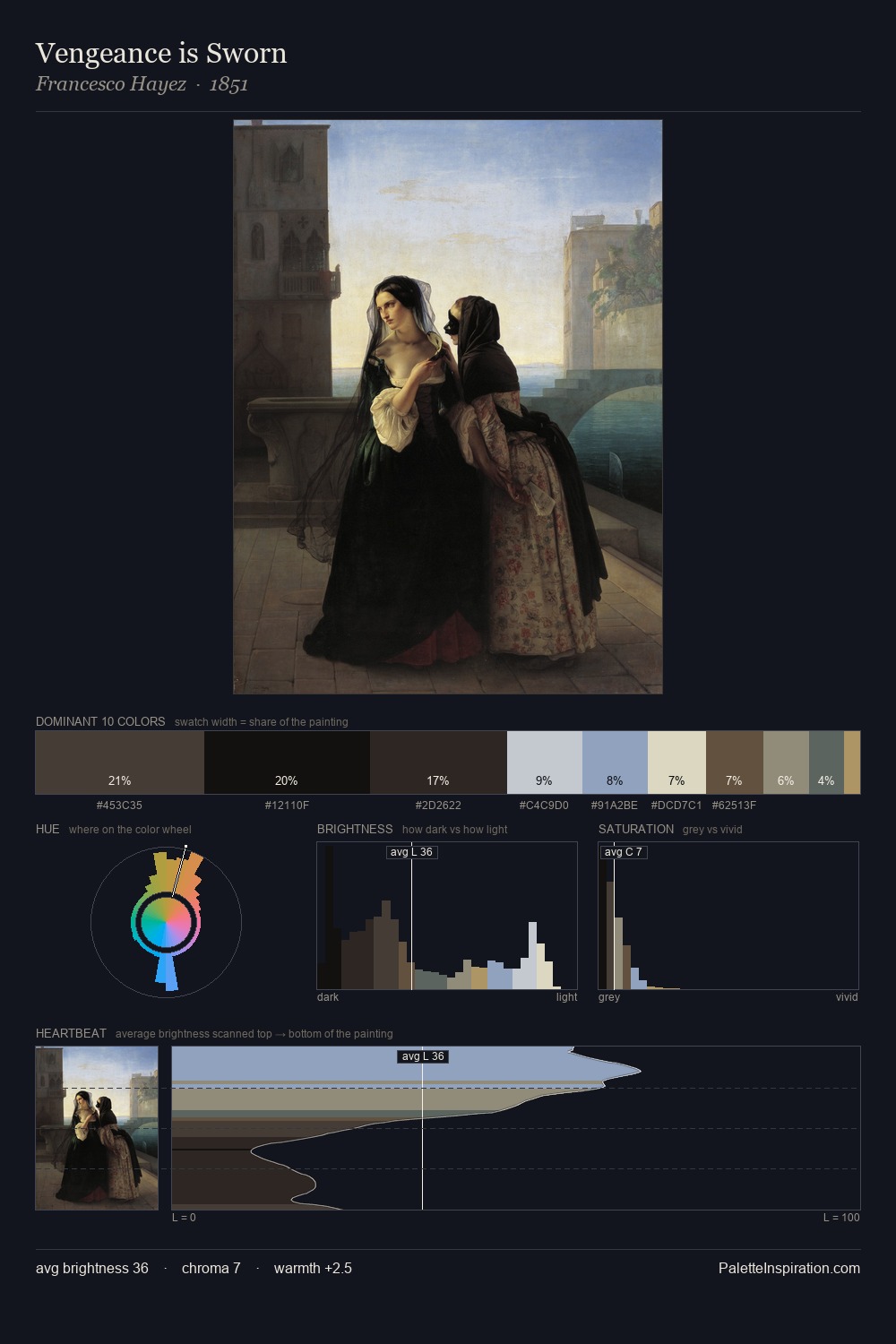
Grigory Chernetsov occupies the comfortable middle of the value scale, avoiding both extremes to hold the eye in a sustained middle grey. Cool hues prevail: blues, greens, and greys anchor the palette's emotional temperature. Muted throughout, the palette achieves its effects through value and temperature rather than chromatic force. #6590A9 functions as the palette's exclamation mark: highest chroma, lowest percentage (6.0%). At 64 units of value range, the palette has the tonal breadth to sustain complex spatial readings. The palette has the character of outdoor light: cool, mid-bright, with colour rendered faithfully rather than expressively. Taken together, these qualities constitute Grigory Chernetsov's chromatic voice - distinctive enough to be read across an entire body of work.
Example use cases
- exhibition design
- foundation branding
- estate management
- art education
- museums & galleries
I Love This!
Copy, export, or download for your project