Graham Bell Palette 2

Palette Analysis
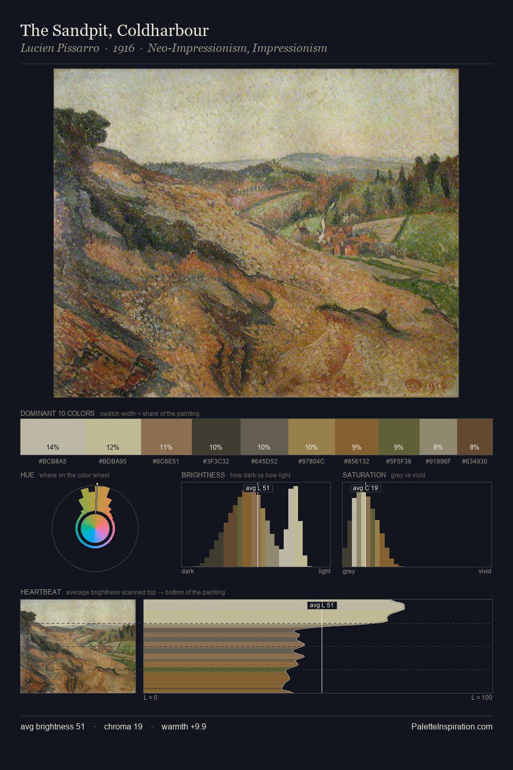
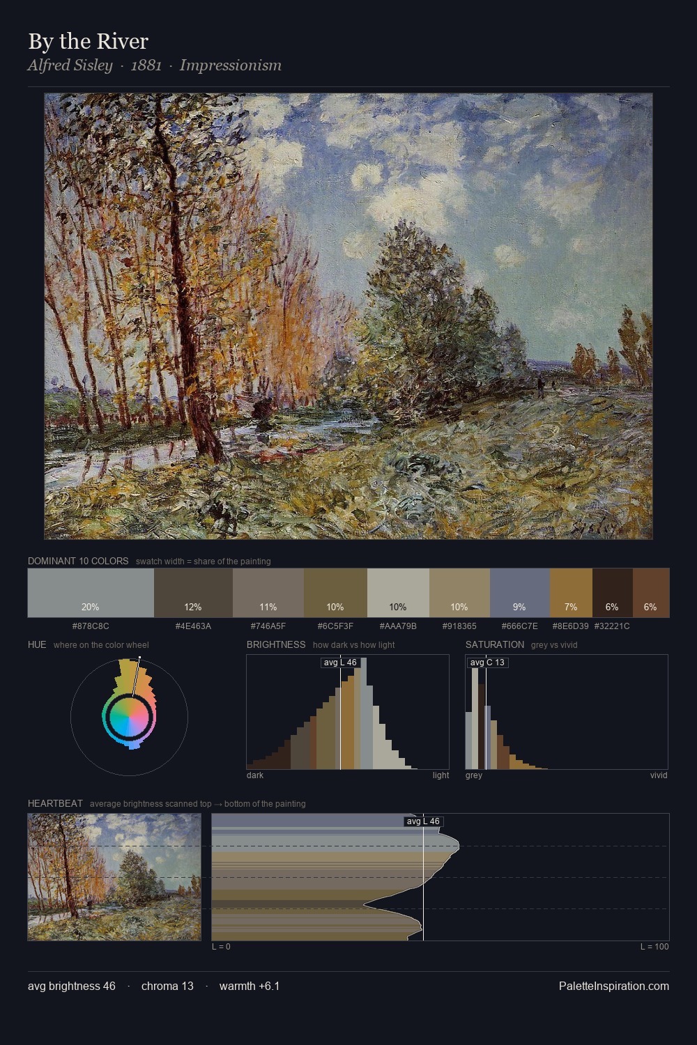
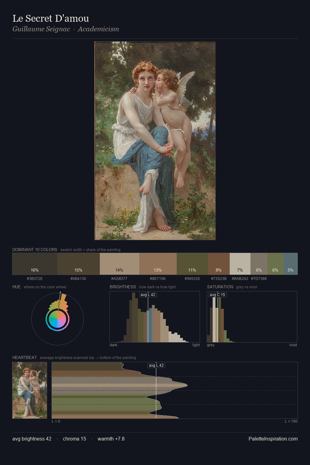
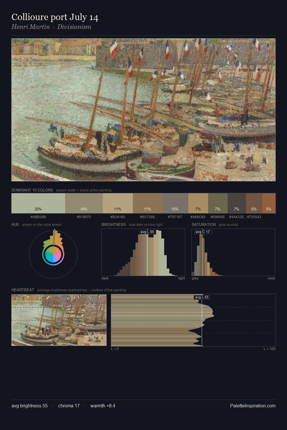
Graham Bell sits in the centre of the value range, lending the palette a sense of even, sustained light. Cool hues prevail: blues, greens, and greys anchor the palette's emotional temperature. Saturation is deliberately withheld - the beauty here lies in the near-monochromatic gradations rather than colour difference. #6B452E functions as the palette's exclamation mark: highest chroma, lowest percentage (5.3%). The value range of 33 units sits in the comfortable middle: enough depth, enough light, neither extreme. The mid-to-high key, cool bias, and moderate chroma point to outdoor observation - sky and diffused daylight as the dominant light source. Palette 2 sits within the larger chromatic argument that Graham Bell's complete body of work advances.
Example use cases
- exhibition design
- foundation branding
- estate management
- art education
- museums & galleries
I Love This!
Copy, export, or download for your project