Gothic Palette 5
Nocturnal Bister
Nocturnal Night-register palette - very low values, the world after dark.
Bister Dark warm brown - a traditional ink and wash pigment made from wood soot.

Palette Analysis
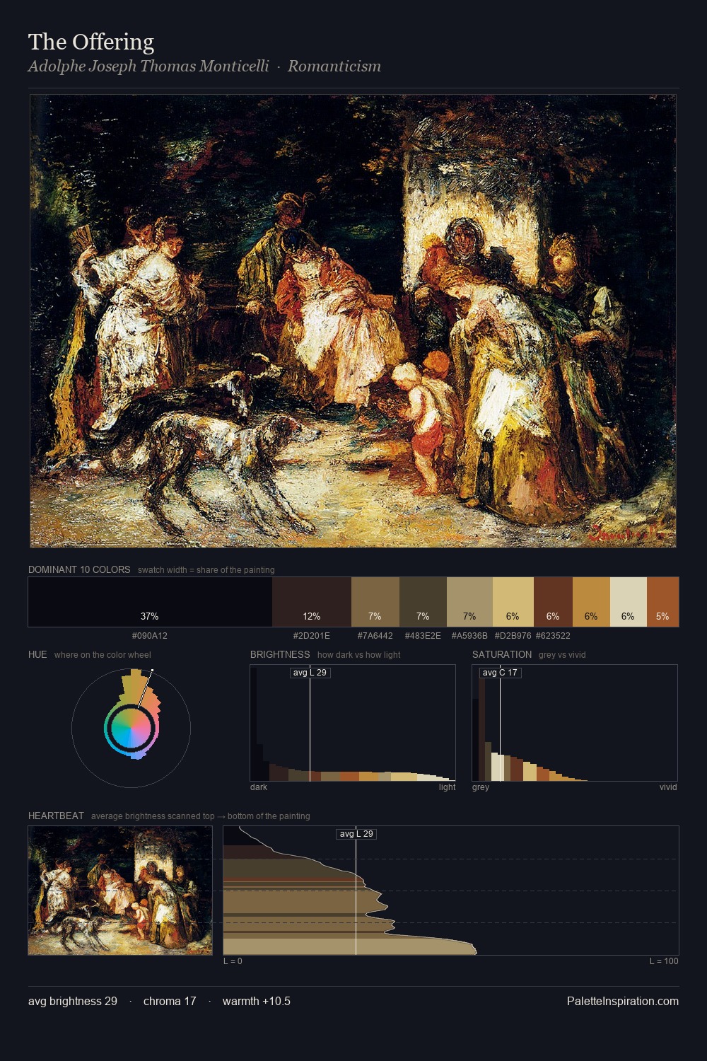
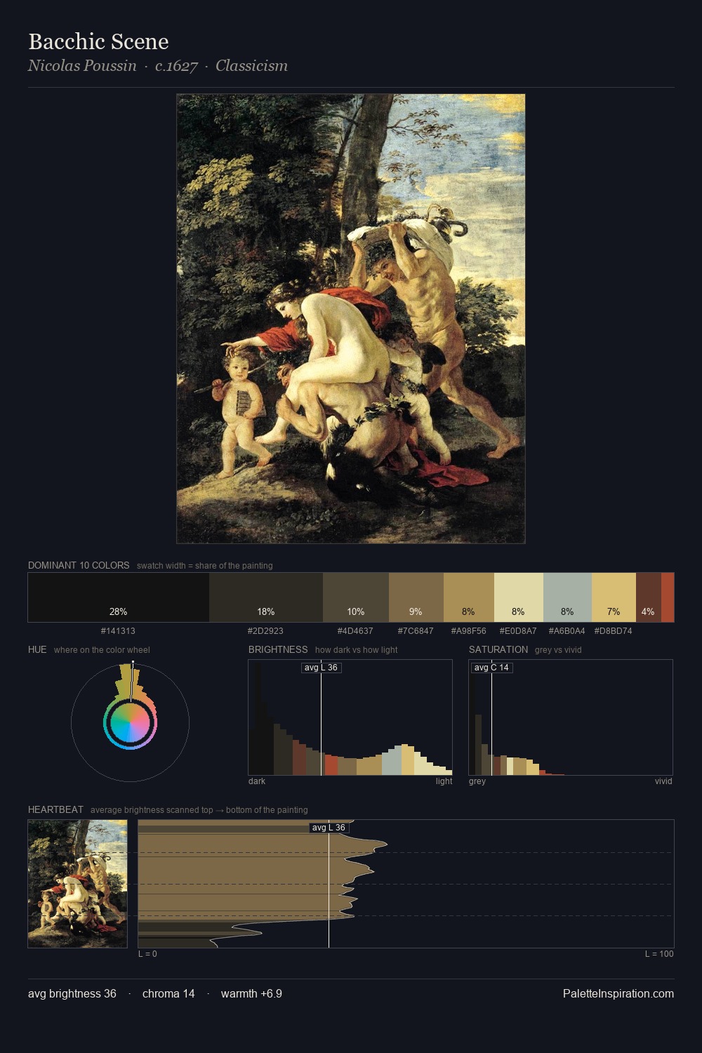
Gothic is built on dark foundations, with values clustered toward shadow. Warm hues command this palette; it favours the reds, oranges, and yellows of firelight and earth. Saturation is deliberately withheld - the beauty here lies in the near-monochromatic gradations rather than colour difference. A single dominant - #131112 at 34.4% - sets the character of the whole composition. The highest-chroma note - #DDD0AC - appears at just 2.6%, deployed as a precision accent against the quieter ground. The value range spans 68 units across the palette, providing the full gamut from deep shadow to near-white and ensuring clear tonal hierarchy. This tonal restraint is characteristic of the Tonalist sensibility: colour serves light, not the reverse.
Example use cases
- theater design
- jewelry brands
- tobacco-adjacent retail
- event branding
- film & entertainment
I Love This!
Use This Palette
Copy, export, or download for your project
Copy, export, or download for your project
Copy:
Download:
Share: