Giuseppe Antonio Visconti Palette 1

Palette Analysis
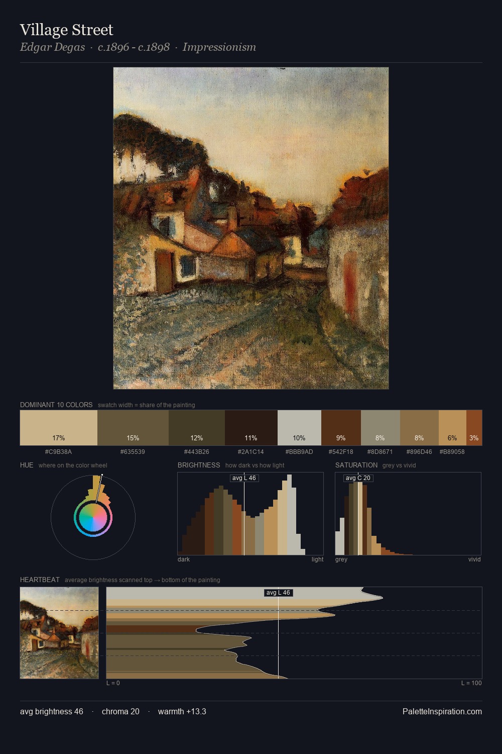
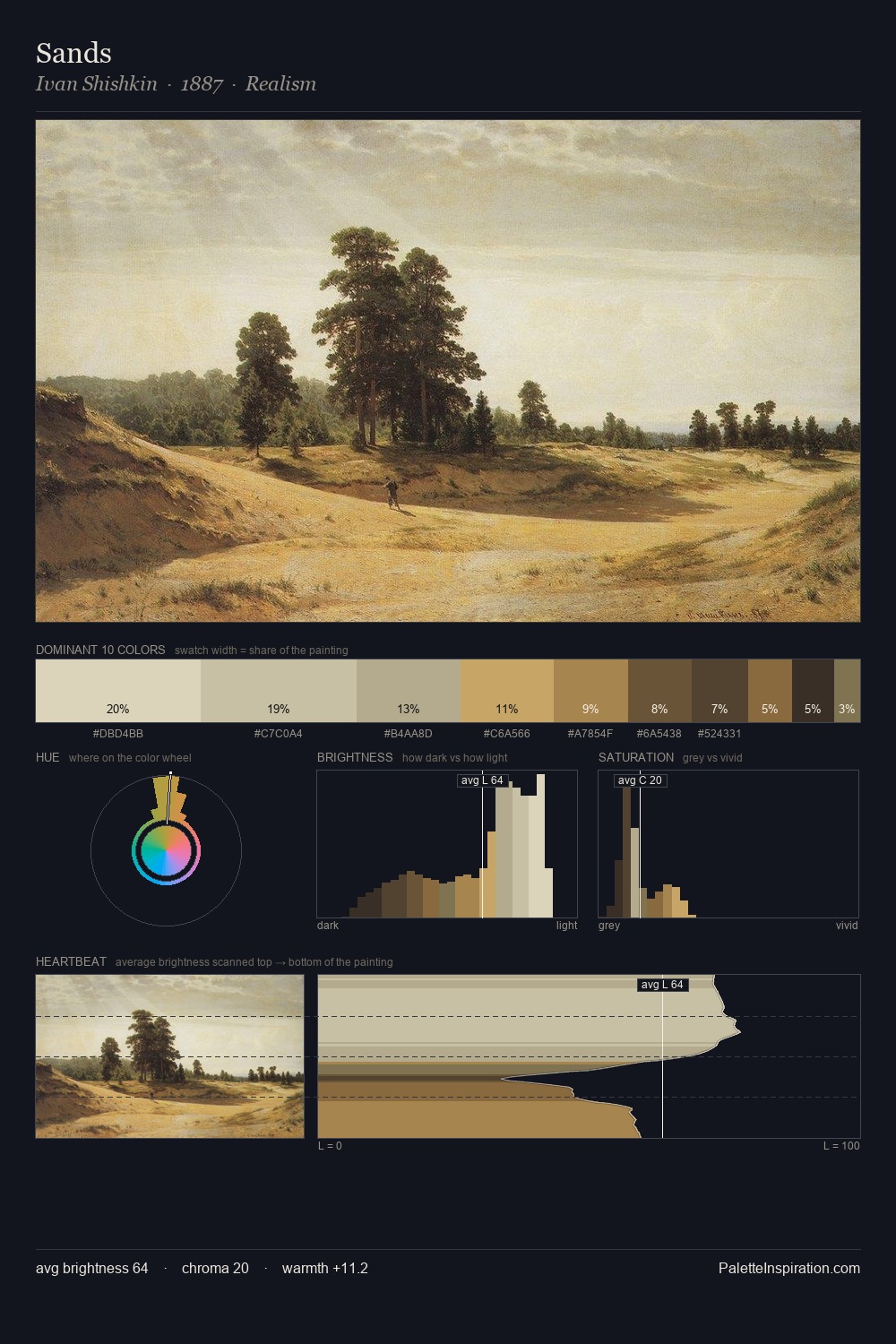
Mid-key values give Giuseppe Antonio Visconti its characteristic quietness - nothing blazes, nothing disappears. Blues and teal-greys govern the palette, lending it an aquatic or atmospheric quality. Muted throughout, the palette achieves its effects through value and temperature rather than chromatic force. The most saturated colour, #B98C4B, is reserved to 4.7% of the surface, where it acts as a focal punctuation. The value range of 53 units sits in the comfortable middle: enough depth, enough light, neither extreme. The palette has the character of outdoor light: cool, mid-bright, with colour rendered faithfully rather than expressively. Palette 1 sits within the larger chromatic argument that Giuseppe Antonio Visconti's complete body of work advances.
Example use cases
- interior design
- furniture brands
- cookbook publishing
- wine & spirits
- food packaging
I Love This!
Copy, export, or download for your project