Giulio Rosati Palette 4
Muted Apricot
Muted Deliberately desaturated - chroma pulled toward gray, the restraint of tonal painting.
Apricot Soft warm orange - peach-adjacent, the color of ripe stone fruit.

Palette Analysis
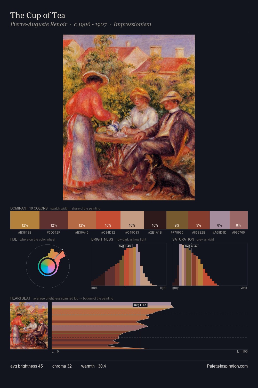
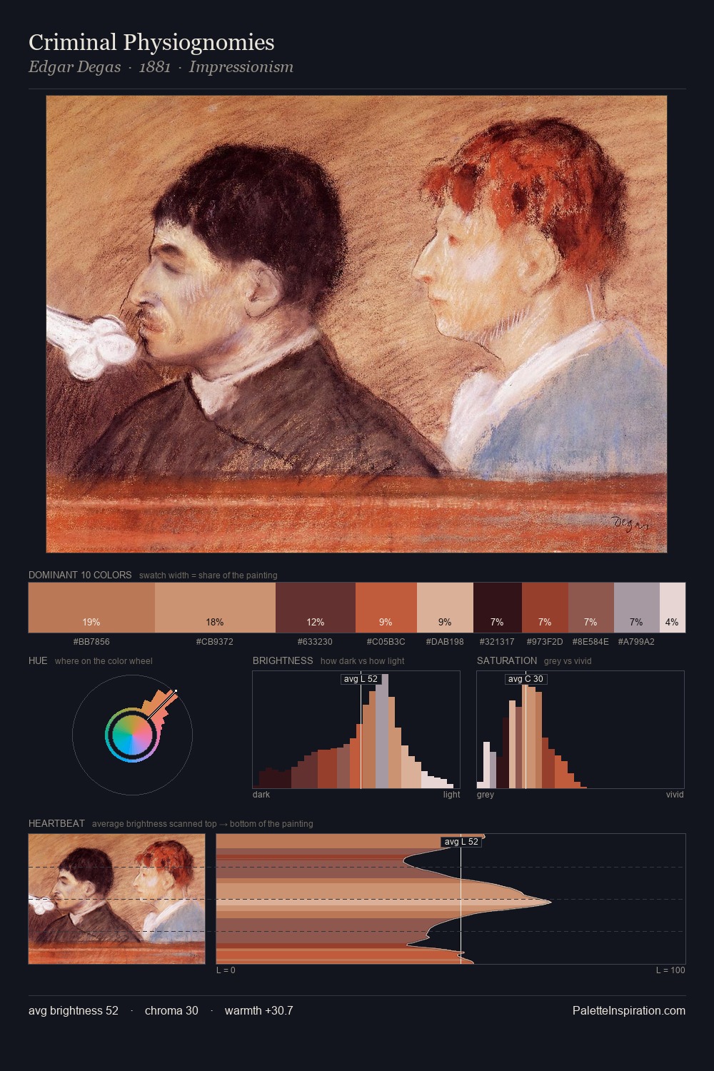
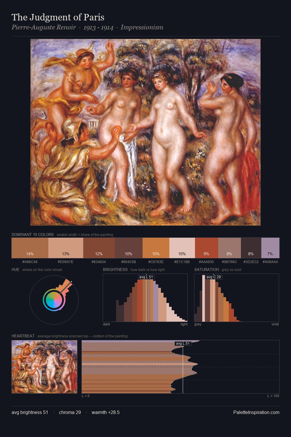
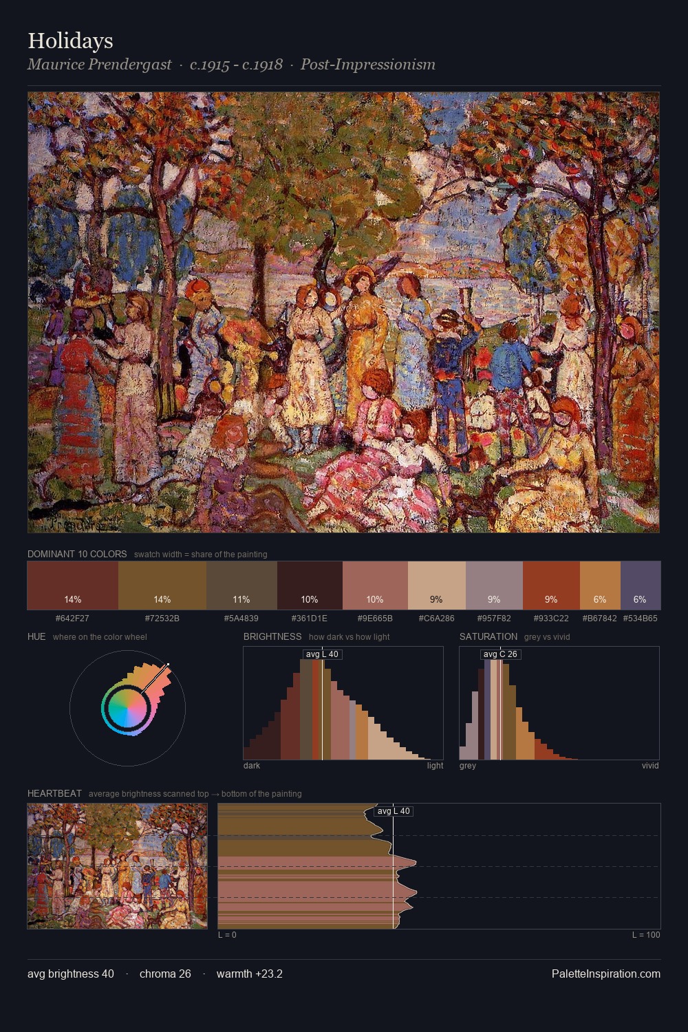
Giulio Rosati distributes its values across the middle register, creating harmony without high contrast. Yellow, ochre, sienna: warm hues that Giulio Rosati deploys as the palette's primary energy. Mid-range chroma keeps the palette grounded - colourful but not strident. Only 7.9% is devoted to #B5633A, yet that small allocation delivers the palette's entire chromatic tension. Value range is moderate at 52 units - enough contrast for legibility, not so much as to fragment the tonal unity. In the context of Giulio Rosati's full range of palettes, group 4 represents one movement in an ongoing chromatic dialogue.
Example use cases
- craft & artisan brands
- specialty coffee
- home goods
- lifestyle retail
- ceramics & pottery
I Love This!
Use This Palette
Copy, export, or download for your project
Copy, export, or download for your project
Copy:
Download:
Share: