Giulio Cesare Procaccini Palette 1

Palette Analysis
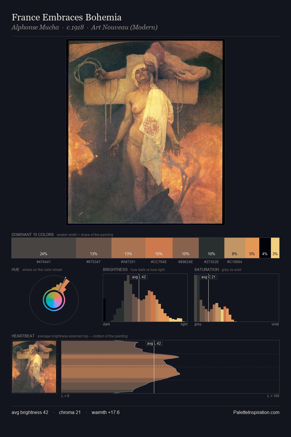
Values in Giulio Cesare Procaccini rest in the mid-range - neither dramatically lit nor steeped in shadow. Warm hues command this palette; Giulio Cesare Procaccini favours the reds, oranges, and yellows of firelight and earth. Chroma is held at a comfortable level - distinct colours, but no single hue is allowed to overwhelm. The most saturated colour, #FEE292, is reserved to 4.5% of the surface, where it acts as a focal punctuation. A value spread of 66 units gives the palette both depth and air - shadows are genuinely dark, lights genuinely light. Palette 1 sits within the larger chromatic argument that Giulio Cesare Procaccini's complete body of work advances.
Example use cases
- ceramics & pottery
- boutique hospitality
- menswear
- heritage food brands
- craft & artisan brands
I Love This!
Copy, export, or download for your project
Related Palettes

Giulio Cesare Procaccini Palette 2
Muted Caramel

Giulio Cesare Procaccini Palette 3
Penumbral Tawny

Giulio Cesare Procaccini Palette 4
Nocturnal Sienna

Giulio Cesare Procaccini Palette 5
Nocturnal Umber

Giulio Cesare Procaccini Palette 6
Shadowed Rust

Giulio Cesare Procaccini Palette 7
Nocturnal Bister