Giovanni Paolo Panini Palette 6

Palette Analysis
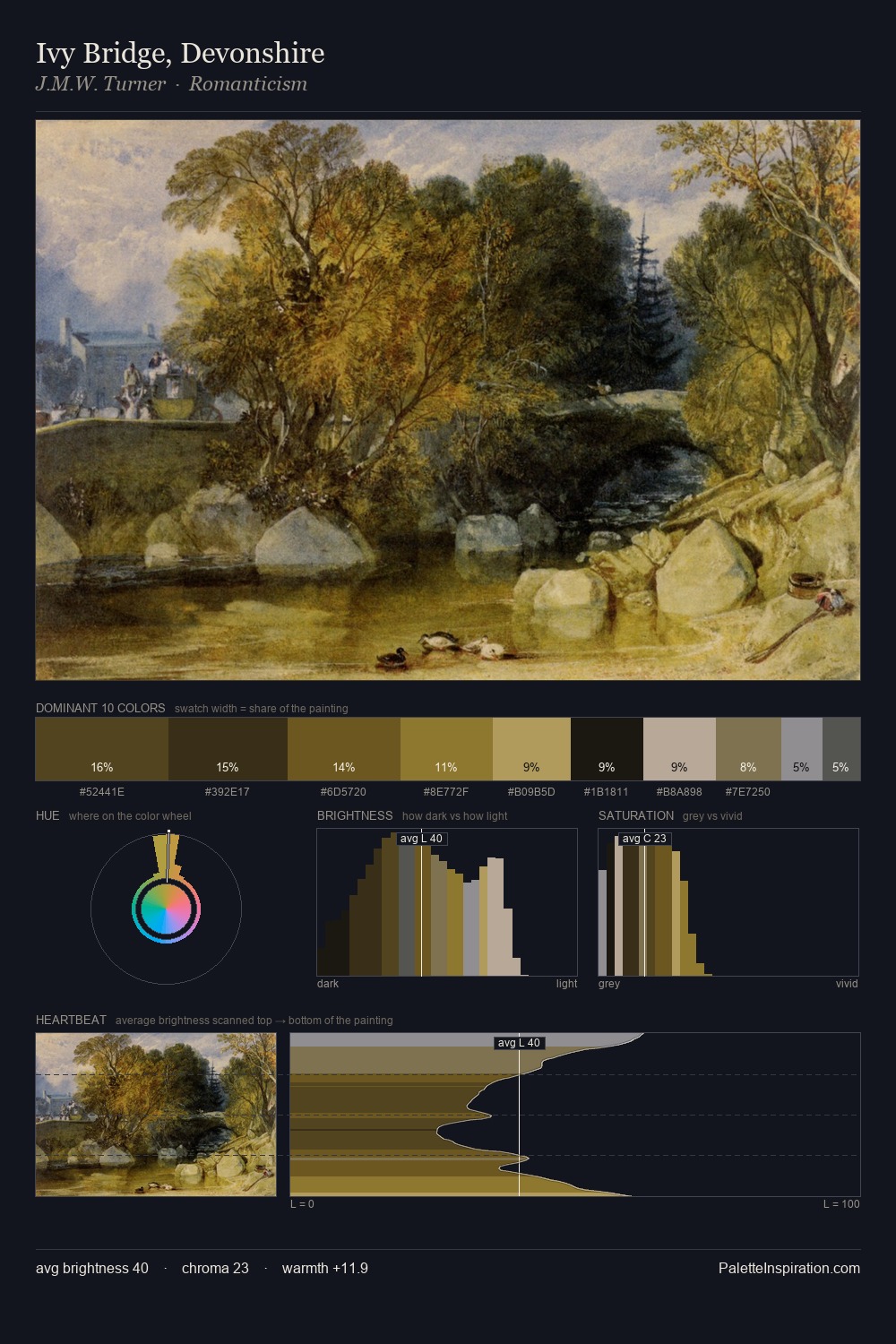
Giovanni Paolo Panini distributes its values across the middle register, creating harmony without high contrast. Blues and teal-greys govern the palette, lending it an aquatic or atmospheric quality. The absence of saturated colour is itself an expressive choice: this is a palette of restraint and atmosphere. The saturated accent, #D3B770, registers at 5.4% - sparse enough to feel like a deliberate surprise. The value range spans 55 units across the palette, providing the full gamut from deep shadow to near-white and ensuring clear tonal hierarchy. The mid-to-high key, cool bias, and moderate chroma point to outdoor observation - sky and diffused daylight as the dominant light source. Giovanni Paolo Panini's palette 6 carries its own internal logic while remaining in conversation with the artist's broader colour intelligence.
Example use cases
- theater design
- jewelry brands
- tobacco-adjacent retail
- event branding
- film & entertainment
I Love This!
Copy, export, or download for your project
Related Palettes

Henri Felix Emmanuel Philippoteaux Palette 5
Tenebrous Umber

George Morland Palette 10
Tenebrous Terracotta

Jacob Samuel Beck Palette 2
Tenebrous Terracotta

Thomas Buchanan Read Palette 2
Penumbral Terracotta

Giovanni Paolo Panini Palette 1
Veiled Parchment

Giovanni Paolo Panini Palette 2
Veiled Sage