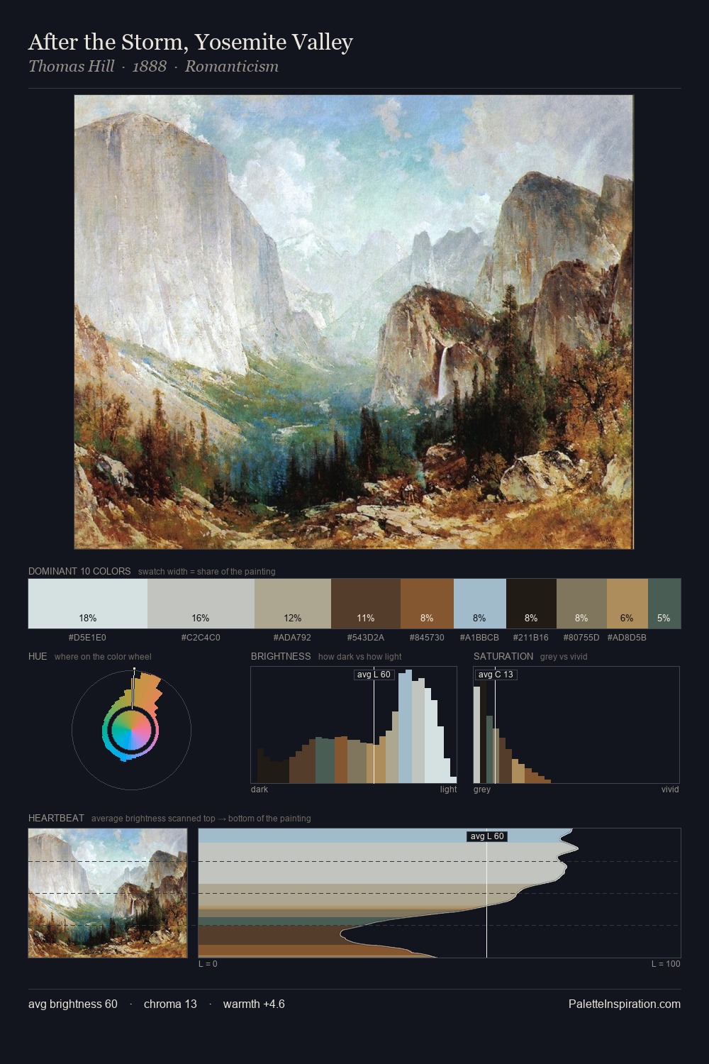
Giovanni Francesco Romanelli Palette 5
Tenebrous Bister
Tenebrous Dark and murky - low-key values with obscured form, Baroque in temperament.
Bister Dark warm brown - a traditional ink and wash pigment made from wood soot.

Palette Analysis
Giovanni Francesco Romanelli keeps values measured and balanced, a hallmark of tonal restraint. Warmth dominates - the palette of Giovanni Francesco Romanelli leans heavily on the yellow-orange-red arc of the colour wheel. Every colour is desaturated; the palette proceeds through near-neutrals and gently-coloured greys. The highest-chroma note - #795432 - appears at just 6.1%, deployed as a precision accent against the quieter ground. From deepest dark to palest light, the palette traverses 56 units of the value scale - a span that creates natural depth. In the context of Giovanni Francesco Romanelli's full range of palettes, group 5 represents one movement in an ongoing chromatic dialogue.
Example use cases
- theater design
- jewelry brands
- tobacco-adjacent retail
- event branding
- film & entertainment
I Love This!
Use This Palette
Copy, export, or download for your project
Copy, export, or download for your project
Copy:
Download:
Share: