Gillis van Tilborgh Master Palette

Palette Analysis
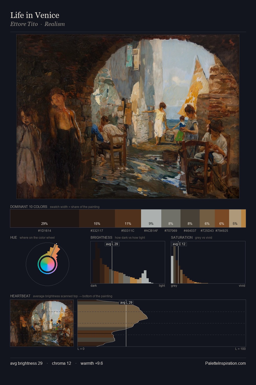
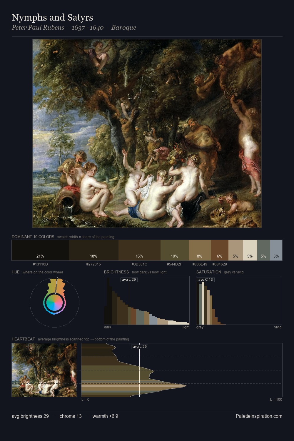
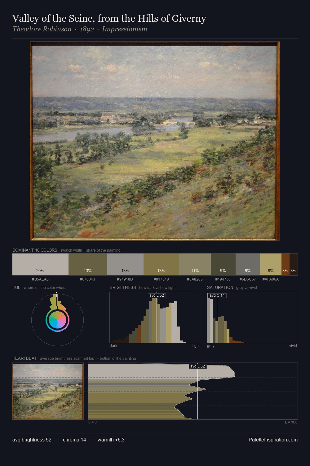
Mid-key values give Gillis van Tilborgh its characteristic quietness - nothing blazes, nothing disappears. Gillis van Tilborgh tilts toward cool - blues and silver-greys carry the structural weight. The absence of saturated colour is itself an expressive choice: this is a palette of restraint and atmosphere. The highest-chroma note - #7F451D - appears at just 4.9%, deployed as a precision accent against the quieter ground. The full value range is 62 units: broad enough to build convincing three-dimensional form. High luminosity and cool temperature suggest the plein-air condition: unfiltered daylight and open sky. The palette is recognisably Gillis van Tilborgh's own: particular in its temperature, chroma, and the economy of its brightest note.
Example use cases
- theater design
- jewelry brands
- tobacco-adjacent retail
- event branding
- film & entertainment
I Love This!
Copy, export, or download for your project