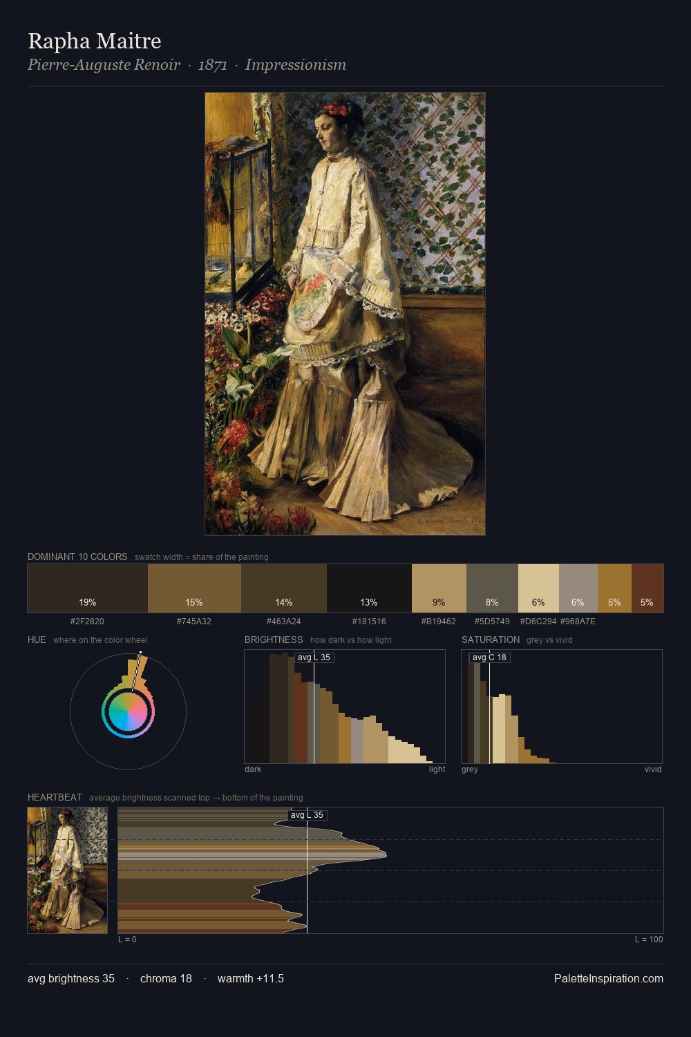
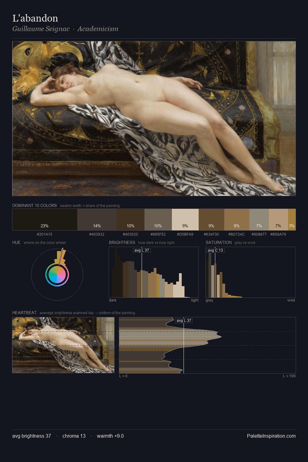
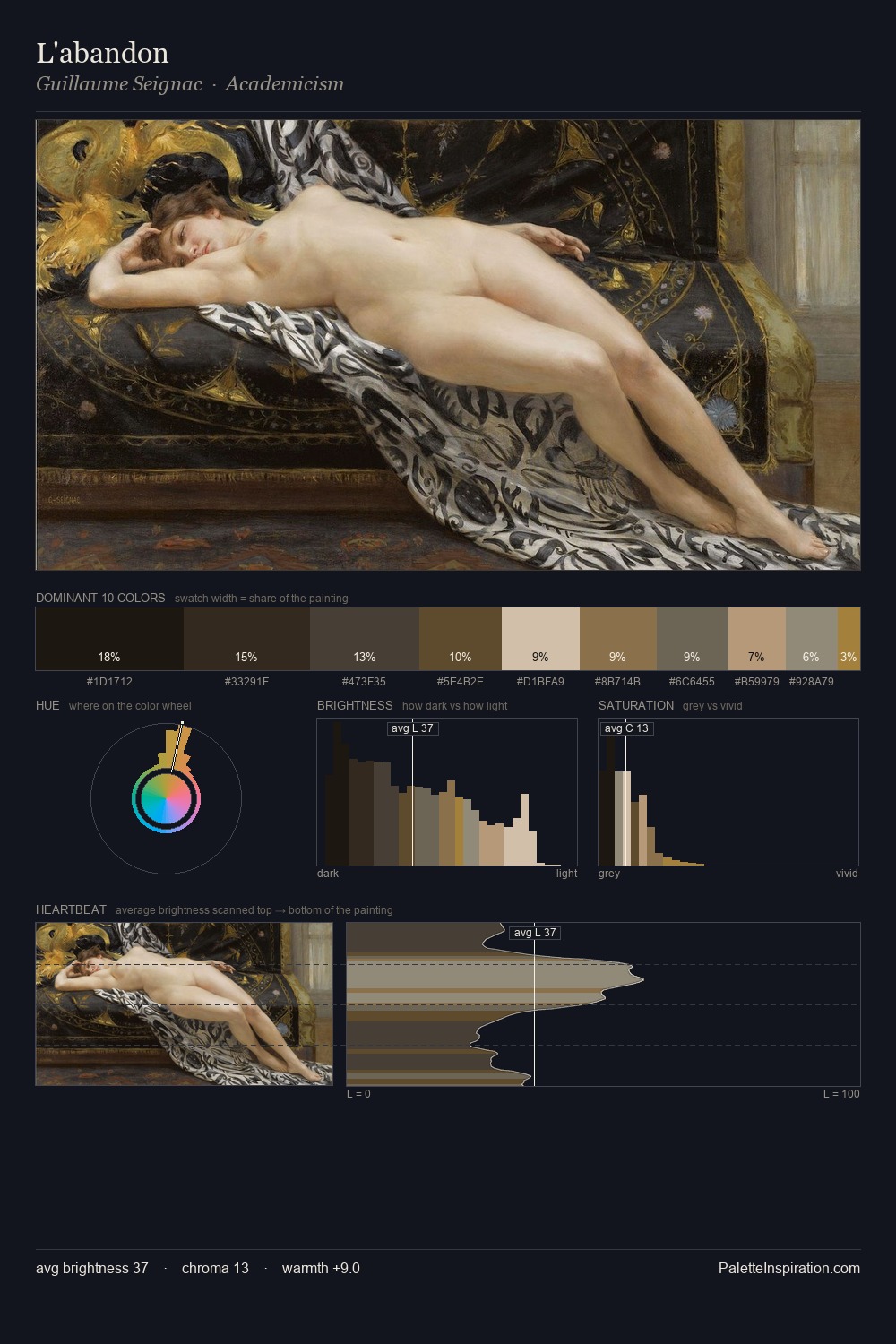
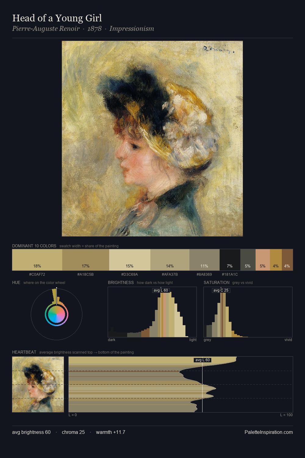
Gilbert Stuart Palette 7

Palette Analysis
Gilbert Stuart is low-key throughout, a quality associated with Tenebrous Pewter - deep shadows dominate the composition. Gilbert Stuart tilts toward cool - blues and silver-greys carry the structural weight. Every colour is desaturated; the palette proceeds through near-neutrals and gently-coloured greys. The dominant colour, #262721, takes 33.5% of the total area, establishing the overall mood before any other hue is introduced. The saturated accent, #9F7329, registers at 0.8% - sparse enough to feel like a deliberate surprise. 65 units of value range underpin the palette's structural clarity: the eye always knows where light falls. Together these qualities place Gilbert Stuart firmly in the tonal tradition - concerned with mood and atmosphere rather than chromatic display. Palette 7 sits within the larger chromatic argument that Gilbert Stuart's complete body of work advances.
Example use cases
- theater design
- jewelry brands
- tobacco-adjacent retail
- event branding
- film & entertainment
I Love This!
Copy, export, or download for your project