Gerda Wegener Palette 4
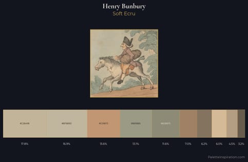
Soft Ecru
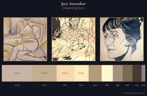
Soft Low-contrast, gentle chroma - mid-key values and low saturation, approachable and calm.
Ecru Unbleached linen - warm mid-neutral, slightly grayed, raw and natural.
Palette Analysis
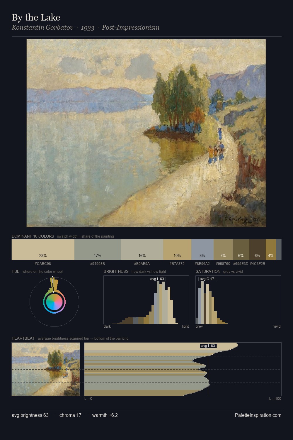
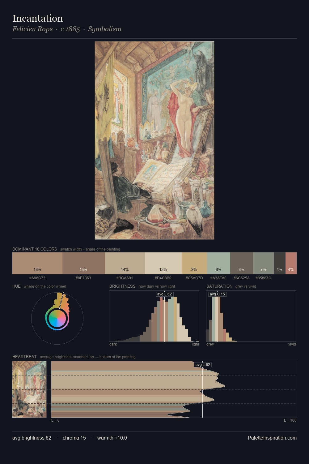
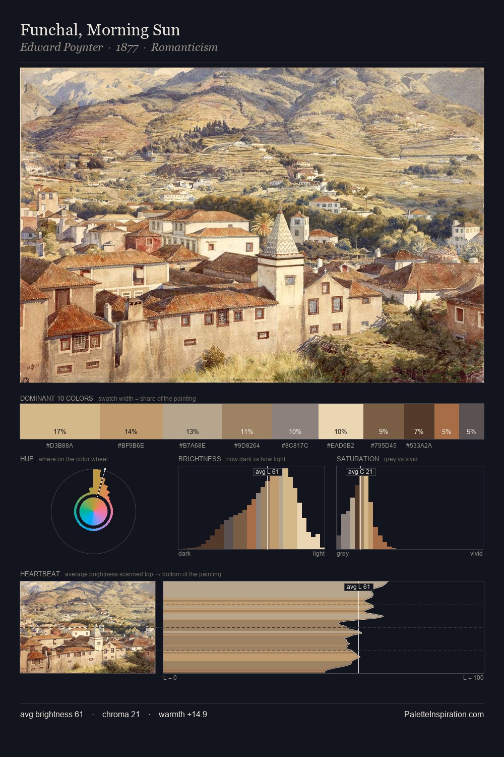
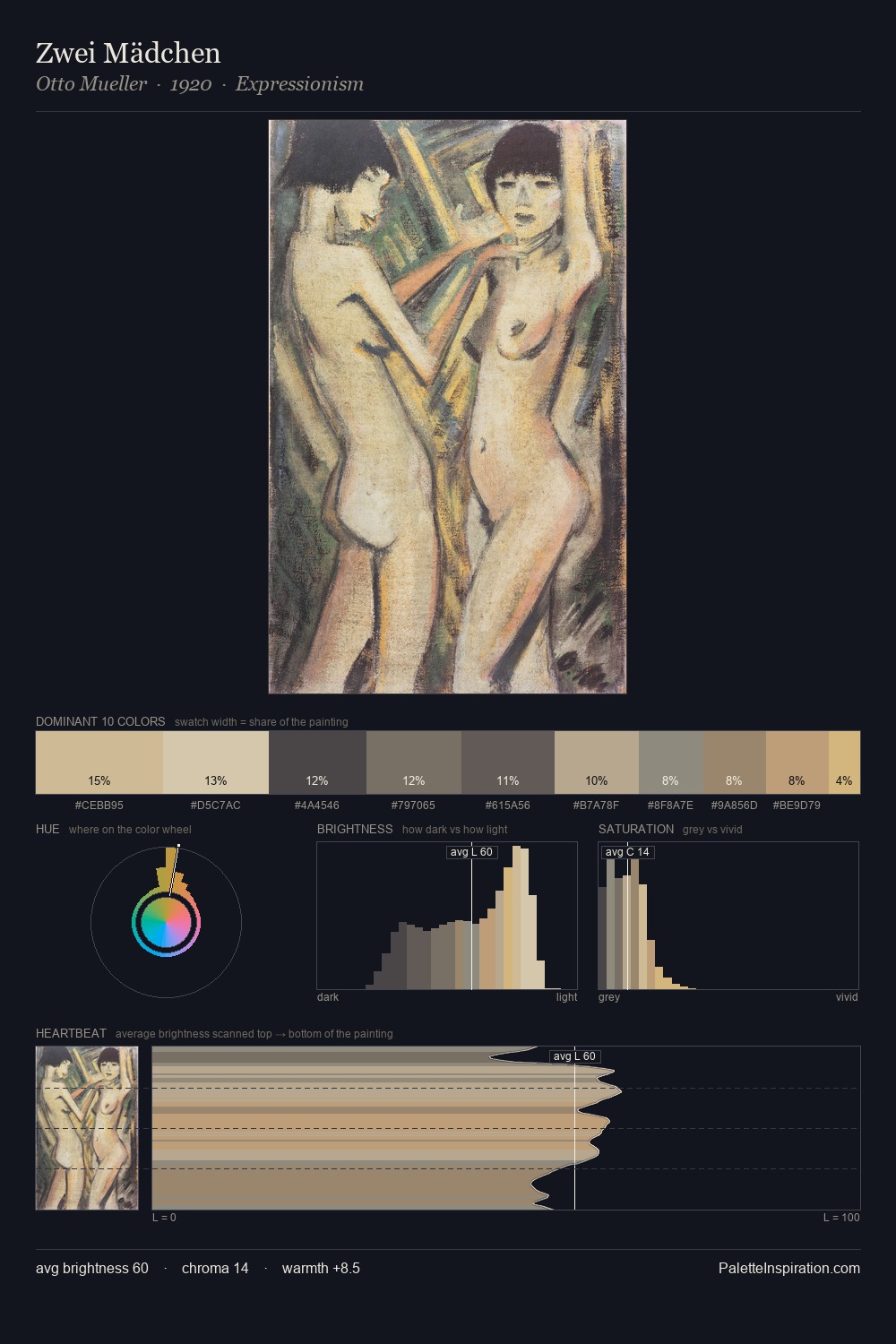
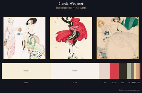
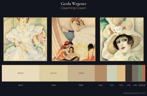
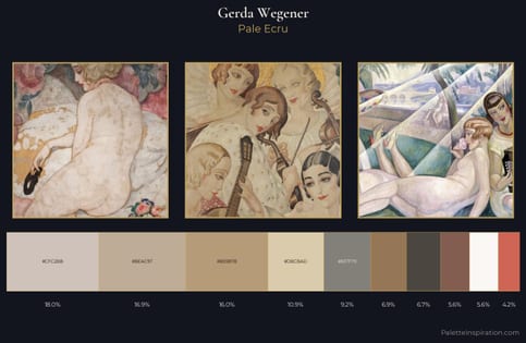
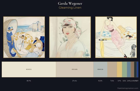
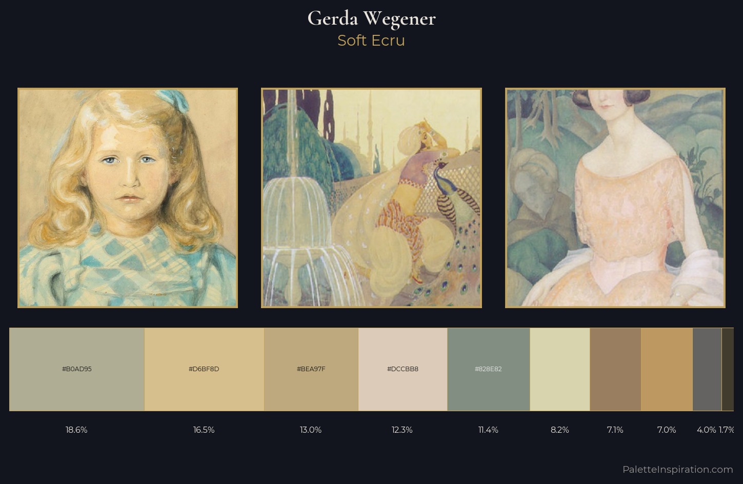
Values in Gerda Wegener tilt decisively toward white, giving the palette its luminous character. Cool hues prevail: blues, greens, and greys anchor the palette's emotional temperature. All colours lean toward grey, building depth through value rather than colour punch. The highest-chroma note - #D8D4AD - appears at just 8.2%, deployed as a precision accent against the quieter ground. The value range of 50 units sits in the comfortable middle: enough depth, enough light, neither extreme. High luminosity and cool temperature suggest the plein-air condition: unfiltered daylight and open sky. Gerda Wegener's palette 4 carries its own internal logic while remaining in conversation with the artist's broader colour intelligence.
Example use cases
- ceramics & pottery
- boutique hospitality
- menswear
- heritage food brands
- craft & artisan brands
I Love This!
Use This Palette
Copy, export, or download for your project
Copy, export, or download for your project
Copy:
Download:
Share: