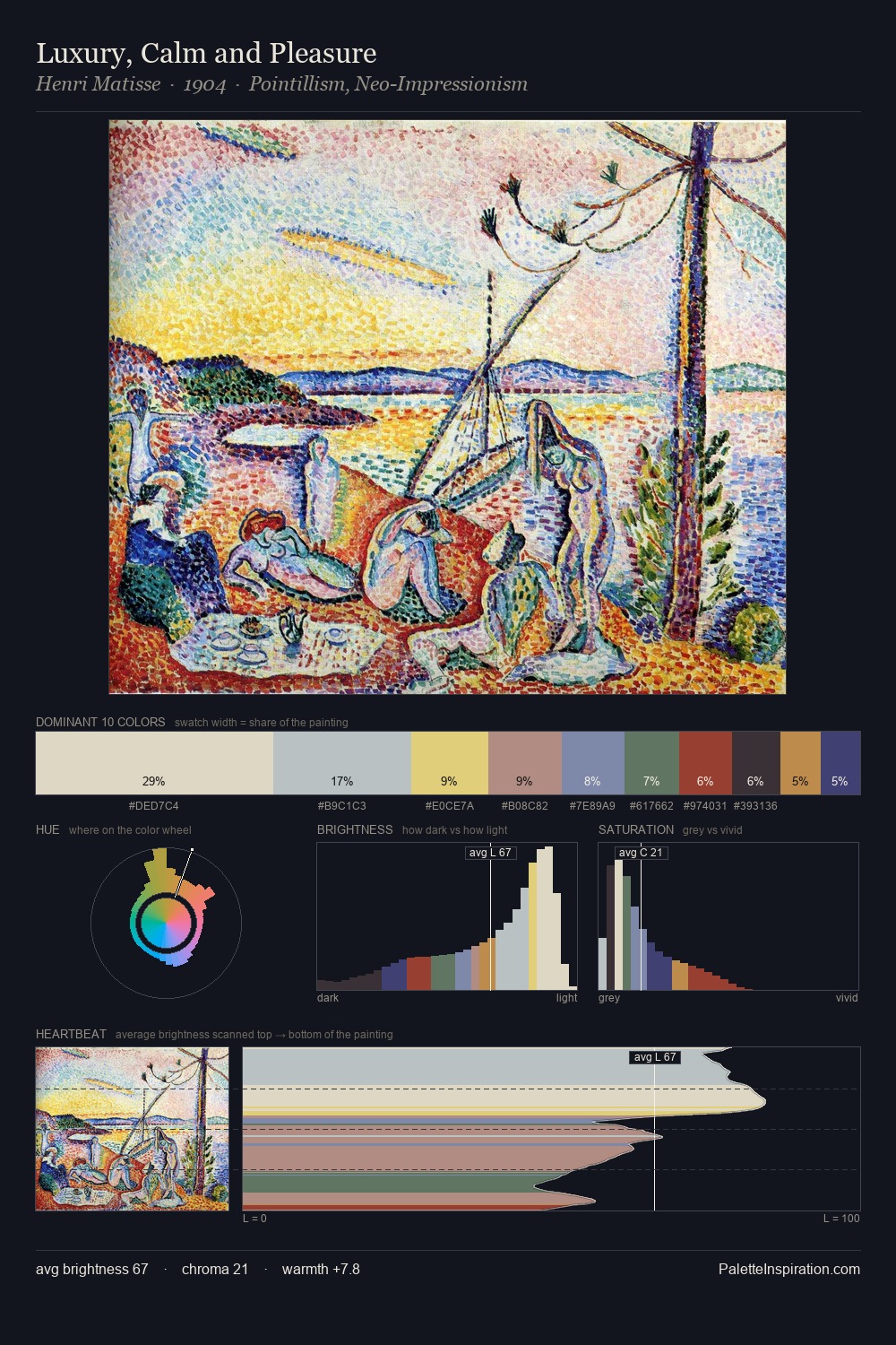
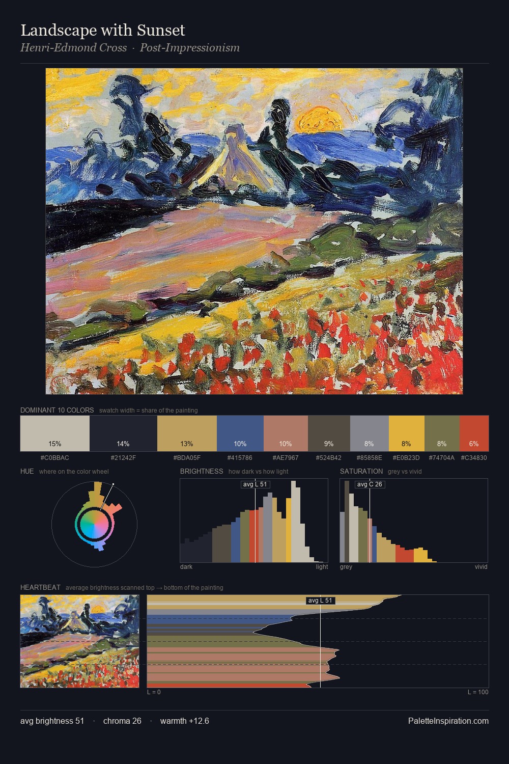
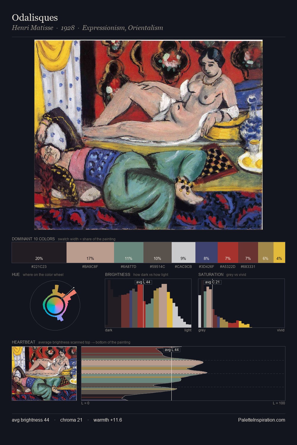
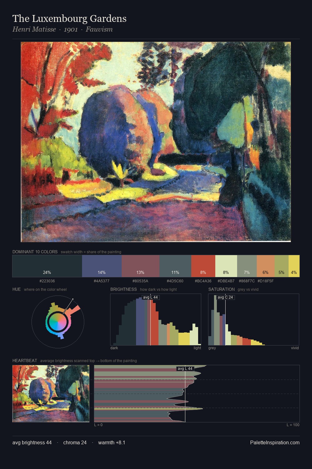
Georges Vantongerloo Master Palette

Palette Analysis
Georges Vantongerloo keeps values measured and balanced, a hallmark of tonal restraint. Georges Vantongerloo tilts toward cool - blues and silver-greys carry the structural weight. Saturation is deliberately withheld - the beauty here lies in the near-monochromatic gradations rather than colour difference. The most saturated colour, #B94145, is reserved to 5.0% of the surface, where it acts as a focal punctuation. At 56 units of value range, the palette has the tonal breadth to sustain complex spatial readings. High luminosity and cool temperature suggest the plein-air condition: unfiltered daylight and open sky. Taken together, these qualities constitute Georges Vantongerloo's chromatic voice - distinctive enough to be read across an entire body of work.
Example use cases
- ceramics & pottery
- boutique hospitality
- menswear
- heritage food brands
- craft & artisan brands
I Love This!
Copy, export, or download for your project