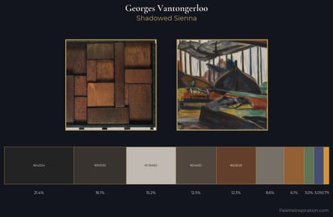
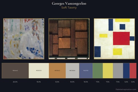
Georges Vantongerloo Palette 1
Palette Analysis
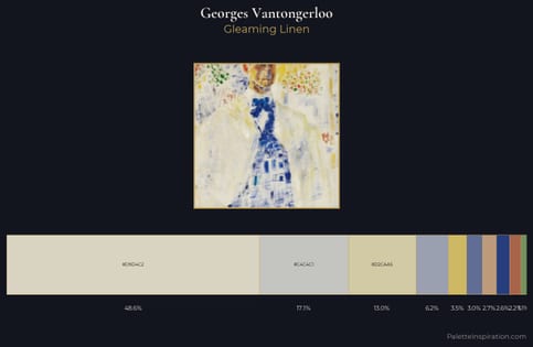
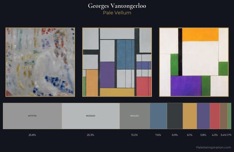
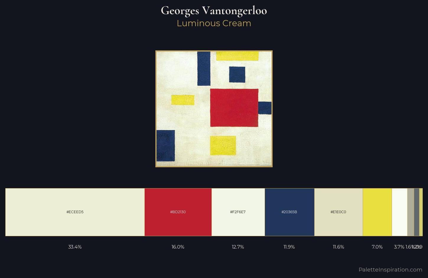
Georges Vantongerloo is high in key: pale, luminous, and filled with optical air. Cool tones set the register here - the blues and greens easily outweigh any warm accents. Saturation is measured and controlled, giving the palette presence without visual aggression. The dominant colour, #ECEED5, takes 33.4% of the total area, establishing the overall mood before any other hue is introduced. The chromatic peak belongs to #D3CE70, and at 0.9% it dominates, not decorates. The value range spans 65 units across the palette, providing the full gamut from deep shadow to near-white and ensuring clear tonal hierarchy. High luminosity and cool temperature suggest the plein-air condition: unfiltered daylight and open sky. Georges Vantongerloo's palette 1 carries its own internal logic while remaining in conversation with the artist's broader colour intelligence.
Example use cases
- publishing
- corporate identity
- consumer apps
- hospitality
- design agencies
I Love This!
Copy, export, or download for your project