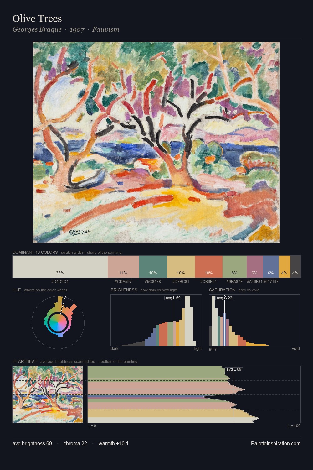
Georges Braque Palette 3

Palette Analysis
Values in Georges Braque tilt decisively toward white, giving the palette its luminous character. Cool hues prevail: blues, greens, and greys anchor the palette's emotional temperature. Every colour is desaturated; the palette proceeds through near-neutrals and gently-coloured greys. 32.4% of the palette belongs to #D4CFBF, a concentration that makes it the unmistakable visual centre. #DDA440 functions as the palette's exclamation mark: highest chroma, lowest percentage (3.2%). The value range of 50 units sits in the comfortable middle: enough depth, enough light, neither extreme. The mid-to-high key, cool bias, and moderate chroma point to outdoor observation - sky and diffused daylight as the dominant light source. Palette 3 sits within the larger chromatic argument that Georges Braque's complete body of work advances.
Example use cases
- ceramics & pottery
- boutique hospitality
- menswear
- heritage food brands
- craft & artisan brands
I Love This!
Copy, export, or download for your project