George Spencer Watson (1869 1934) Palette 1
 Palette 1 - Veiled Tawny")
Palette Analysis
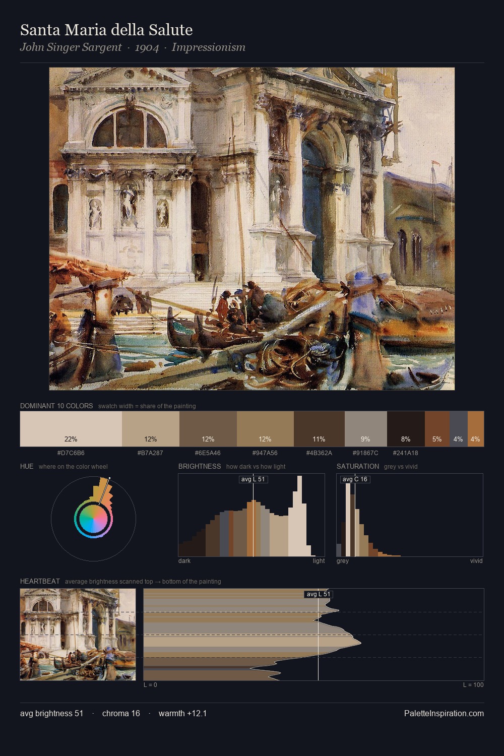
George Spencer Watson (1869 1934) distributes its values across the middle register, creating harmony without high contrast. Cool hues prevail: blues, greens, and greys anchor the palette's emotional temperature. Chroma hovers near zero; colour declares itself through subtle shifts in hue rather than outright saturation. The dominant colour, #857F74, takes 32.9% of the total area, establishing the overall mood before any other hue is introduced. The saturated accent, #4D3A26, registers at 7.5% - sparse enough to feel like a deliberate surprise. The full value range is 60 units: broad enough to build convincing three-dimensional form. The mid-to-high key, cool bias, and moderate chroma point to outdoor observation - sky and diffused daylight as the dominant light source. George Spencer Watson (1869 1934)'s palette 1 carries its own internal logic while remaining in conversation with the artist's broader colour intelligence.
Example use cases
- museums & galleries
- academic publishing
- heritage brands
- auction houses
- exhibition design
I Love This!
Copy, export, or download for your project
Related Palettes

Giuseppe Tominz Palette 2
Veiled Tawny
 Palette 2 - Nocturnal Bister")
George Spencer Watson (1869 1934) Palette 2
Nocturnal Bister
 Palette 3 - Nocturnal Sienna")
George Spencer Watson (1869 1934) Palette 3
Nocturnal Sienna
 Palette 4 - Shadowed Gamboge")
George Spencer Watson (1869 1934) Palette 4
Shadowed Gamboge
 Palette 5 - Nocturnal Bister")
George Spencer Watson (1869 1934) Palette 5
Nocturnal Bister
 Master Palette - Shadowed Tawny")
George Spencer Watson (1869 1934) Master Palette
Shadowed Tawny