George Hitchcock Palette 2
Penumbral Weld
Penumbral Partial shadow - the transitional zone between light and full dark, soft-edged.
Weld Clear warm yellow - a traditional dye plant color, clean and slightly golden.

Palette Analysis
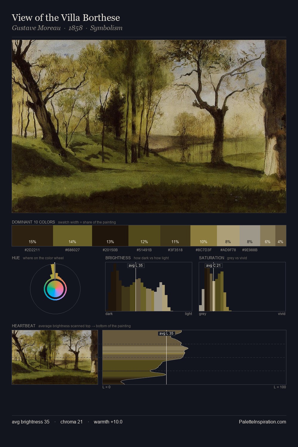
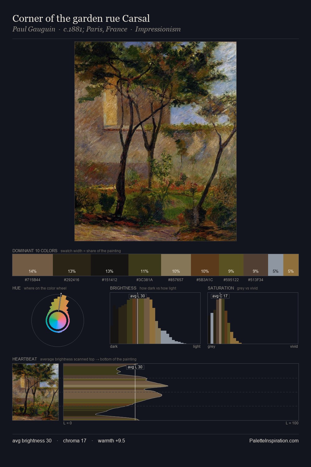
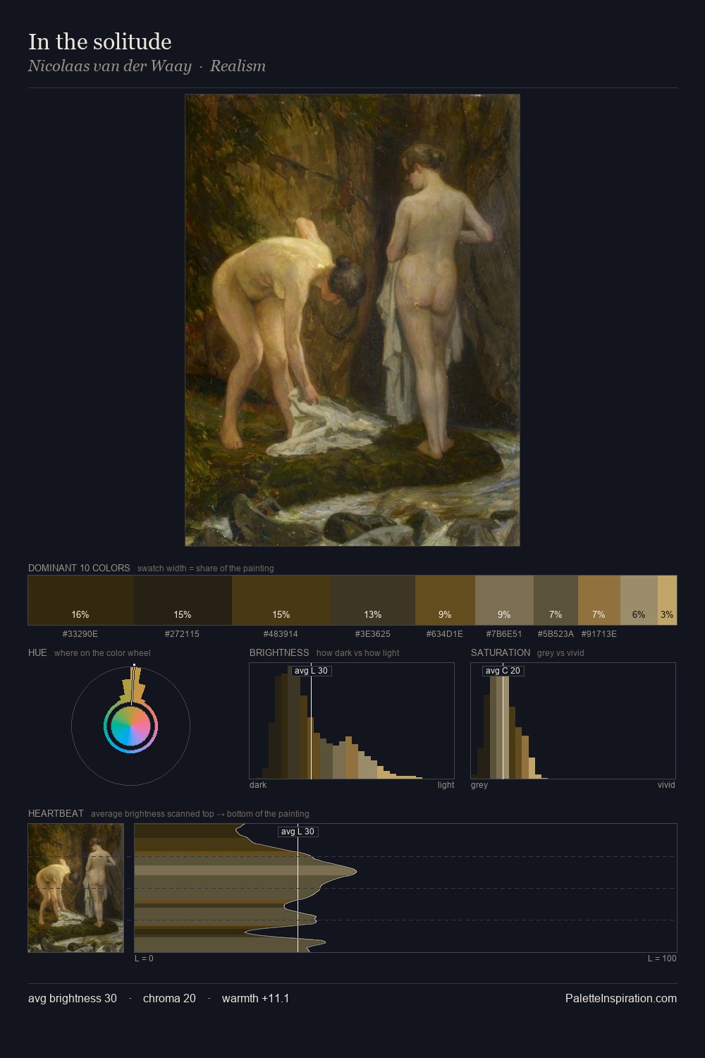
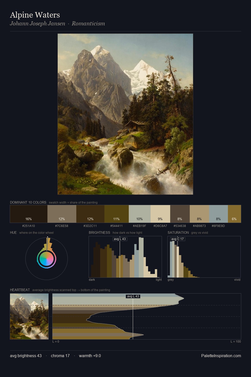
George Hitchcock keeps values measured and balanced, a hallmark of tonal restraint. Warm and cool are kept in productive tension, creating the kind of chromatic harmony that sustains the eye. All colours lean toward grey, building depth through value rather than colour punch. The most saturated colour, #5A471A, is reserved to 7.3% of the surface, where it acts as a focal punctuation. The value range of 46 units sits in the comfortable middle: enough depth, enough light, neither extreme. Palette 2 sits within the larger chromatic argument that George Hitchcock's complete body of work advances.
Example use cases
- music labels
- luxury hospitality
- editorial photography
- leather goods
- premium streaming
I Love This!
Use This Palette
Copy, export, or download for your project
Copy, export, or download for your project
Copy:
Download:
Share: