George Dawe Palette 2

Palette Analysis
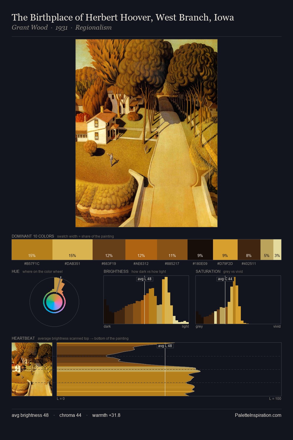
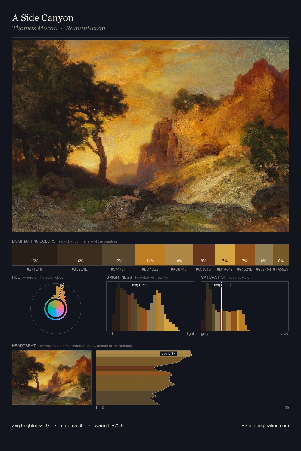
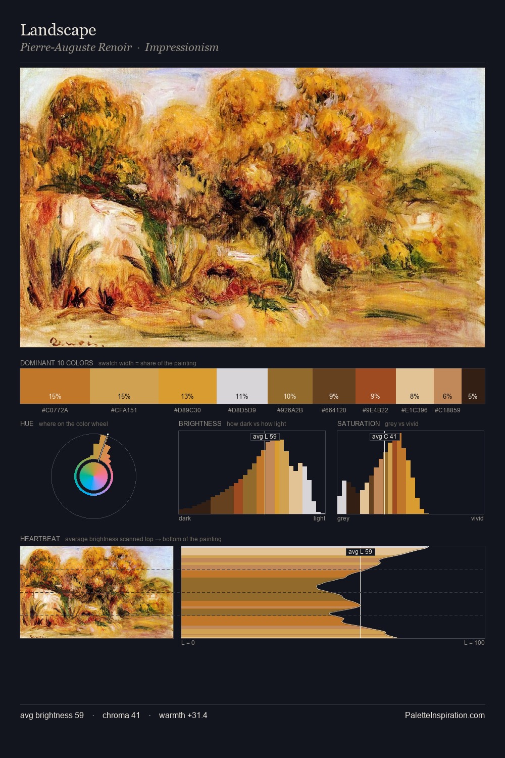
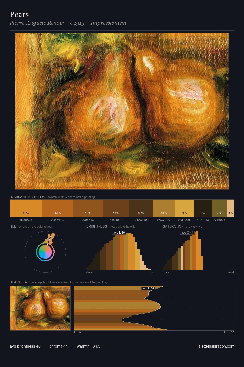
George Dawe distributes its values across the middle register, creating harmony without high contrast. Neither warm nor cool has the upper hand here; the equilibrium between the two generates the palette's visual energy. Colours are neither washed out nor blazing; they occupy the productive middle ground of the chroma scale. The highest-chroma note - #D29925 - appears at just 6.5%, deployed as a precision accent against the quieter ground. The full value range is 58 units: broad enough to build convincing three-dimensional form. The palette reads as an Impressionist one - light-biased, chromatically direct, and built on temperature contrast rather than value opposition. This is palette 2 of George Dawe's sequence - a single chapter in a chromatic story told across many works.
Example use cases
- theater design
- jewelry brands
- tobacco-adjacent retail
- event branding
- film & entertainment
I Love This!
Copy, export, or download for your project