Georg von Rosen Palette 2

Palette Analysis
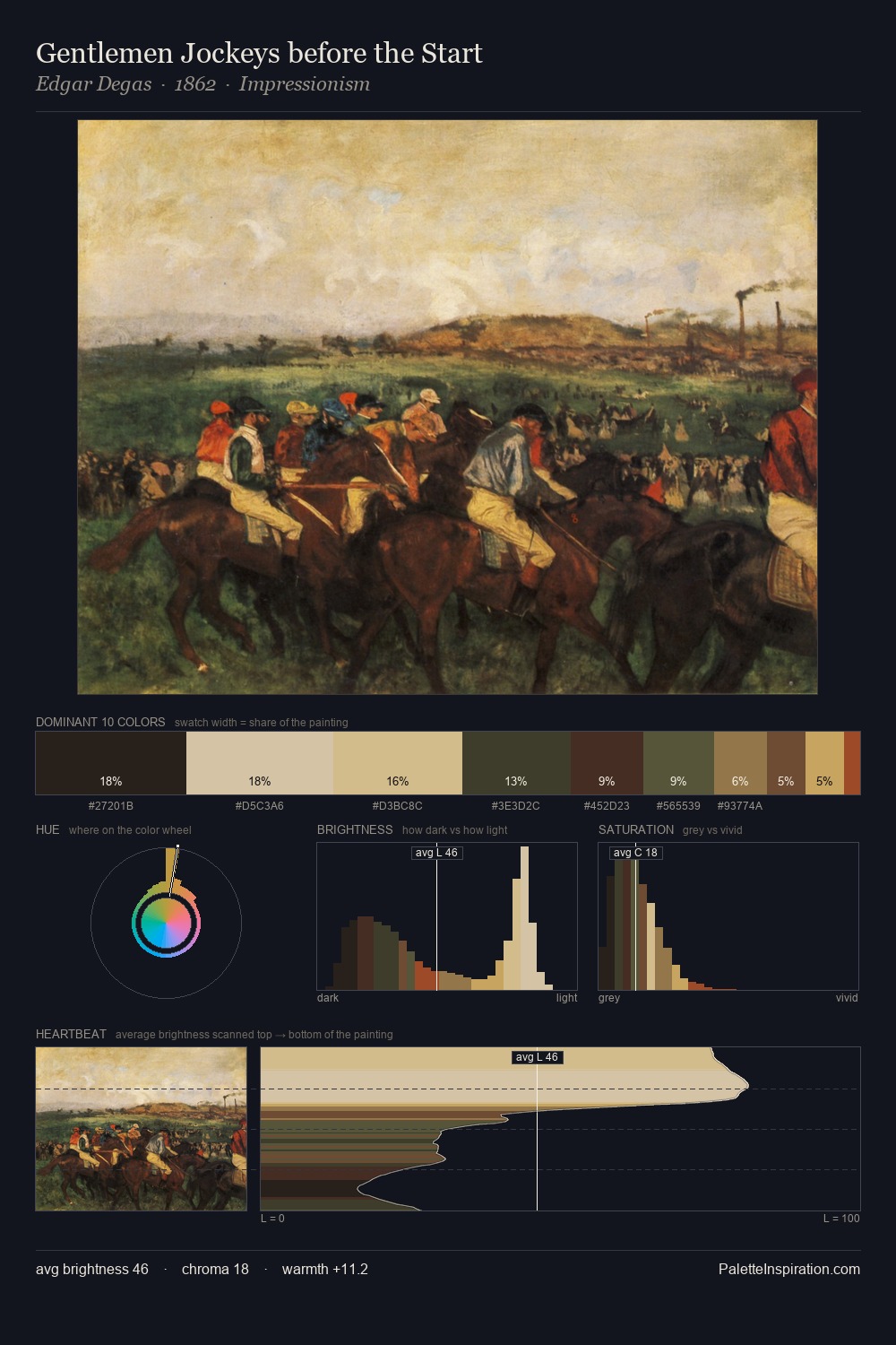
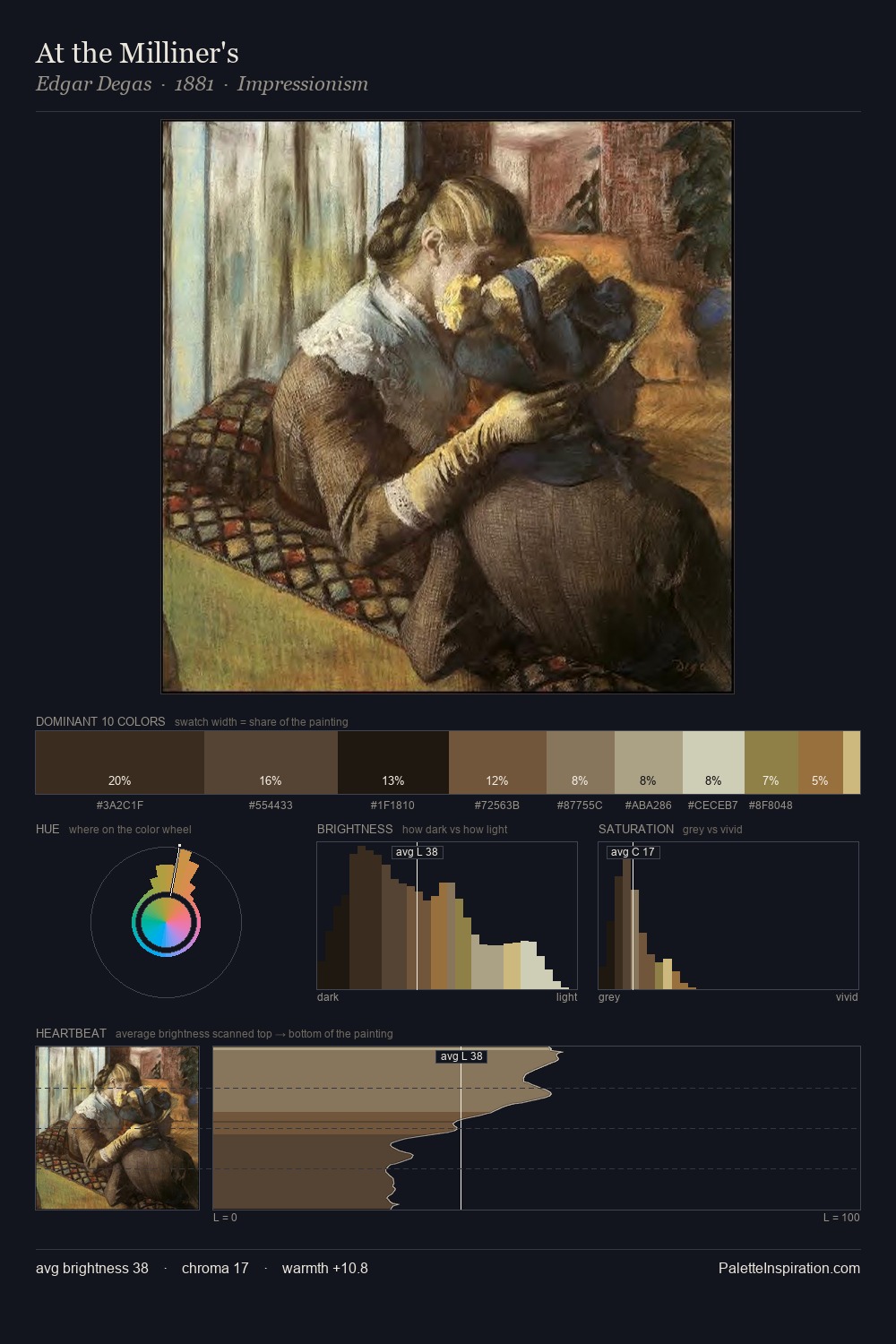
Georg von Rosen occupies the comfortable middle of the value scale, avoiding both extremes to hold the eye in a sustained middle grey. Temperature is cool-dominant, with blue and green families claiming the largest areas. The absence of saturated colour is itself an expressive choice: this is a palette of restraint and atmosphere. At 4.0%, #986E40 carries the palette's sharpest chromatic charge: an accent that earns its place precisely because it is withheld. From deepest dark to palest light, the palette traverses 55 units of the value scale - a span that creates natural depth. The palette has the character of outdoor light: cool, mid-bright, with colour rendered faithfully rather than expressively. Georg von Rosen's palette 2 carries its own internal logic while remaining in conversation with the artist's broader colour intelligence.
Example use cases
- theater design
- jewelry brands
- tobacco-adjacent retail
- event branding
- film & entertainment
I Love This!
Copy, export, or download for your project