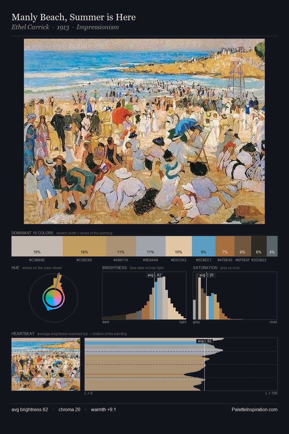
Georg von Rosen Palette 1

Palette Analysis
Georg von Rosen is high-key - luminous, open, and weighted toward light. Georg von Rosen balances warm and cool with remarkable evenness, giving the composition its characteristic vibrancy. Chroma is moderate: colours carry enough saturation to be read as colour, but the palette stops well short of garish intensity. 25.7% of the palette belongs to #DEB88A, a concentration that makes it the unmistakable visual centre. The saturated accent, #935426, registers at 3.0% - sparse enough to feel like a deliberate surprise. A value spread of 60 units gives the palette both depth and air - shadows are genuinely dark, lights genuinely light. Together these qualities point to the open-air Impressionist method: recording light rather than local colour. Georg von Rosen's palette 1 carries its own internal logic while remaining in conversation with the artist's broader colour intelligence.
Example use cases
- publishing
- corporate identity
- consumer apps
- hospitality
- design agencies
I Love This!
Copy, export, or download for your project