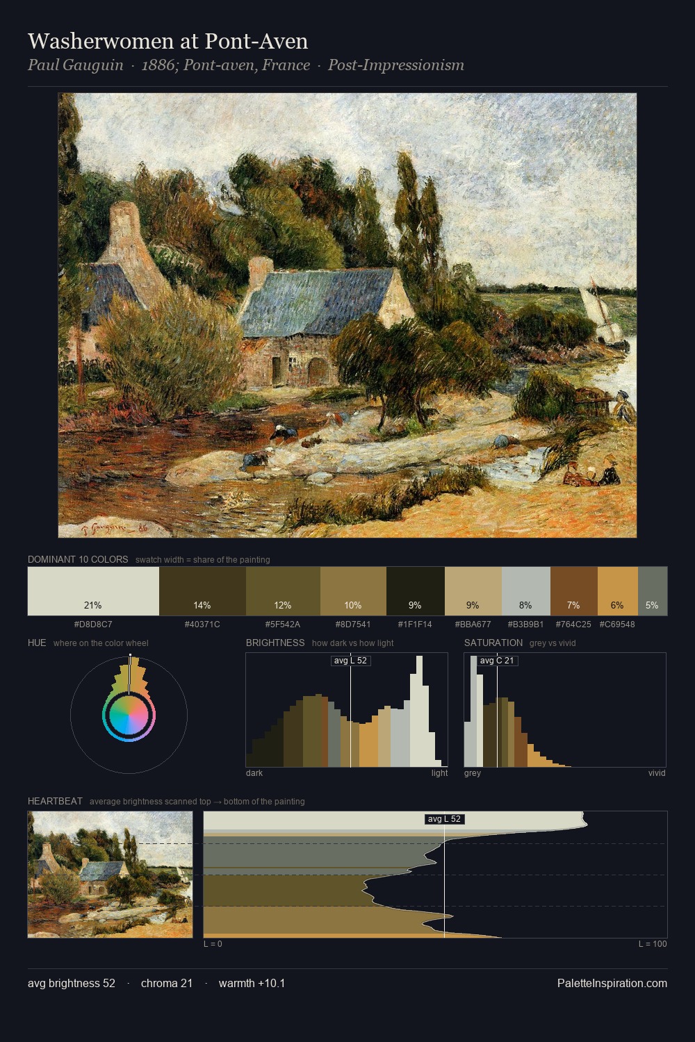
Georg Heinrich Crola Palette 2

Palette Analysis
Mid-key values give Georg Heinrich Crola its characteristic quietness - nothing blazes, nothing disappears. Cool tones set the register here - the blues and greens easily outweigh any warm accents. Saturation is deliberately withheld - the beauty here lies in the near-monochromatic gradations rather than colour difference. The saturated accent, #BCA15D, registers at 6.2% - sparse enough to feel like a deliberate surprise. At 54 units across the value scale, the palette keeps contrast readable without letting it dominate. The mid-to-high key, cool bias, and moderate chroma point to outdoor observation - sky and diffused daylight as the dominant light source. This is palette 2 of Georg Heinrich Crola's sequence - a single chapter in a chromatic story told across many works.
Example use cases
- theater design
- jewelry brands
- tobacco-adjacent retail
- event branding
- film & entertainment
I Love This!
Copy, export, or download for your project