Georg Heinrich Crola Palette 1
Shadowed Sienna
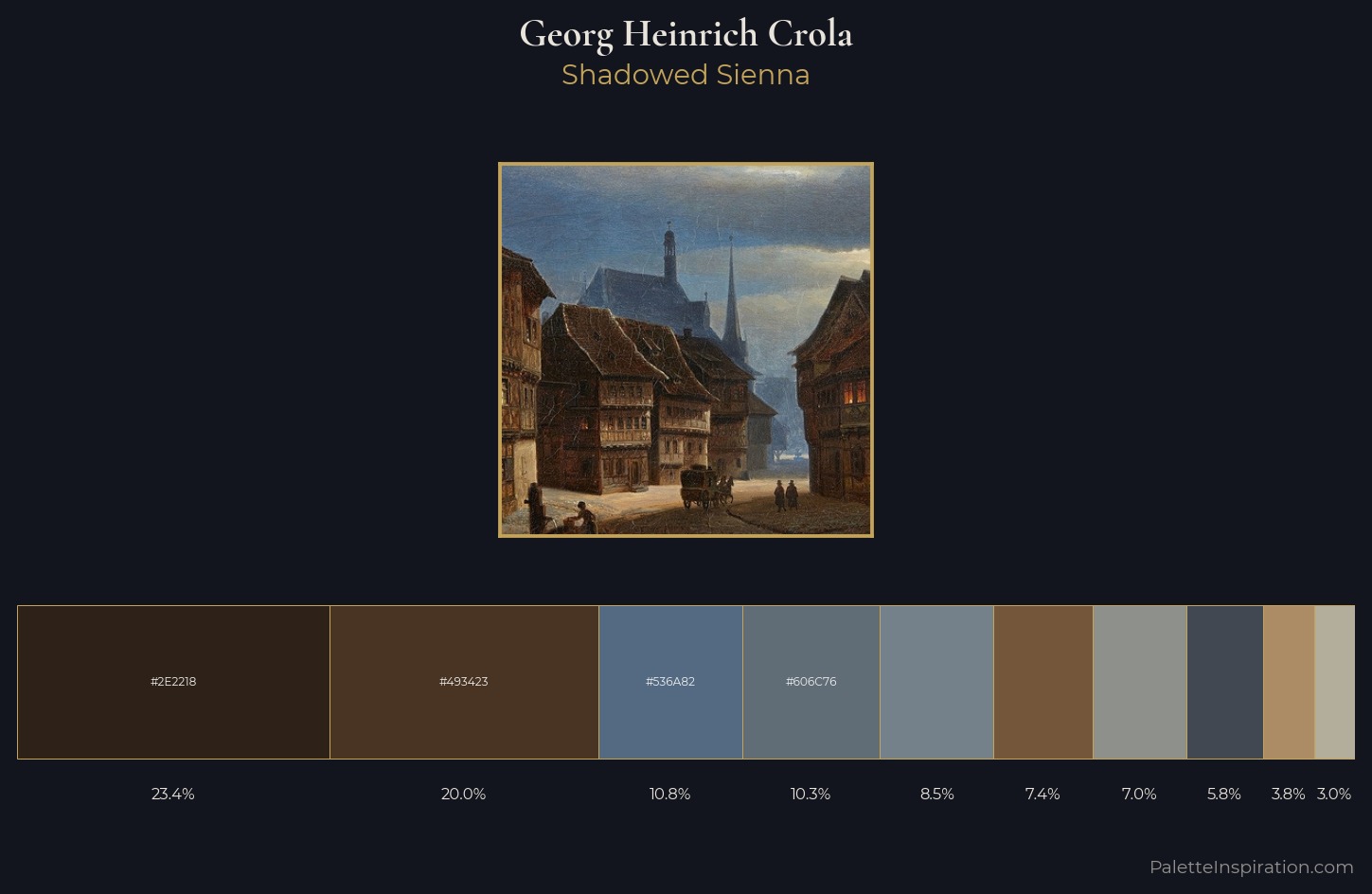
Shadowed Low-key - values weighted toward shadow, the palette of dim interiors and overcast skies.
Sienna Warm red-brown earth - named after the Sienese pigment, a fundamental artist earth color.
Palette Analysis
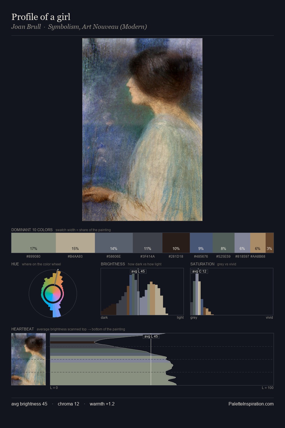
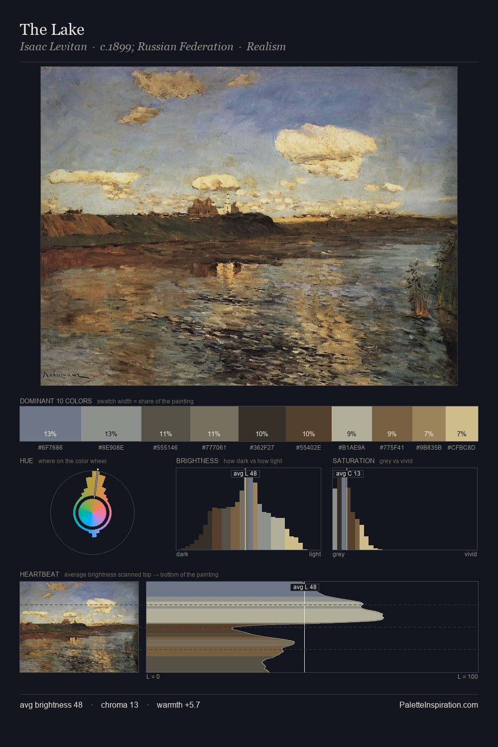
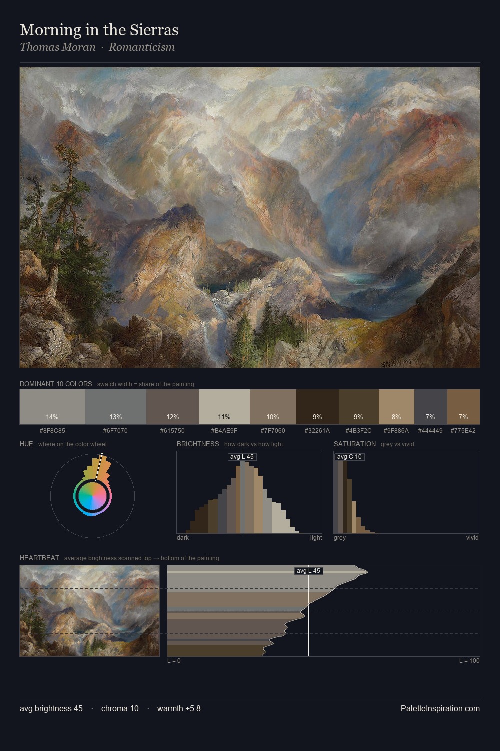
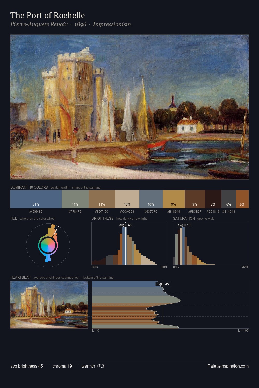
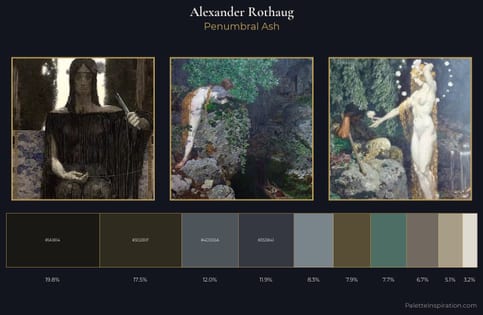
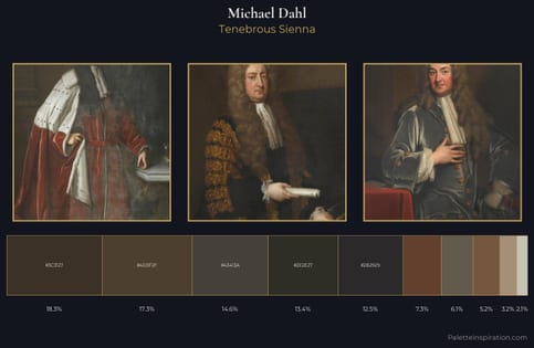
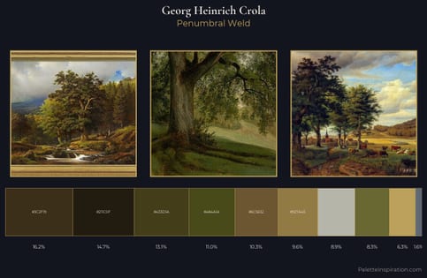
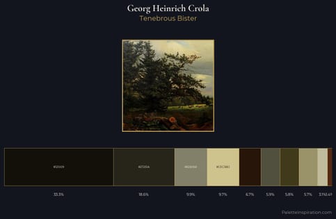
Georg Heinrich Crola occupies the comfortable middle of the value scale, avoiding both extremes to hold the eye in a sustained middle grey. Georg Heinrich Crola balances warm and cool with remarkable evenness, giving the composition its characteristic vibrancy. Saturation is deliberately withheld - the beauty here lies in the near-monochromatic gradations rather than colour difference. The highest-chroma note - #AB8C65 - appears at just 3.9%, deployed as a precision accent against the quieter ground. At 49 units across the value scale, the palette keeps contrast readable without letting it dominate. Georg Heinrich Crola's palette 1 carries its own internal logic while remaining in conversation with the artist's broader colour intelligence.
Example use cases
- theater design
- jewelry brands
- tobacco-adjacent retail
- event branding
- film & entertainment
I Love This!
Use This Palette
Copy, export, or download for your project
Copy, export, or download for your project
Copy:
Download:
Share: