Gaspar van Wittel Palette 4

Palette Analysis
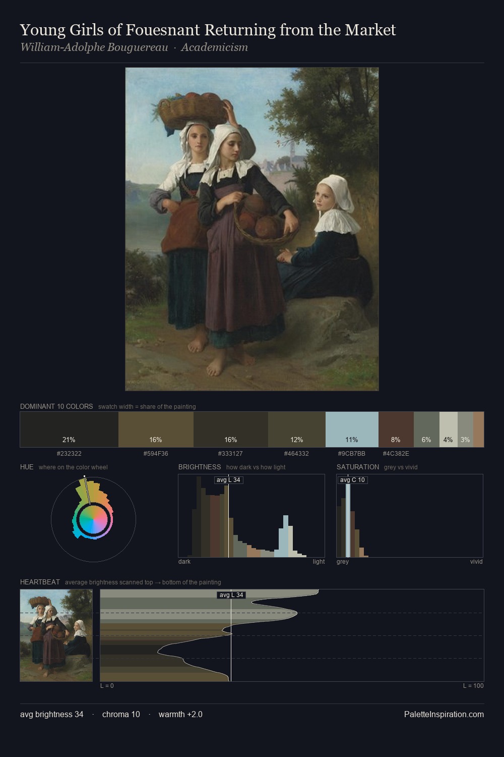
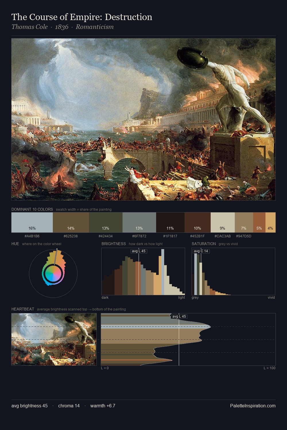
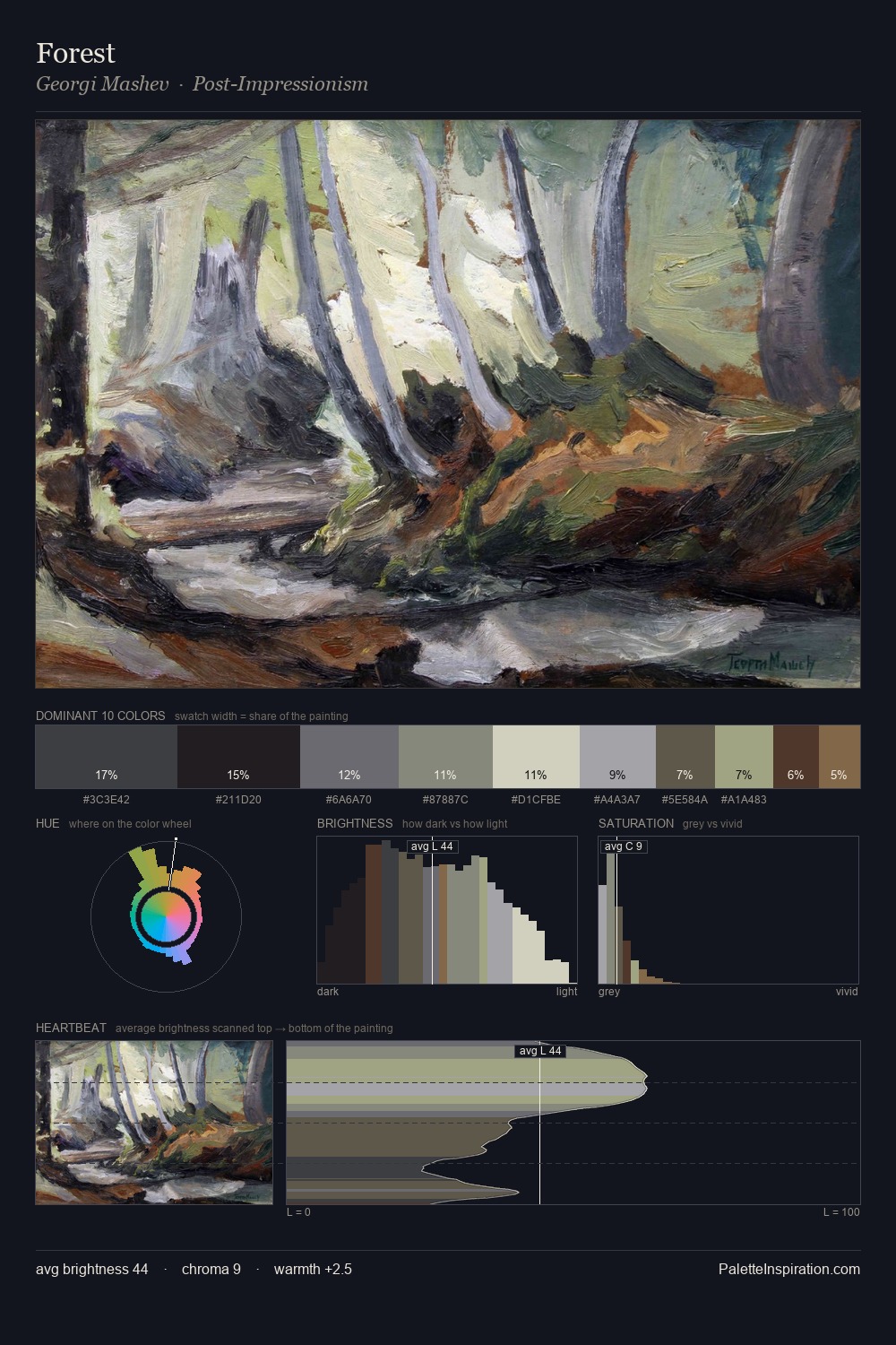
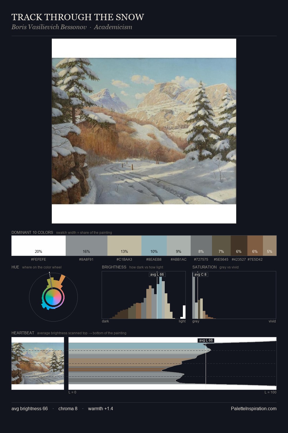
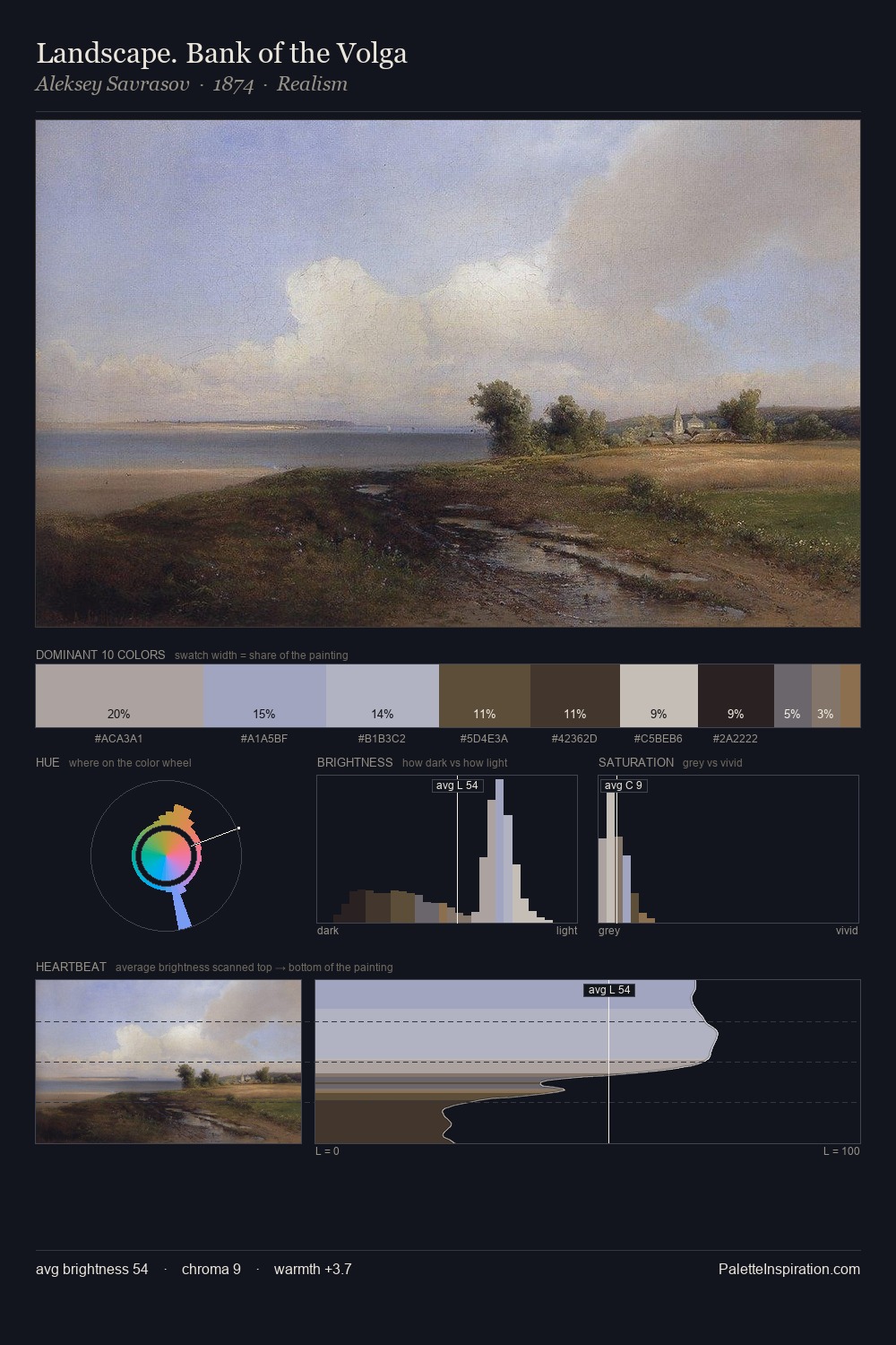
Gaspar van Wittel occupies the comfortable middle of the value scale, avoiding both extremes to hold the eye in a sustained middle grey. Blues and teal-greys govern the palette, lending it an aquatic or atmospheric quality. Muted throughout, the palette achieves its effects through value and temperature rather than chromatic force. The saturated accent, #90704E, registers at 5.0% - sparse enough to feel like a deliberate surprise. 52 units of value spread create a palette that is varied but unified - contrast in the service of harmony. The mid-to-high key, cool bias, and moderate chroma point to outdoor observation - sky and diffused daylight as the dominant light source. This is palette 4 of Gaspar van Wittel's sequence - a single chapter in a chromatic story told across many works.
Example use cases
- museums & galleries
- academic publishing
- heritage brands
- auction houses
- exhibition design
I Love This!
Copy, export, or download for your project