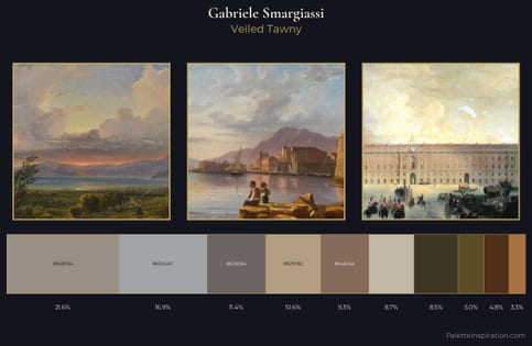
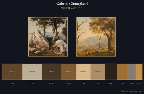
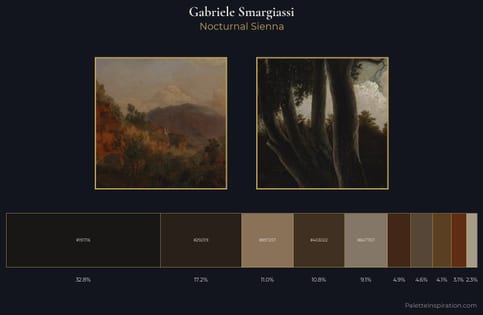
Gabriele Smargiassi Master Palette
Veiled Tawny
Veiled Partially obscured light - mid-dark with a hazy, scrim-filtered quality.
Tawny Warm orange-brown - a traditional term for the color of tanned leather or lion fur.
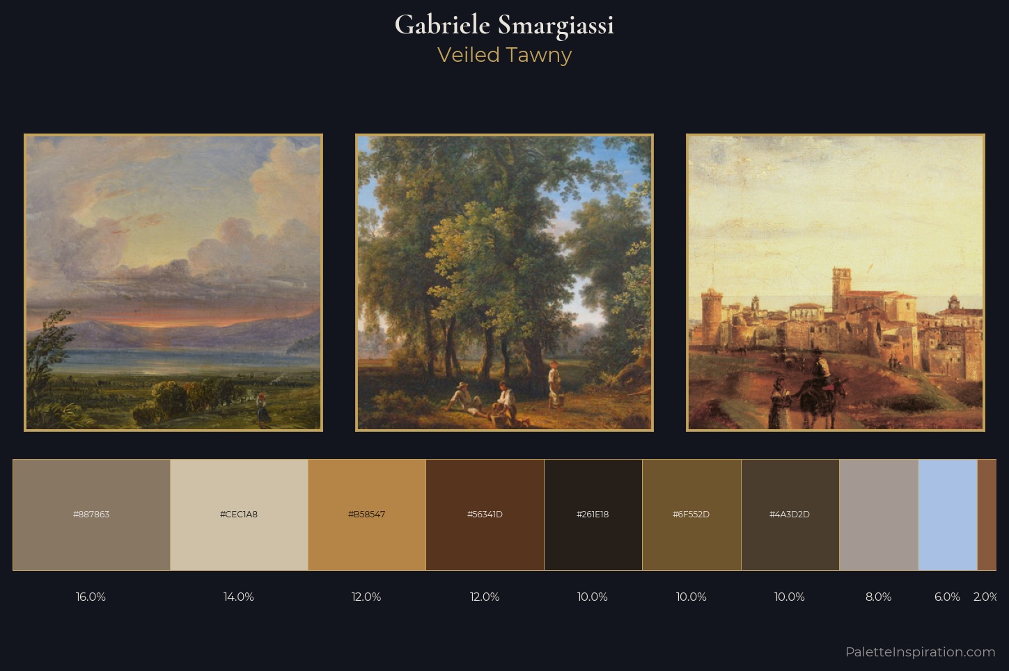
Palette Analysis
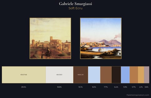
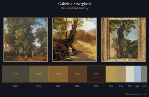
Values in Gabriele Smargiassi rest in the mid-range - neither dramatically lit nor steeped in shadow. Warmth dominates - the palette of Gabriele Smargiassi leans heavily on the yellow-orange-red arc of the colour wheel. All colours lean toward grey, building depth through value rather than colour punch. The saturated accent, #6F552D, registers at 10.0% - sparse enough to feel like a deliberate surprise. A value spread of 58 units gives the palette both depth and air - shadows are genuinely dark, lights genuinely light. This is the light Gabriele Smargiassi preferred, made measurable.
Example use cases
- ceramics & pottery
- boutique hospitality
- menswear
- heritage food brands
- craft & artisan brands
I Love This!
Use This Palette
Copy, export, or download for your project
Copy, export, or download for your project
Copy:
Download:
Share: