Fyodor Vasilyev Master Palette

Palette Analysis
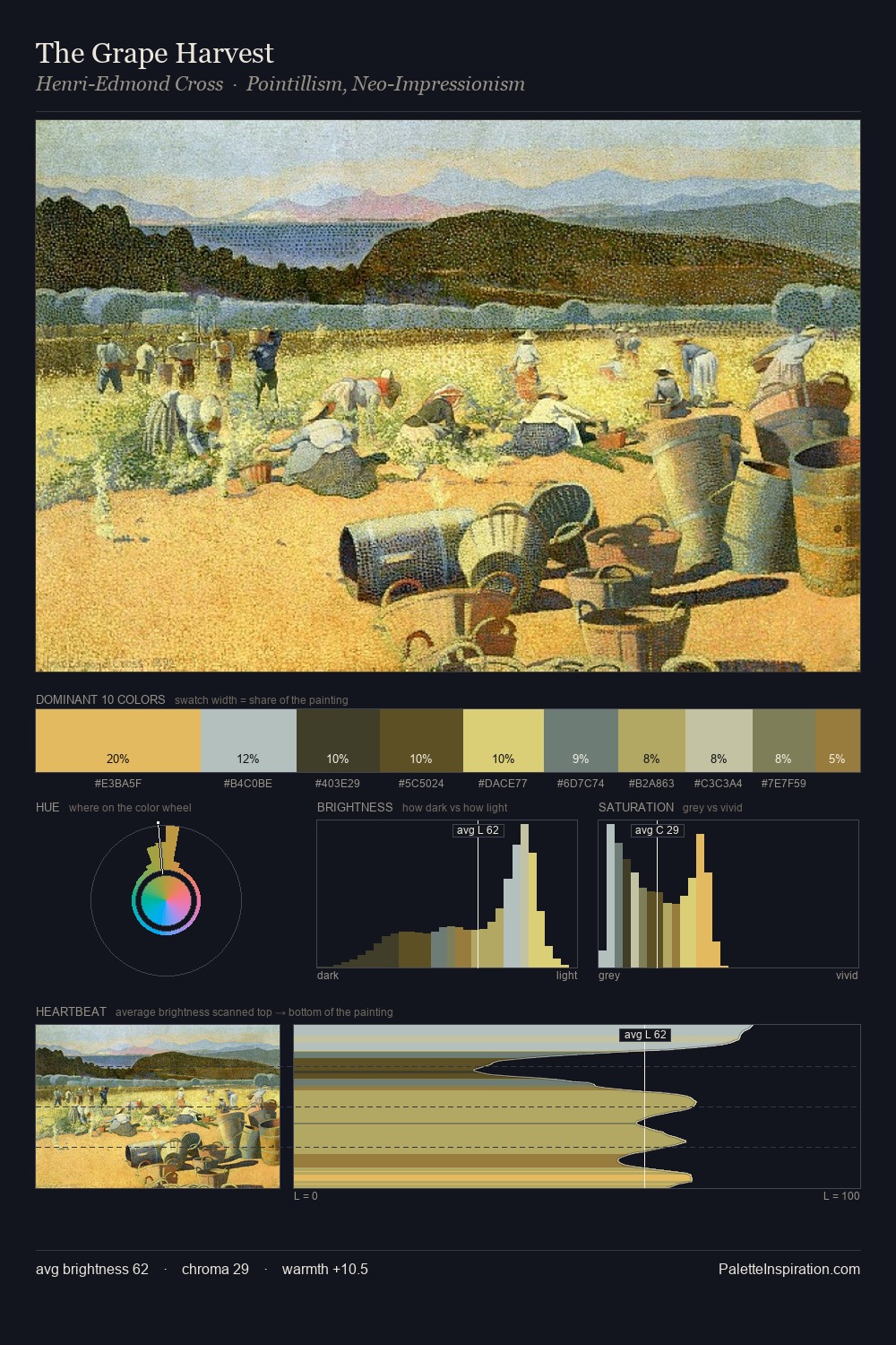
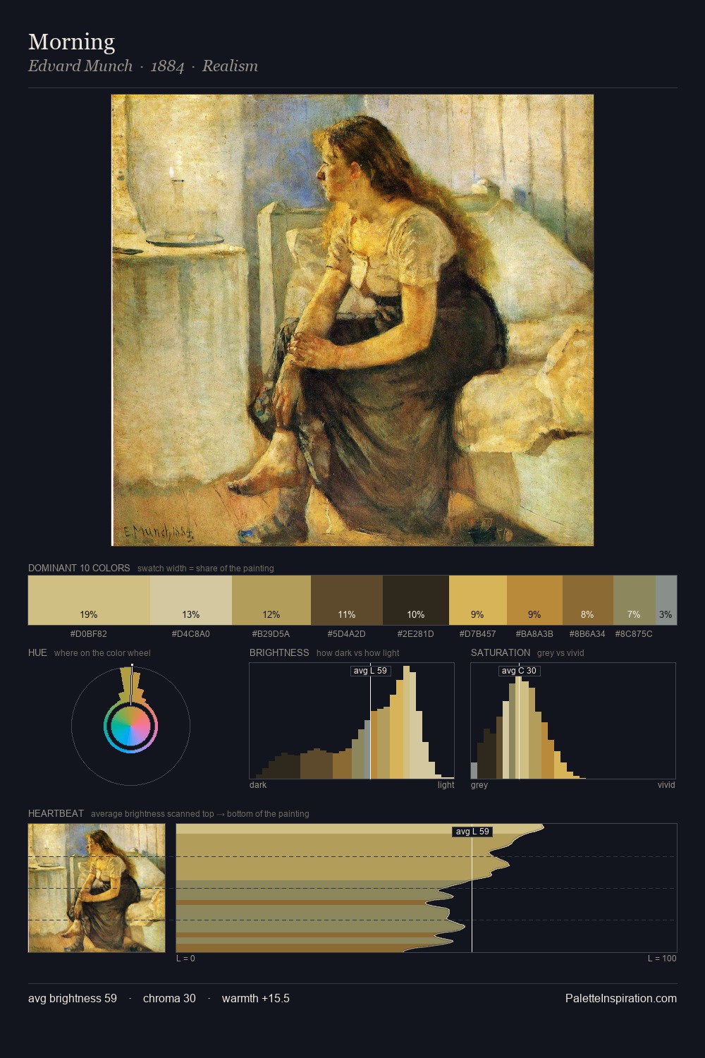
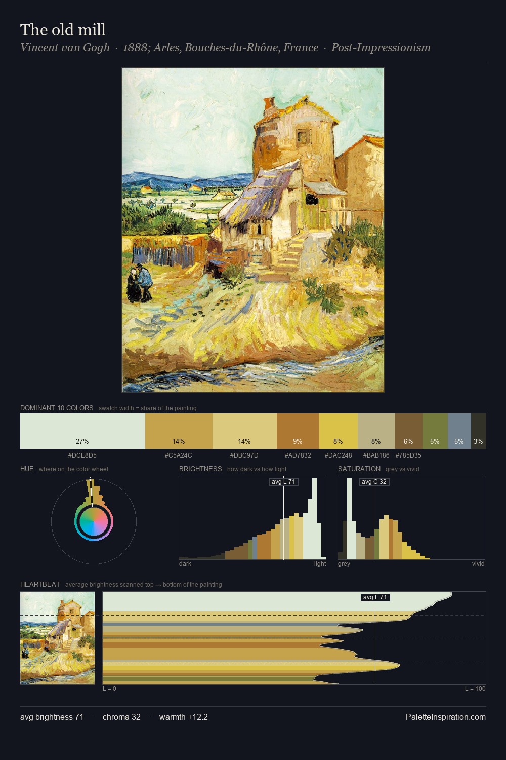
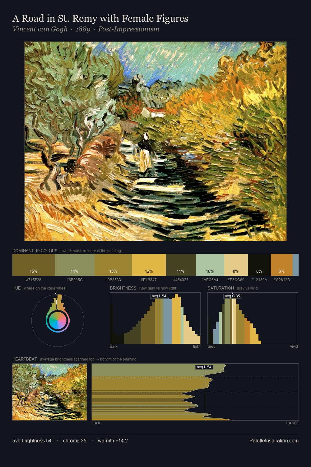
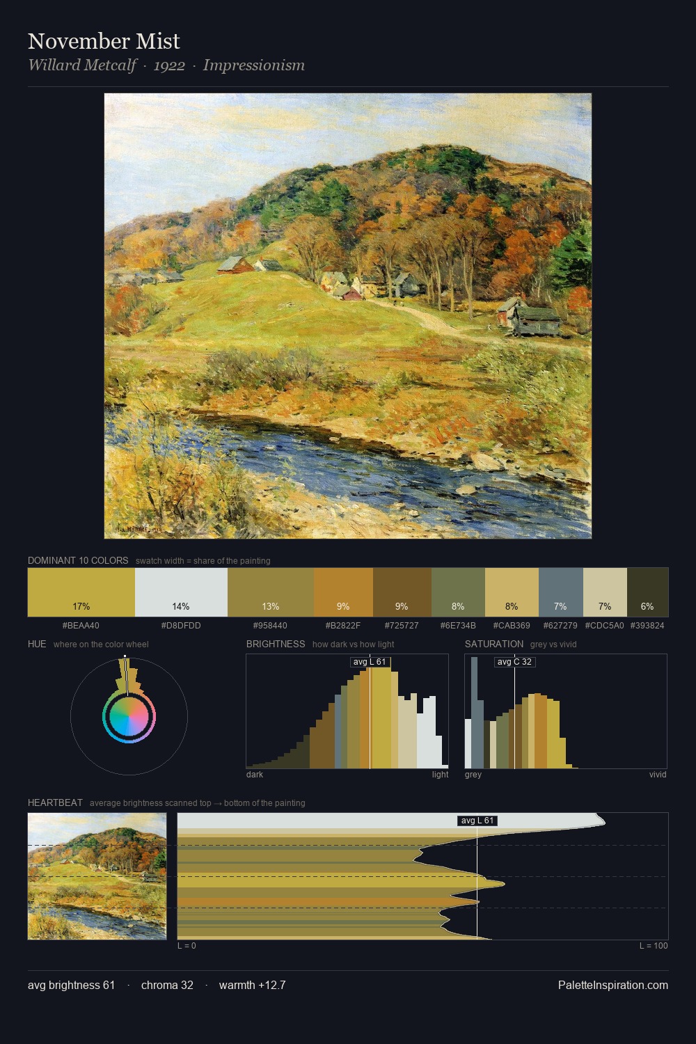
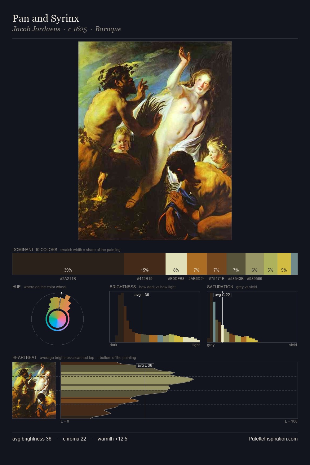
Fyodor Vasilyev occupies the comfortable middle of the value scale, avoiding both extremes to hold the eye in a sustained middle grey. Fyodor Vasilyev tilts toward cool - blues and silver-greys carry the structural weight. Saturation is deliberately withheld - the beauty here lies in the near-monochromatic gradations rather than colour difference. The most saturated colour, #D2AB3C, is reserved to 3.4% of the surface, where it acts as a focal punctuation. A value spread of 58 units gives the palette both depth and air - shadows are genuinely dark, lights genuinely light. The mid-to-high key, cool bias, and moderate chroma point to outdoor observation - sky and diffused daylight as the dominant light source. Taken together, these qualities constitute Fyodor Vasilyev's chromatic voice - distinctive enough to be read across an entire body of work.
Example use cases
- publishing
- corporate identity
- consumer apps
- hospitality
- design agencies
I Love This!
Copy, export, or download for your project